In his book, Success Made Easy, retail guru Ron Martin suggests using a daily chart to track your progress towards a goal. His chart shows progress towards the goal as well as where you need to be to remain on track. In the image, the straight line is the track.
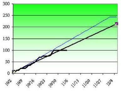
As shown in Fig. 1098, I can see from the chart that I am not working on track to meet the goal. However, my question is: What would happen if I continued to work at my current pace? By how much would I miss the goal on 1 December?
Excel makes it easy to add a trendline to charted data.
-
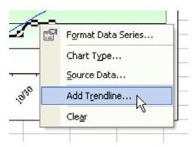
Right-click the graphed line for actual results. From the menu that appears, choose Add Trendline…, as shown in Fig. 1099.
-
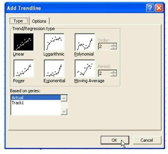
In the Add Trendline dialog, you can accept the defaults, as shown in Fig. 1100. Click OK.
Advertisement
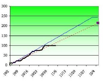
A trendline is added. Other than being straight, it looks very much like the line that it is based on. As shown in Fig. 1101, the line tells me that I will only be around 200 at my current pace.
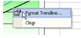
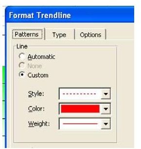
- Since the trendline is only a forecast, I like to format it with a dotted style so that I know it is just a prediction. Right-click the trendline and choose Format Trendline…, as shown in Fig. 1102.
- Choose a thin weight in red and a dotted style, as shown in Fig. 1103.
The result in Fig. 1104 is a dotted line showing the predicted results if you continue at your current pace.
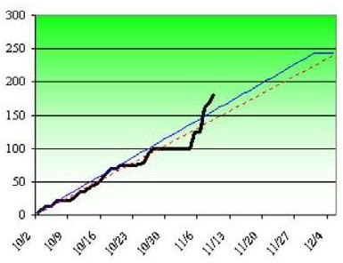
As you continue to plug in actual data, the trendline will redraw. After seeing the above chart, I was nervous about missing my goal and really put it into hyperdrive for the next few days. Even though the Actual line is above the Track line, the dotted trendline is still predicting I will miss the goal. That is because the trendline sees all of those days between 10/30 and 11/5 where I did nothing, as shown in Fig. 1105. It can predict that those days might happen again.
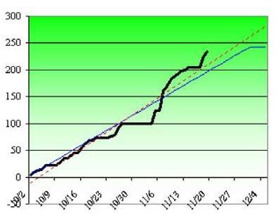
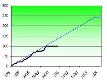
My reaction was to continue working at a pace to finish the project ahead of schedule. Finally, the red trendline acknowledged that I might beat the schedule, as shown in Fig. 1106.
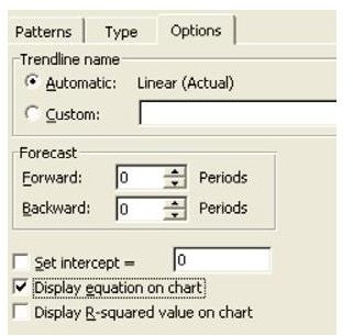
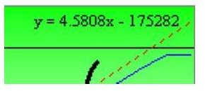
Right-click the trendline and choose Format Trendline. On the Options tab, you can choose to display the equation on the chart, as shown in Fig. 1107.
Images