How do advertisers utilize white space? Design and layout of their ads, that’s how — it’s done to maximize the impact of negative space. Learn how white space is used to give advertisements maximum impact.
White space is a small but essential component of advertisement design. Especially when communicating marketing messages, negative space may look empty and quiet, but it speaks volumes. But precisely how do advertisers utilize white space? Design tips and answers can be found in this article.
What is White Space?
White space is more precisely known as “negative space.” It is, as you might imagine, empty, blank space on a page. The reason it’s called negative space is because it’s one side of a balance: “positive space” is the actual items on a page: shapes, text, illustrations, art, photos. Negative space is the area around and in between these items.
In the world of drawing, artists are continually cognizant of positive and negative space, to the point of being exhorted to “draw the negative space.” This and the concept of balance are applied to graphic design and advertising design in the form of utilizing white space to capture and hold the attention of the reader or viewer.
The Messages That White Space Delivers in Ads

Think back to the last perfume ad you saw. Was it perhaps a product shot or a lone model shot on a stark, empty background, alone on the page save for some pithy motto and logo tucked at the bottom of the page? As the Magic 8-Ball would say, “All signs point to yes.”
And this is what large amounts of white space in advertisements implies, concepts and feelings of:
- extravagance
- richness
- elegance
- sophistication
- elite
- luxury
- exclusivity
Why is this? It may be because advertising costs money, and it’s particularly extravagant to spend money to print and deliver a message and then not use every bit of space you’re given. White space in ads says, “We are so confident in our product that we don’t need to scream about it.”
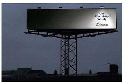
Thus, ads for brands that wish to communicate these luxe concepts, such as jewelry, perfume, watches, luxury cars and other expensive items, should utilize vast swathes of white space.
Using White Space in Non-Luxury Ads
White space used in non-luxury concepts is a tricky beast. On the one hand, it can be used to make a pedestrian product or service seem more upscale. On the other hand, it may be perceived as putting on airs or hoity-toity.
Ads for oil changes, for example, aren’t going to use an artistically-shot image of an oil can centered on the page surrounded by miles of open white space. Readers would expect this oil change facility to be very expensive.
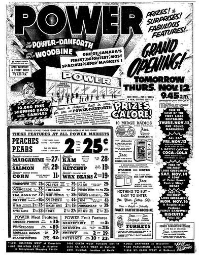
Notice how ads that are geared towards utilitarian items and working class concepts tend to be extremely busy. Clutter is the anti-white space, proclaiming a down-to-earth sensibility.
However, even in utilitarian advertising, e.g. supermarket ads, designers can still make use of judicious leading and paragraph spacing and the principles of alignment and contrast to help cluttered layouts be pleasant and readable. In fact, this is the grand challenge of the designer: to utilize white space to its best effect in advertisements of all kinds, from spacious luxury layouts to busy, copy- and image-heavy layouts.
And with that, I hope this article has helped to answer the question, “How do advertisers utilize white space?” Design, while it does allow us to express artistic impulses, is at its heart an endeavor to communicate clearly. Using white, or negative, space in ads to send the intended message while still being clear and easy to understand is among the highest goals we can shoot for.
References and Image Credits
Advertising layout strategy: https://www.wiu.edu/art/courses/handouts/layout.html
Billboard: by otakuchick, CC-license, Flickr
Perfume: by e9ine, CC-license, Flickr
Ad: by jbcurio, CC-license, Flickr


