Trying to learn the principles of design? Harmony? Consistency? What does this mean to you, and why should you care? This article will give you a basic lesson of things you need to keep in mind when doing any design project out there! Explored are color theory, balance, and simplicity.
Form & Function: A Match Made in Heaven
When designing a project, it’s important to think about balancing form and function. Creating a harmony between aesthetics and usability is probably the easiest concept to grasp, but one of the harder practices to execute. Have you ever bought a pair of shoes that looked really nice but hurt your feet? That’s an example of form winning out over function. Those shoes are probably buried at the bottom of your closet, waiting for the day you’ll forget how they pinch your toes and rub your heel the wrong way. What about those shoes that you bought because they were just so comfy, but they don’t look snazzy enough to wear outside of your own house? Sure, they’re great for mowing the lawn or maybe even driving to the drive-through, where you know you won’t be leaving your car. Wouldn’t it be nice to have a pair of shoes that look great, but you can still wear all day?
Your project should be like the perfect pair of shoes — nice to look at, and achieves its purpose well. If you’re designing a flier, websites, or even invitations, make sure that while being aesthetically pleasing, it isn’t extremely cluttered and the information isn’t hard to find. Product packaging and advertisements should clearly state what your product is for, but in a tone that appeals to your target audience. After all, you wouldn’t want to use Mother Goose rhymes to try to sell a fancy designer suit to powerful business men, would you?
Colors, Colors Everywhere
While I can’t give you an entire course of color design and theory as this is something people spend years learning, I can give you the basics. Balancing color correctly in any project is an absolutely crucial design component. If you’ve never thought about it, you might want to take a look at either purchasing a color wheel from a local hardware or craft store, or taking a look at a few color scheme designers online.
Getting familiar with colors and their meanings will help to bring a sense of clarity to your project, and can help you to reach your audience on a deeper level. After all, advertisers have been using colors to market to specific genders and age groups for years! Learning how to pair specific colors together is a helpful skill as well. This can draw people to your project, or make for a memorable decorative keepsake when applied to scrap-booking, invitations, or other handicrafts. Also, once you find a color scheme you like, try not to deviate from it! Too many colors tend to feel jarring and can be a complete turn off for those looking at your project.
Curious about specific colors, their meanings, and how you can pair them with other colors? Why don’t you check out these articles on the colors blue , green , and yellow to help get you started?
When All Else Fails, KISS
Have you ever heard the expression KISS when in relation to design? KISS stands for Keep It Simple, Silly (or alternatively, Keep It Sweet and Simple)! Often times, you’ll go into a project with so many things that you feel like you absolutely have to incorporate, that you inadvertently do more harm than good. Try to pick out only key elements for your project, and then one or two supporting, tasteful embellishments. A great example is a wedding invitation: sure, you have to put the address of the wedding, the name of the bride and groom, the time and date…these are all important. But feel free to add a few lines of embellishment — just don’t try to fit on a whole sonnet. And pick a single, meaningful piece of artwork to emblazon the front of the invitation over all the cliche symbols. The same goes for web design and product packaging as well!
Image Credits
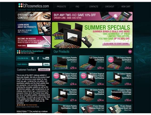
Web Design Example: BH Cosmetics Site 2010
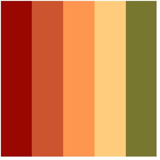
Color Scheme: Amber Neely
Big Colors Whale: Logorodo


