
Different colors have different meanings, and blue is no exception. What color of blue are you looking to use? Not sure? Don’t worry! This article explores the meaning of the color blue and showcases some different colors schemes of blue that can be used for a variety of different effects.
Meaning of the Color Blue: Positives & Negatives
**
The Positives of Blue: Blue has long been used in color therapy, interior design, and product advertising to help promote calm feelings. Blue traditionally is the feeling of comfort and sincerity. Being a cooler color, blue is thought to be “less emotional,” and generally has come to associate itself with a mental clarity you won’t get from shades of oranges and reds, which are more toward the emotional end of the spectrum.
Light blues are often associated with cleaning or clean liquids - clean water, cleaning liquids, water filters, swimming pools, and even vodka are all frequently associated with the color blue. Darker blues have come to be the picture of masculinity and is widely accepted among men and boys. Blue is also thought to be the color of expertise and is used frequently for products that require a bit of skill to use.
The Negatives of Blue: Blue has also managed to get stereotyped as an apathetic color, or even a little melancholy. Ever get the blues? Ever hear someone play the blues? You know what we’re talking about, then! Blue is also rumored to be the least appetizing color, and has been considered almost taboo to use in interior designs for kitchens, as well as in most food packaging.
When to Use Blue, and What Blue to Use
Much like other colors, the different shades of blue are associated with different feelings and can be used for wildly different effects just by changing the shade. Lighter blues are great for invitations to boys’ birthday parties and baby showers for sons-to-be . Darker blues can be used to promote expertise in marketing.
Indigo blues work wonders for promoting sincerity, and can be used to great effect on thank you cards as well as business cards. If you’re still not sure what you’re going for, here are some examples of different shades of blues and what they mean:

True Blue (Medium, vibrant blue): Depth, stability, faith
Dark Blue: Expertise, Power
Light Blue: Cleanliness, understanding, softness, health
Baby Blue: Infant color (male)
Blue-Green: Emotional healing, protection
Indigo: Knowledge, Integrity
Denim/Faded Blue: Melancholy, apathy
Blue Schemes:
Fortunately for blue, it plays well with just about every color out there. Using it with warmer colors can help balance out a scheme both visually and emotionally. Adding it in with other cooler colors, such as purples and greens gives a rich, yet wildly accepted feel. Blue can pair extremely well in both masculine and feminine schemes, making it a truly versatile color.
Muted Blues:
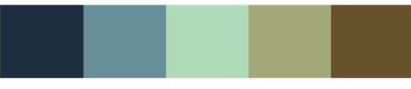
Blue looks especially striking when added to a muted color scheme filled with browns and teals. You may have noticed that these colors have become especially popular in fashion, as well as bedding and interior design over the last few years. This is because these are considered extremely calming colors, and together create a very attractive color scheme. This scheme has actually come to be somewhat feminine, so using it for a girl’s birthday invitation or even a bachelorette party or wedding shower color scheme are great ideas.
Blue’s Place Among the Warmer Colors:
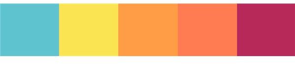
Adding blue to an otherwise already warm color scheme can help “cool it down”, or prevent the scheme from feeling too one-dimensional. This also helps to lessen the natural emotional impact of a color scheme, which can help make it feel a little less overwhelming. Not to mention, it makes a striking accent color after all. The scheme above is a great tropical feel, good for everything from invitations to beach-party birthday blow outs to graduation party themes .


