Color is one of the most important elements in design. Color affects the visual appeal of print designs and also impacts viewers’ moods and how they feel about the subject you are presenting. Read on for these tips on desktop publishing color design.
You can learn how to use color to your advantage even if you’re not an art school graduate. Whether you create images in which color is obvious or very subtle, it affects your audience’s perceptions of print designs and also affects viewers’ moods. For the best results, follow some tried and true desktop publishing color design tips for using color in your postcard, poster, and brochure projects.
Use Spot Colors for Vibrancy
If your design has bold, graphic elements in solid blocks of color, you can use spot color printing , such as the Pantone system. Spot Colors are printed as a single color, and the result is an intense, rich hue. Spot color printing can also cost less than four color (CMYK) printing if the images you are printing are solid blocks of color. Keep in mind that spot colors cannot be used for photographs or complicated graphics in your poster, business card, or brochure printing designs. It is possible to print a single document using both Pantone and CMYK colors, but you must let your printer know that is your intent, and you must also realize it will probably cost a lot more than to use just one or the other color method.
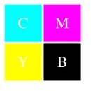
Use CMYK Colors for Depth
Cyan, magenta, yellow, and black are mixed together to create hues for CMYK printing, also known as process color or four color or even full color printing. If printing photos or other colorful graphics, CMYK is best for achieving the gradient tones and shading found in most images. CMYK printing produces colors by creating layers of cyan, magenta, yellow, and black. When printing images with lots of depth and colors, CMYK is the most cost-effective and quality choice.
Preview the Colors in Print
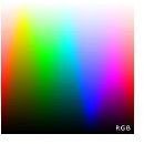
RGB colors work nicely for web designs, but what about when you’re sending a project to the printer? One of the best desktop publishing color design tips when sending a project to print is to change the color scheme to CMYK or Pantone. Since a monitor only displays RGB colors accurately, you will need to print your project for a more precise preview. You may want to request a physical proof from your printer as well to see an even more accurate representation of your design’s colors.
Incorporate Contrasting Colors Correctly
Colors that are opposite each other on the color wheel are considered contrasting colors. Warm and cool hues are located on different halves of the color wheel, which is why mixing colors from these two main sections create create great contrasts; in fact, the more directly opposite colors sit from one another, the higher the contrast. If used correctly, contrast can make text and other design elements stand out well from a background. Lightness is an important part of making contrasting colors work well together. If using a light hue for the background, choose a dark hue for other graphics or text. The greater the difference in lightness and darkness of two contrasting colors, the more effective the contrast will be.
Use Warm Colors for Excitement
Reds, yellows, and oranges are vibrant and exciting. Yellow is perceived as cheerful, hopeful, and inspirational. Orange is flashy and grabs attention. Red also gets a lot of attention and represents passion. Use warm colors when you want to get people excited about a project or campaign.
Use Cool Colors to Calm and Instill Trust
Blues and greens have a calming effect. Blues are especially tranquil, representing clear skies and water. Blue is perceived as intellectual, stable, and clean. Green is also very peaceful yet a bit earthy, representing nature. Use cool colors in corporate brochure printing projects to reassure people that they can trust you.
Use Rich Black for Graphics
If you want to print a design with a lot of black elements, use rich black. Rich black is made by combining cyan, magenta, yellow, and black. The result is an intense black. Just plain black ink can look dull. You will not want to print normal sized text in rich black, though, because combining all four colors can result in a slightly haloed effect. This effect shows up on narrow text lines, making it difficult to read, so be sure to print body text in plain black.
Conclusion
Using color correctly on postcards , posters or brochure designs will save a lot of unexpected costs as well as make your designs much more effective. Educate yourself and browse through examples of effective color designs, and you will be well on your way to creating dynamic and successful color print materials just like the pros.


