Typography is all around us in every genre, on movie posters, billboards, signage and the like. For this reason we need to understand the top typography for the web and other multimedia. It’s important to know the most popular fonts for online graphic projects, before you begin creating it.
Typography and Fonts
Which are the top typography choices for the Web? This question needs to be addressed long before your web or any other media project begins. Choosing the most popular fonts for your online graphic project is key, when designing a graphic design project. It can make or break you in the advertising world, depending on how you use it. We want to show you a few examples of the effect that typography has on your graphic design project, and the attention that you get when trying to attract people to your product.
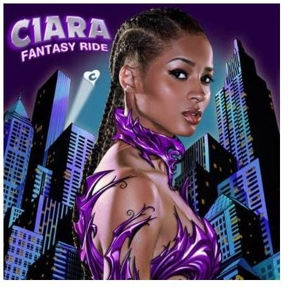
Web Comic Typography
Usually comic books have a very interesting typography that attracts teenagers and young adults. Depending on the comic, it will use very bold and fantasy like letters on the cover with the main character, to grab attention right away. The sample above is an example of a comic cover typography with a bold, fantasy feel for comic buffs. Comics may also use the Braggadocio font, which is commonly seen in children’s books.
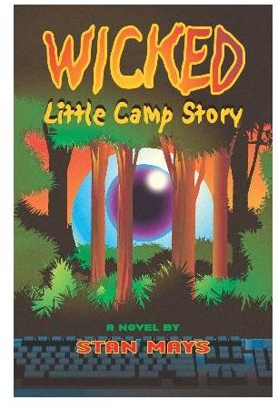
Storybook Typography
On the other hand for a slightly younger audience, the typography for the cover may be enlarged and a lot more playful. This style is usually used in a storybook fashion, where the characters or scene are intertwined with the logo or the text, as in this sample.
Fonts and Moods
Verdana font is commonly used online with website and blog publishing. It is the most readable at all sizes on a screen, it holds very little risk of being illegible. The only problem is that it may be a very plain text in reference to style. It’s best used in conjunction with images on a informational site, ie: lawyers, real estate agencies and the like.
Trebuchet MS is another legible font that is great for web design and news print. Many newspapers and magazines use Trebuchet Ms for large headlines and subheadlines. Trebuchet MS is also popular on the web online newsletters, banner and one liner advertisements.
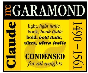
Garamond was a typeface that was popularized by Apple. It is best used in children fantasy novels, such as Harry Potter, and the Lord of the Rings.
Gotham is very popular for it’s unique geometry style. This font is widely used in comic books, and mystery book covers. It is legible in small and large sizes.
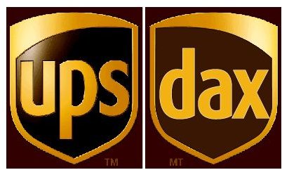
Dax Regular is the most modern font that is now being widely used for corporate marketing. Companies like UPS, and government agencies in US and Canada are now employing Dax Regular in their logo and brochure designs.
So there you have it. If you want to design a winning web or print project that sends the right message, the typography must be one of the first things you think about to launch an effective campaign.


