Desktop publishing need not be an overwhelming task, as long as some basic concepts are followed. Once you learn the basics, you’ll be creating newsletters and other publications like a pro! Use these simple design tips to create a professional looking document quickly and easily.
Newsletter Design Tips
Creating a newsletter offers unique design opportunities and challenges for the desktop publisher, but it can also be an incredibly creative experience. There’s nothing quite like the thrill of designing and publishing your own newsletter for your club or organization or your business.
Newsletters are an effective marketing tool for staying in contact with your customer base, promoting new products or services, and recognizing your staff. Let’s take a look at some tips that will help you put together a professional looking publication every time.
Fonts

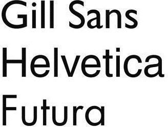
Typography plays an especially vital role in newsletter design. Type must be consistent throughout your publication or if it isn’t, there must be a good reason to break the rules. If you decide to use fifteen different fonts in a newsletter, which we don’t recommend, have a very good reason to do this. By the way, while the fact you just downloaded some awesome fonts and want to try them somewhere is not a valid reason to go overboard, finding and downloading free fonts is a smart business move.
Readers like (and want) consistency (whether they are aware of it or not). Keep the format for your newsletter consistent. Using a pre-designed template is a fast and simple way to do that, and we’ll tell you more about templates in the next section.
Fonts and typefaces convey messages just like graphics and images do. They can be casual, formal or informal and you’ll want to keep that feature in mind when you are selecting the fonts for your newsletter. A newsletter for the chess or soccer club at school might use a more laid-back font whereas one for a real estate company or other business might opt for a more formal look.
Use the same size of fonts throughout, and keep leading consistent as well. Headlines may use a different font than the body copy, but don’t use a different font for each headline. That doesn’t mean you can’t use different font sizes and types for different sections, but have a rationale for your typographic choices. For example, feature stories might utilize one size and type of font, while regular editorial columns might use another size and type to more readily distinguish them from one another.
A good way to train your eye is by reading (or scanning) lots of different newsletters to get some creative ideas. Make notes on what you do (and don’t like). Compare print newsletters to online newsletters and take the best from both. While you don’t want your publication to be a carbon copy of someone else’s, if you see a feature or font that you really like, there’s no reason not to use it in your own.
Type must be readable. A distorted ‘grunge’ type font in deep purple on a black background might look innovative, but it probably won’t make for a very readable newsletter. Save the concept for the next CD cover you plan to design.
Templates
The first place to look for templates is in a publishing program such as Microsoft Word or Microsoft Publisher . You’ll probably be amazed by all the free, pre-designed templates that are available. However, if you are looking for a specific template—say for a holiday or special celebration—there are lots of places on the Internet where you can find and download free templates .
The beauty of pre-designed templates is most of the creative and design work has been done for you so you can move from conception to completion pretty quickly. The downside is that unless you know enough about desktop publishing to modify the template to your specific purposes, you are pretty much locked into whatever design and template you choose.
Graphics & Images
According to the old adage, “A picture is worth a thousand words.” Visuals, including photos, line art illustrations and graphs, are a good way to break up copy in an interesting way, and provide some graphic appeal to a newsletter, but more importantly, they are the best way to convey and reinforce your message. Whenever possible, use an image that expresses action. For instance, if your article is about how to raise chickens, a picture of a farmer feeding chickens has more impact than a stock image of a chicken or an egg.
However, make sure the visuals you are using enhance and explain the accompanying copy. Let’s refer to our example above. A picture of a farmer feeding chickens is not going to add much oomph to an article about how much protein is in an egg.
Make sure you aren’t violating copyright laws by using an image. Just because an image is on the Internet does not mean that it is copyright free or can be used for commercial purposes. Be sure to read the licensing agreement for the image and comply with all the stipulations of the copyright holder. After all, you wouldn’t want someone to plagiarize your newsletter after you have worked so hard to produce it, would you?
Page Layout
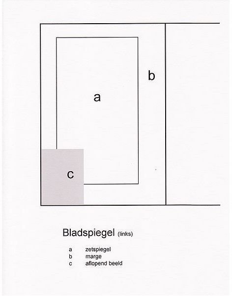
If you’re using a predesigned template, you can skip over this section. If not, you’ll need to become very familiar with whatever software you are using and learn to set up and design within its page layout possibilities . Some popular choices for ease of use and short learning curves are Microsoft Publisher, Corel, and Adobe. Each has its advantages and disadvantages as well as its fans and detractors. The best advice we can give you is to try a couple of programs to see which you like best.
Other Helpful Tips

The last thing to keep in mind when designing a newsletter is that content is king. While visual considerations such as lots of white space and graphic impact do play an important role in newsletter design, ultimately you must create a newsletter with one very important goal in mind. Readers need to be able to read and absorb the content. Unlike a poster, which contains a short, concise message for instant impact, grabbing their attention is less important than presenting information in a coherent, readable way to keep their attention.
The Internet reader processes information differently than a print reader. Break up long paragraphs of text into shorter chunks and use numbered lists and bullet points to highlight key points and make it easy for the reader to scan the page. Put the most important information in the beginning of the article. For instance, in a how-to or tutorial, you want to get to the instruction part of the article as quickly as possible. Leave the long, explanatory text for the end.
Ask for Feedback
The best way to produce a newsletter that your readers will love is to solicit their feedback. Find out what they like and what they want changed. On that note, we’d love to hear from you! Tell us what you found helpful and what else you want to know.
References
- Image: Fonts by saperaud under public domain
- http://www.sxc.hu/photo/[1208391](http://www.sxc.hu/photo/1208391)
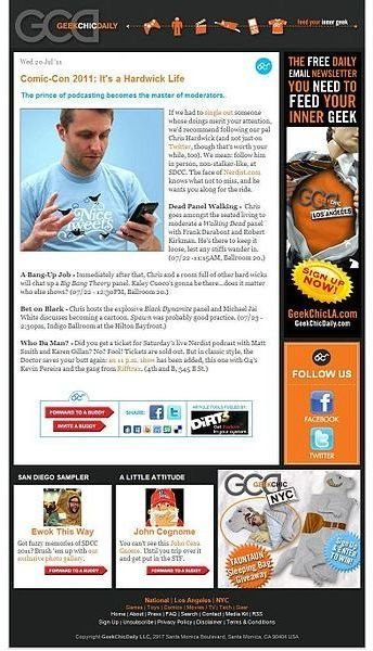
- Image: Newsletter No. 89 by Fluxfire 01 under CC-BY-SA 3.0
- Image: Page layout by Bessel Dekker at nl.wikipedia under CC-BY-SA 3.0
- http://www.sxc.hu/photo/[1129275](http://www.sxc.hu/photo/1129275)
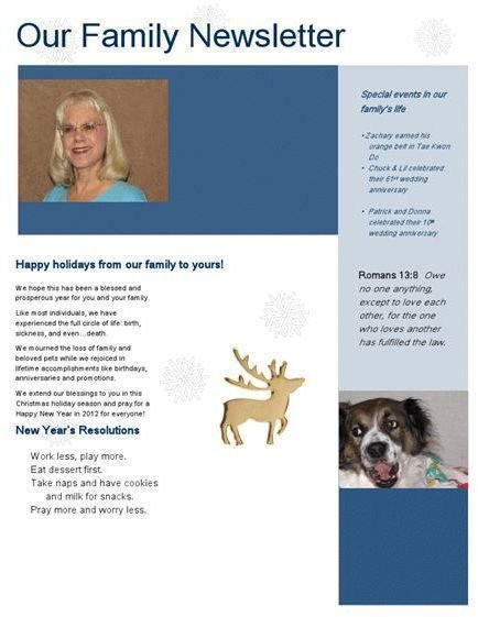
- Newsletter image, D. Cosmato, 2011, all rights reserved
- Image: Typefaces-sans serif by Roger Koslowski under CC-BY-SA 3.0


