There is a specific way to perform spot color separations in Photoshop that will work for all spot color images. In this type of artwork, colors do not fade into one another or have highlights or shading. Much of the time, the colors don’t touch either.
Performing Spot Color Separations
If you are a screen printer, one of the tasks you’ll need to complete often is color separating spot color artwork. Spot color artwork is comprised of colors do not fade or blend, contain highlights, or would otherwise need to be printed using a process print. You must have color separated artwork to create the screens for printing t-shirts on your screen printing press.
If you are not a screen printer, you may be asked to create “camera ready artwork” for a company you’ve commissioned to print business cards, letterheads, t-shirts, or similar goods. If you can provide this artwork yourself, you can often save a bit of money.
To perform a basic, two-color spot separation in Photoshop 7.0 (Photoshop CS3 is similar), follow these steps:
-
Open the file that contains the artwork.
Advertisement -
If it isn’t already available, open the Channels palette using Window>Channels.
-
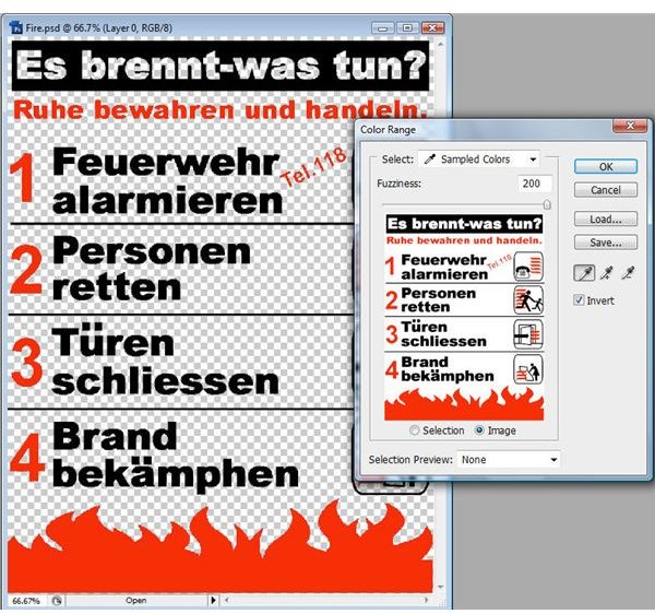
Choose Select>Color Range. In the Color Range dialog box, make sure the Select window is set to Sampled Colors, Invert is checked, and Selection Preview is None. Verify that Image is selected too. You’ll use the Eyedropper tool, also selected in this dialog box. [See Image 1]
Advertisement
-
Use the cursor (an Eyedropper) to click on one of the colors in the image.
-
Adjust the Fuzziness slider to pull the amount of color you want. You want to select all of the color, but you don’t want the edges to be too hard.
Advertisement -
In the Selection Preview choices, select Grayscale. Notice how the image changes. What you see here is only what is the selected color, and will be separated from the others. You can use this preview to see if the Fuzziness setting is good or needs to be revised. Change Selection Preview back to None and click OK.
-
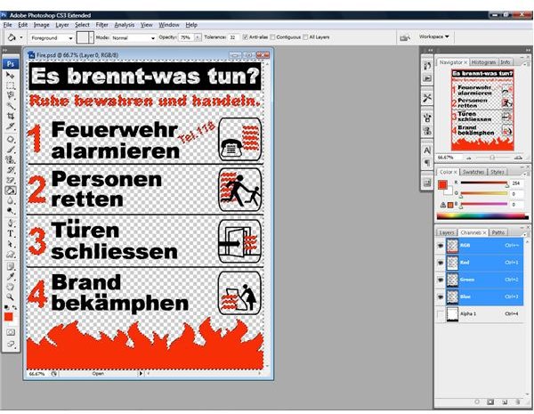
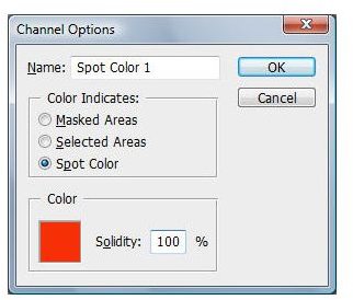
The color has been selected. You can see the marching ants around the selected color in the image. In the bottom of the Channels palette, click the save selection as channel icon; it is a square icon with a circle inside it. A new alpha channel will be created (from the selection. [See Image 2] Hold down the Ctrl key on a PC or the Cmd key on a Mac and double-click on the new alpha channel. The Channel Options dialog box appears.
Advertisement -
Select Spot Color and change the solidity to 100 percent. (Do not press OK just yet!) [See Image 3]
Note: Solidity values can be between 0 and 100 percent. This option lets you simulate on your computer monitor how solid the printed color will be. These settings only affect the on-screen image and do not have anything to do with the printed separation. So, it’s okay if you aren’t quite exact here!
-
Click on the color square in the Channel Options dialog box to bring up the Color Picker.
-
Use the Eyedropper to click on the foreground color in the toolbox, which is also the color you selected in the image.
Advertisement
11. If you need to match this color with the nearest Pantone color, click Color Libraries and choose a Pantone color from the list. The nearest match is selected. Click OK. Notice that the name of the channel is changed to the name of this Pantone color.
- Click OK in the Channel Options dialog box.
- Select the new spot color channel in the Channels dialog box. From the Select menu, choose Deselect (or use Ctrl+D).
Note: Double-click on the alpha channel, now called Spot Color 1, or the name of the Pantone color you selected and rename it (if desired). This will help you keep track of what channel is what color.
-
In the Channels palette, select the composite channel. Choose Select>Color Range. In the Color Range dialog box make sure the Select window is set to Sampled Colors, Invert is checked, and Selection Preview is None. Verify that Image is selected too.
-
Use the cursor (Eyedropper) to click on the second color of the image.
Advertisement -
Adjust the Fuzziness slider to pull the amount of color you want. Because the image is only two colors, you can move the slider almost all the way to the right. Don’t slide it so far that the image loses its clarity or pulls too much from the image, but pull it far enough to get all of the color. Click OK. (Again, you may want to toggle between None and Grayscale for the Selection Preview.
- The second color of the image has been selected. In the bottom of the Channels palette, click the save selection as channel icon. It is a square icon with a circle inside it.
Note: The next few steps differ from the previous steps for working with the red channel to show you another way of working in the Channels palette.
-
Select the channel in the Channels palette, and choose Select>Deselect (Ctrl+D).
-
Double-click the Alpha channel (named Alpha 1) to bring up the Channel Options dialog box shown.
Advertisement -
Select Spot Color, and change Solidity to 100 percent. Click on the color square in this dialog box to bring up the Color Picker. Choose the desired color.
-
If you need to match this color with the nearest Pantone color, click Color Libraries and choose a Pantone color from the list. Click OK. Notice that the name of the channel is changed to the name of this Pantone color.
Advertisement -
Click OK in the Channel Options dialog box. (Rename the channel if desired.)
-
In the Channels palette, use the eye icons to view only the two new alpha channels. Remove the eye icons from the other channels. These are the two channels that you’ll use to print out your spot color separations.
Advertisement
This information was excerpted from my book, Photoshop 7.0 for Screen Printers. A new version is available for CS3 at www.wordware.com . Use the code ps0365 for 35% off this book and any others at the site.
Images