Christmas is coming, Hanukkah, too. With the Holiday Season comes the tradition of sending out a family newsletter to your friends and family. Do you want to send the same old boring Microsoft Word document with a piece of holly clip art? Of course you don’t. You don’t have to.
Christmas Newsletters and Holiday Newsletters
No matter what holidays you celebrate, chances are the month of December brings with it the urge to communicate with people who you are close to, and people you are not so close to. But, with the end of the year, holidays, family, and of course your regular life of job, family, hobbies, there is no way you’ll ever be able to visit or call all of those people. Enter the Holiday Newsletter.
Traditionally, the holiday newsletter was handwritten and thus customized to each recipient. Those days have gone replaced long ago by a printed out copy of a word processing document. Unfortunately, that is what most people will send out and receive. Oh, the really snazzy ones will have a Christmas themed clip art on them, but does that really change the fact that it looks like you are mailing your friends a term paper?
Desktop Publishing and the Best Holiday Family Newsletters
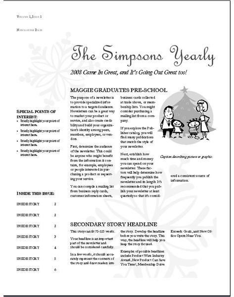
Desktop publishing software is more suited to the task of newsletters. Heck, it was practically born to do it. DP software used to be complicated, but no more. Microsoft Publisher is particularly easy for all but the least computer savvy amongst us. Even the default template for “Seasonal Newsletter” looks better than the alternative. But, why not kick it up a notch?
Start with color. If the only printer you have is black and white, you have to stick with it, but many people have color printers they hardly use. That photo printer? It’s probably color. That all-in-one office printer? If it’s less than four years old, it’s probably color too. Use it.
Here is the same template with a little COLOR!
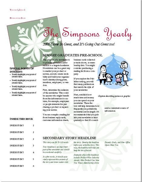
Nice huh?
Now, get in there and replace that silly clip art with a family photo and you are really cooking.
Christmas Family Newsletter Tips and Tricks
Have you ever wondered why your cards and newsletters and what not always look like they were printed on a computer? Chances are, the answer is your font choice.
Fonts like Ariel and Helvetica look great on your computer screen. There is a reason for that. They are designed for your computer screen! They are not designed for crisp, readable printing. Instead, try a font like Garamond or Baskerville or Goudy. Those fonts are made for printing. In fact, the same type of font is used for most newspapers and magazines.
The other trick to make your newsletter a little less printout-y is to change the paper. Everyone is used to 20lb, 95 Brightness white paper. Shift it up by going with heavier or brighter paper. Or, for a really new feel, get colored paper. Just make sure to adjust your colors and design to avoid having them lost on the new color.
This year, your family will be the family that sent the cool newsletter that didn’t look like just some printed out file.


