Learning how to format a book for self publishing means first knowing what kind of book you’ll be producing. Formatting your book for a print publication is far different than formatting for an e-book. Although some of the basic standards are the same the technical aspects are different.
Setting up your book for a hard copy self publication involves specific formatting. If you don’t carefully format your text the results can look amateurish at best. It is best to start your formatting before you actually write the text because it is harder to fix it once the text is written; it is still possible but it will take a lot longer. One of the newest problems that self publishers are having is distinguishing between e-book formatting and formatting for print publication. E-books don’t have to compensate for the gutter of a traditional book, nor do they conform to the standards of font choice or size.
The following standards work with all hard-copy publications that will have a standard binding. If you will be using a comb or spiral binding then you can omit the measurement that compensate for the gutter. Once you’ve learned how to format a book for self publishing you can use it for producing hard copies from your own home printer.
Basic Formatting
The first decision that you have to make when producing your own self-published book is what size the finished product will be. In the industry this is called the trim size, or the size one page when it has been trimmed down so that all the pages are flush. Standard trim sizes run anywhere from 5” x 8” to 8” x 11” although you can make a book in any size you want (this is one of the major advantages to self publication–you are not limited to the formats offered by professional printers). When you set your initial page size it should be 1/4-inch larger than your finished trim size in both height and width to compensate for trimming done to make the signatures flush (ie. a 5” x 8” book should be formatted in your word processing program to a page size of 5 ¼” x 8 ¼”.
The next step is setting up all the front matter in the book. This is all of the material that preceeds the actual content of the book: The title page, copyright page, a table of contents, a dedication page, and a forward or preface are all common pieces of front matter.
Title Page - The title page is always a right-facing page (odd numbered) and includes the title and author name and illustrator name if applicable. Titles are usually placed 1/3 of the way down the page and centered with the author name centered below in a smaller type size.
Copyright Page – The copyright page is printed on the back of the title page and includes all the copyright information for the book including the symbol ©, the year the book is published, and the name of the copyright owner. In addition there may be an ISBN(International Standard Book Number) number, an ISSN (International Standard Serial Number) number, a list of prior publications, permissions, and acknowledgments plus a web address or contact information. Because this will be a self-published book it will not qualify for a Library of Congress Cataloging-in-Publication (CIP) data number and will not be indexed by the Library of Congress.
Table of Contents – A table of contents also starts on the page after the copyright (the right-hand facing page) and includes a chapter listing and listing of illustrations. It can also include the forward, preface, index, epilogue and any reference sections. Standard formatting places the chapter titles left-justified and the starting page number in the far right tab.
Dedication – The dedication page follows the table of contents on the first open right-facing page. It is often placed in a similar manner as the title, 1/3 of the way down the page, and is often italicized.
Forward or Preface – The forward or preface starts on the next open right-facing page and is generally numbered with roman numerals.
After the front matter comes the core matter of the book. This is the actual content of the book starting with page one. Core matter formatting is discussed in the technical formatting section below.
After the conclusion of the core matter the back matter begins. Back matter includes any of the following; epilogue, afterward, about the author, bibliography, index, glossary, and a list of resources or references.
Epilogue or Afterward – These portions are sometimes considered a continuation of the novel and are thus numbered as a continuation of the book. For example, if your book ends on page 199, the epilogue or afterward will pick up from there and start on the next right-facing page (in this case page 201).
Bibliography, Index, Glossary, Resources and References – These sections have no consistent numbering technique. In most cases they are not numbered at all. In scientific and nonfiction books a numbering system that incorporates a decimal system may be used so that the first section is section 1 and the pages are numbered 1.1, 1.2, 1.3 etc. Section 2 would then be numbered 2.1, 2.2, 2.3 and so on and so forth.
Technical Formatting
Technical formatting is the place where the text is readied for printing in a way that it will be consistent and easily readable in the printed form. This means that the text on the screen will not look like it does once it is in the bound book. The formatting here is for a standard, signature bound book. Each signature contains 16 pages. These pages are sewn together and then trimmed before being glued to the book binding. So the total number of pages in your book must be divisible by 16. This doesn’t mean that you have to have that many printed pages it just means the total number of pages will be divisible by 16 (blank pages count here). There is nothing wrong with having three or four blank pages at the end of a book.
Technical formatting covers the gutters, external margins, top margin, bottom margin, tabs, line spacing, font choice and size and headers and footers.
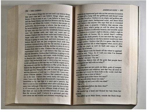
Gutters – The gutter is the area in the center of the book where improperly formatted text can disappear into the signature binding. These are the internal margins of the page. For an odd numbered page the gutter is the left margin while the opposite is true for an even numbered page.
The gutter should be at least ¼” larger than the opposite margin. In most publications the gutter margin is 1” while the outside margin in ¾”.
External page margins – The external page margin is the margin on the outside of a page. These usually range from ¾” to 1”.
Top margin – The top margin is usually 1” but can be as large as you want for your particular format.
Bottom margin – The bottom margin is at least ¾” up to 1½” again to your liking.
Tabs – Tabs are set every ½” although they may be set as low as every ¼”. The key here is to apply this setting to the entire document to maintain consistency.
Line spacing – It may seem intuitive to set your line spacing to single space but this is difficult to read and double spacing is awkward as well as inefficient. The proper line spacing is 1.15.
Font type and size – There are literally tens of thousands of fonts to choose from. Keep your reader in mind while choosing the proper font. It should be something that is easy to read and is large enough that a reader won’t have to strain to read it. Some common choices are Garamond, Palatino, Times Roman, and Century in sizes of either 11 point or 12 point. These serif fonts are easier to read than some of the old industry favorites like Arial or Calibri.
Headers and Footers – Headers are quite common in self publication. They usually identify the author on the left outside header and the chapter name in the right outside header. Set the header 2 points smaller than your body text and italicize it. Also keep it at least ¼” from the page edge. Footers are less common but can be used in the same manner. This is also where page numbers are inserted. A common self publishing standard is to place the page number, center justified, in the footer at a font size 2 points smaller than the text.
Things to Remember
There are a few things that are extremely important when you are formatting a book for self publishing. What you see is not what you get. This means that the way the text looks on the screen is not necessarily how it will look on the printed page. This is especially true if you use the space bar to line up characters or use the enter key to insert lines to go to the end of a page. It is essential that you use the tab key for formatting paragraphs and that you use the page break to indicate a new page starting. These things will save you a lot of time in the long run.
When creating your cover it is important to measure the size of the spine. Without the correct spine size the exterior of the book will not look right, and this is the first thing a potential reader will see. He will judge your book by the cover. Measuring your spine size is rather simple. The calculation is made using the page count of your book and the PPI (Pages per Inch) of the paper you’re using. Standard paper has a PPI of 434. So your calculation for a book with 40 signatures (640 pages) would be 640 divided by 434 or 1.47”. Add this to the width of your cover dimensions (which will be ¼” larger than your trim size) to accommodate the spine.
Following these tips, you should be able to produce a professional-looking publication without the help of a print shop. A self-published book will allow you to maintain creative control of your work and keep your costs down. It is a great option for the causal writer or the niche writer who can’t convince a publishing house of the importance of his or her work.
Looking for more tips and advice? Check out the other articles in Bright Hub’s guide, What You Need to Know About Self Publishing .
References
- Image courtesy of theilr @ FlickR, http://www.flickr.com/photos/theilr/5341105122/sizes/m/in/photostream/ , license
- Harvard.com; DIY Formatting and Layout Guidelines; http://www.harvard.com/images/uploads/diy.pdf


