Creating a logo that looks good and is unique is a daunting task. By following these tips, I’ll set you on the right track by helping you to avoid common mistakes in logo design, which can make all the difference when designing that perfect company or individual logo you’ve been looking for!
Sticking to a Theme
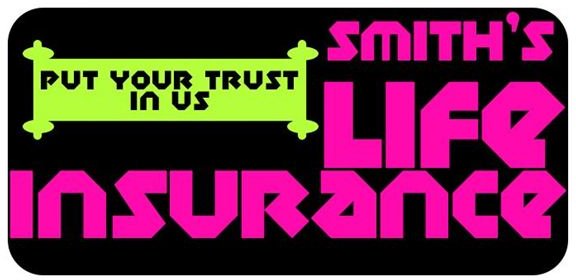
There aren’t a lot of rules of design, but one of them is that you should generally try to stick to a common theme. For example, if you’re designing a logo for a coffee-house, using familiar imagery and color schemes will help people to associate the name of the business with the product it provides to the public. If you’re selling something like life insurance, you aren’t going to want to pick a design that centers around a grungy font and a color scheme that consists only of flashy neon colors – no one would take your business very seriously!
The Comic Sans Faux Pas

There’s really no excuse for you to default to fonts that aren’t designed very well, or that are easily overused “as is”, so make sure you avoid these common mistakes in logo design. With thousands upon thousands of free-to-use fonts, you should easily be able to find a font that looks good and helps your logo to stand out. This is especially critical for people who are designing wordmarks , as you should be aiming for a logo that looks good and stands out from the rest!
Just make sure that the font you grab is free for commercial use, and if you can’t find it listed on the website you downloaded it from, don’t risk it! Get in contact with the author or continue your search for the perfect font. If you’ve got the time, skills, and knowledge, there’s a lot to be said for those who design their own wordmarks by hand, and this can go a very long way in having your logo recognized compared to using a widely available font.
Don’t Forsake Originality

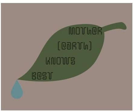
There are a lot of designs that seem to be used over and over again in logo design, and even though they look good, they are a bit stale. If you see someone’s logo and you like it, don’t feel like you need to copy it exactly. One of the most overused designs seems to be the rounded square with one pointed corner. It kind of looks like a leaf, and for some reason designers feel like this is one of the most effective logotypes. Unfortunately, this is also one of the most overused logo designs as well. Remember that logos serve a fairly utilitarian purpose, and that is to distinguish whatever you’re promoting – be it a business, individual, service, or product – from other promoted things. You don’t want to get your brand of shoes confused with someones logo for soy-burgers, do you?
Readability/Clarity is Important
One of the most common mistakes in logo design – especially when designing a logo targeted at the high school and college-age crowd – is making it impossible to read under the assumption that it is “edgy.” Sure, you can make your design a little rough around the edges, but don’t make it so no one can recognize the name of your business or brand. The same goes for spelling the name of your brand, collection of items for sale, or your business. Make sure that people can easily read and pronounce the name of whatever it is you’re promoting, because otherwise you’re not going to get much business from word of mouth!
Don’t Tread on Toes
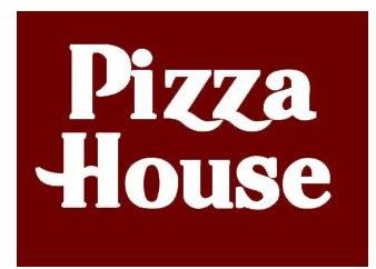
When it comes to being creative or thinking you’re being clever, always pick creative. Don’t think that because you have a business called “The Pizza House” that you can steal Pizza Hut’s font and color scheme. This is dangerous, especially because Pizza Hut’s font is considered part of their wordtype, meaning that it is copyrighted. Aside from the legal repercussions, this is also considered one of the most tacky things you can do when you design a logo. It’s not terribly clever, nor is it funny. So just because you found that free font on the Internet, that doesn’t mean that you should use it commercially.
Creativity is Good… In Moderation
Occasionally you’ll see a logo that looks like the designer had too many ideas or was given a little too much leeway to design what they wanted. These designs lack balance and cohesiveness , and sometimes are almost too much to look at. Remember that when you design a logo, you’re not trying to overwhelm the viewer, you’re trying to create an identity for whatever it is you are promoting. This is a critical part of marketing, so make sure that you don’t mess it up. When all else fails, remember that sometimes simple logos are the most effective, so give your design a little KISS treatment - Keep it simple, silly!
References
- All images and information are provided by Amber Neely, who has over a decade experience with Photoshop, and seven years professional experience in graphic design.


