Designing your own business card if you’re a travel agent might be a little tricky if you’ve never done it before. That’s why we’ll show you four fantastic designs for business cards aimed for the travel industry, as well as give helpful tips to budding designers for creating great designs!
Looking for examples of travel agents’ business cards? Well, you’ve come to the right place! Not only will you find examples, but you’ll learn what makes each design special, as well as a ton of tips that can help you to design your own. These tips will deal with key factors, such as what information to include on your card so your potential clients can contact you, why utilizing colors can help your card be picked up more than a simple black and white card, how your overall design should focus on being visually interesting but not fussy, and what kind of popular imagery you may want to include with your card.
Color Scheme
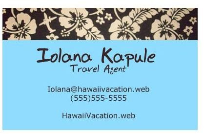
If you’re a travel agent that does specific locations, a color scheme based on familiar imagery from that country, location, or area is a fantastic idea. For example, a travel agent that specializes in trips to Asian countries might employ a color scheme of red and white, or green and tan, while someone who helps plan trips to Hawaii might want to go with vivid greens, yellows, oranges and pinks. Creating an association between your business card and the intended destination is a fantastic way to help create a lasting bond between your business and any potential clients. Not to mention, these types of business cards are eye-catching, meaning that more people are likely to pick them up and keep them in their wallets longer. Of course, general purpose travel agents who don’t specialize in anywhere specific can always fall back on green and blue, two colors strongly associated with the whole of the Earth. These colors will also make a lasting impression on your potential clients! The card to the left uses a bright, tropical color scheme to entice people to pick it up as well as create the association between the offered services and the destination in question.
Overall Design
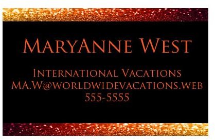
Business cards are small, which means that you have to make use of this tiny canvas as best you can. What you’re going to need to do is think about how you can create a lasting impression while not overwhelming any person who picks up your business card. Don’t feel like you have to include incredibly detailed graphics, lots of information, and tons of logos. Sometimes a simple card can speak volumes more than a card that is overfilled with content. Taking the time to learn some elements of design, such as consistency, balance, and harmony can help you make sense of this tricky concept. The card to the right showcases a very eye-pleasing black, red, and gold scheme coupled with a simple layout. This card couples both form with function and aims not to overwhelm anyone looking at it by being overcomplicated or fussy.
Themes & Imagery

Naturally the travel industry has its imagery and themes, and including these is a great way to help people remember why they picked up your card in the first place! Once again, if you specialize in trips to certain locations, use any popular imagery or themes that you can to help sell your services! Palm trees are a popular addition to cards that deal with tropical locations, and if you specialize in trips to Europe, don’t be afraid to use popular landmarks such as the Eiffel Tower, Big Ben, the Arc de Triomphe - anything that you think people will immediately recognize and be drawn to! If you don’t deal in anywhere specific, you could easily employ images of the Earth, trains, plains, and cityscapes to help make your card stand out. The example to the left showcases a very simple card with three pyramids, helping to drive home the point that the agent specializes in trips to Egypt.
Presentation of Information

Presenting your information is key. If you’ve noticed a common theme in these examples of travel agents’ business cards, it’s that the information has been presented in a clear way. This means picking a font that is easy to read as well as presenting your name, email, phone numbers, business websites, and any other crucial contact information. By giving people a multitude of ways to get in contact with you, you’ve opened the lines of communication with anyone who might even potentially think about using your services. The card to the right showcases information in a very clear, easy-to-read format while still managing to have some visual interest, thanks to the addition of textures and a calm color scheme.
References
- All images and information are provided by Amber Neely, who has over a decade experience with Photoshop, and seven years professional experience in graphic design.


