Creating a band flyer might seem like a fun task - and it should be! However, that doesn’t mean that you should throw caution to the wind and design without keeping a few key rules in mind. Here you’ll learn important tips for keeping your poster both pleasing to the eye and useful!
Whether you’ve been tasked to create a flyer for a band festival or you’re looking to promote your own band by creating posters to showcase the date and time of your venue, there are some crucial things you need to remember. Here you’ll learn about the importance of color schemes, layout and design, what fonts you should be using, how you should present the required information, and why you should give special consideration to readability and balance within your overall design.
Color Schemes
When selecting the color scheme for a band flyer or poster, there are a few important things to keep in mind. Of course you should always try to keep in mind what genre of music is being played. For example, if the band or bands (especially if you have been given the task to create a flyer for a band festival) are playing heavy metal, you might want to steer clear of that olive green and brown color scheme you’ve been dying to try out, the same way you probably wouldn’t want to design a red and black poster for a polka concert. Of course, if you’re designing the poster for the show at a well-known venue, you might want to take the venue’s overall color scheme into account as well.
Fonts
As always, you should be thinking about the fonts you’re going to use for any given project, and they should fit in well with both the overall theme of the poster and the genre of the music being played when you start to create your flyer. For example, heavy metal music generally tends to have thick, blocky, or sketchy fonts. Country music tends to focus on fonts that people used on old western signage. Jazz festivals are heavily influenced by the art deco movement, so you’ll do well to use fonts that were in use during the 1940s. Of course, hand-lettering your flyers is always an option if you’ve got a graphic tablet and a copy of graphic design software, too!
Overall Layout & Design
There are some key factors to remember when creating the overall layout of your band flyer as well. Say that the focus is on a night of music played by several bands, with none of them really any more famous than the other. Giving each band equal space on the poster is a good way to put emphasis on the music overall, and no particular act. What if it’s a special show at a popular local place? Go ahead and make the name of the venue the center stage - for example, your poster might look like the one to the left. However, if a popular band is playing, you’ll do well to emphasis the band’s name.
Required Information
Now that you’ve got an idea how you should be doing the overall layout of your flyer, take the time to think about the information that should be posted on it. Of course, you’re going to want to put the date, time, and location of the show. Make sure this information is presented in a clear, unmistakable fashion. Don’t use fonts that make this information hard to read or confusing in any way. And of course, don’t forget to include the name of the bands that will be playing, either! However, one of the most important things that you should remember when you are designing a flyer for any sort of music venue is to put the age limit, or if there is no age limit you will include “all ages” on the poster as well. Many shows are 18 or 21 and up only, and this should be included in a fairly obvious place on the poster. That way you don’t have to worry about any discrepancy later on if people show up to the venue with their kids, or if teenagers show up and expect to get in with no problem!
Importance of Readability
On a final note, you should be thinking about the overall readability of your flyer. While many designers feel as though they need to cram as much information on the flyer as possible, you should take a little time to think about balance and flow of design. A little symmetry can go a long way, and making sure that your information is presented in a clear, well-thought-out way is very important. Learning about the elements of design makes a difference - no matter what type of flyer you’re designing!
References
-
All information is provided by Amber Neely, who has over a decade experience with Photoshop, and seven years professional experience in graphic design.
Image Credits:
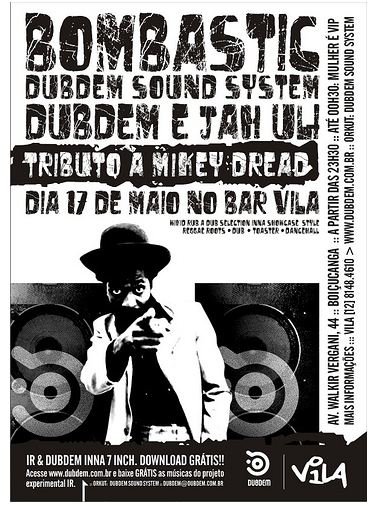
AdvertisementBOMBASTIC :: Maio de 2008 by dubdem sound system (License )
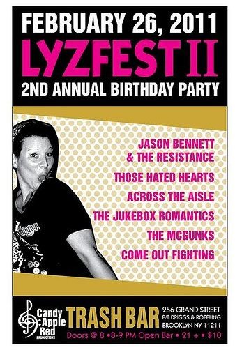
Lyzfest by Otto Yamato (License )
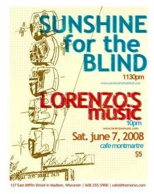
AdvertisementMontmarte Flyer Art June 7, 2008 by Tom Ray (License )


