So you want to design something like a penny or a quarter, but you’re still fairly new to Photoshop? Don’t worry! As long as you have a basic understanding of Photoshop, we can show you how to create a nice, realistic looking metal coin using simple techniques you may already know.
Prep Work
I feel like one of the most important things you can do when designing something like a metal coin is to actually grab yourself a coin and spend a fair amount of time looking at it. This allows you to get a better idea of what your end result should look like. Here are a few things to consider when looking at the coin.
-
Size - If you’re creating other coins or objects in the image, how does the size of the coin you are creating differ? Is it bigger or smaller?
Advertisement -
Metal - What metal is this coin made from? Pennies are made from copper (the new ones are made of bronze, though!), tend to be very shiny when new and have quite a bit of patina when old. Quarters and dimes are made of a nickel-copper alloy that remains quite shiny despite age. Nickles are much more matte, even when new, as they are 25% nickel.
So, for this tutorial, grab yourself the coin of your choice and spend a few minutes looking at it, front and back. Don’t worry, I’ll still be here when you get back!
Getting Started
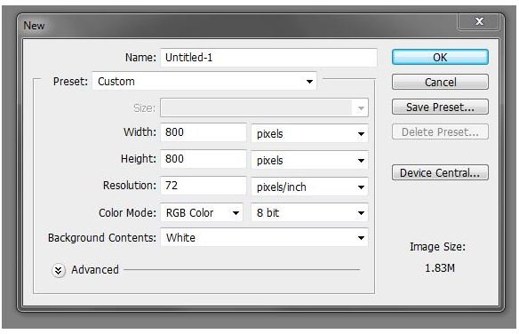
Open Photoshop and create yourself a new document. Here I’m using 800x800 pixels as I plan to make this coin large to show you all the details I’m going to include. You can start smaller, but remember that it’s always much, much easier to start larger and scale down, rather than start small and scale up.
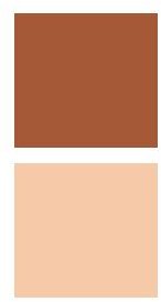
Set your foreground color to #A55937 and your background color to #F4C9A7. The two swatches to the left show what those colors look like.
Create a new layer and name it “Penny Body.” Grab your circle tool or elliptical marquee tool and hold shift and drag yourself out a decent sized circle. Fill it with your foreground color.

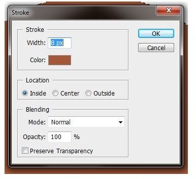
Because pennies are stamped currency, they have that ridge around the outside. To create that, make a new layer above “Penny Body” named “Ridge”. Make sure your selection is still active, and with your marquee tool selected, right click within your selection and select “stroke” in the flyout that appears. Make sure your foreground color (#A55937) is selected and make a stroke of about 8px.
Now we can begin to create the mock 3D style for the ridge to help give your penny a little bit extra realism! Double click your “Ridge” layer thumbnail to open up the Layer Styles and enter these following settings (click on images for a larger view).
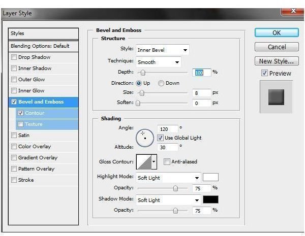
Bevel & Emboss
(Leave all unnamed settings at their defaults.)
Depth: 100%
Size: 8px
Highlight Mode: Soft Light
Shadow Mode: Soft Light
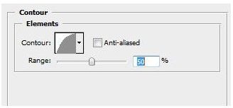
Contour:
Half-Round
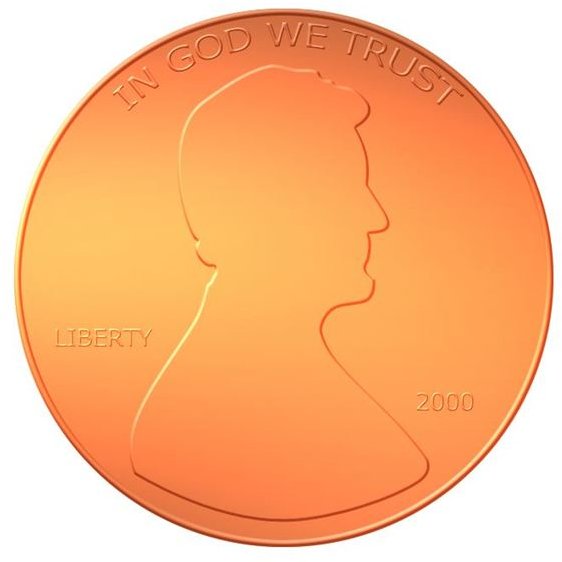
Adding Honest Abe
Create a new layer and name it “Abe.” Now to create ol’ Honest Abe’s head for our coin. You could freehand this, but why would you bother? I snagged a fair use image of a penny from Wikipedia and simply traced around it with the pen tool. For those of you who aren’t quite familiar with Photoshop’s pen tool, I highly advise you take a look at the Pen Tool Tutorial . Once you’ve created Abe’s head and it looks… well, like Abe’s head, go ahead and fill it with the same color as the rest of your penny. I’m only doing a silhouette of his head, but if you really want to test your artistic mettle, go ahead and try to be a little more detailed.
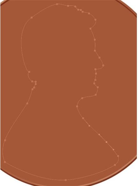
Now go to your “Ridge” layer, and right-click on the thumbnail. You’ll see an option near the bottom that reads “Copy Layer Style”. Select that. Now go back to your “Abe” layer, right click on the thumbnail, and select “Paste Layer Style.” Now you’ve made it appear as though Abe is raised from the rest of the stamp!
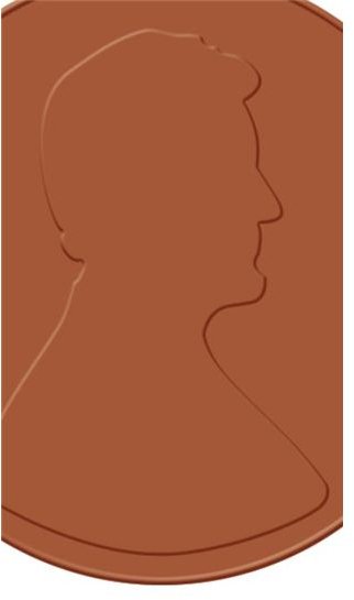
Note: You may want to go into your the layer styles under bevel and emboss and turn the size down to around 4px as I’ve done here.
Putting on Text
Now that Abe’s head looks raised from the rest of the coin, this should go fairly fast! Now create your text. Across the top of the penny it says “IN GOD WE TRUST”, near the left side of Abe’s head it says “LIBERTY” and then the year the coin was minted is on the lower right. Here’s what that looks like in terms of positioning. Once again, you’re going to want to set these to the same color as the rest of your Penny, but don’t be afraid to temporally set it to black so you can make sure you get your positioning correct. Once again, simply copy the layer style from the Abe layer and apply it to your text to create an embossed text that looks fantastic.
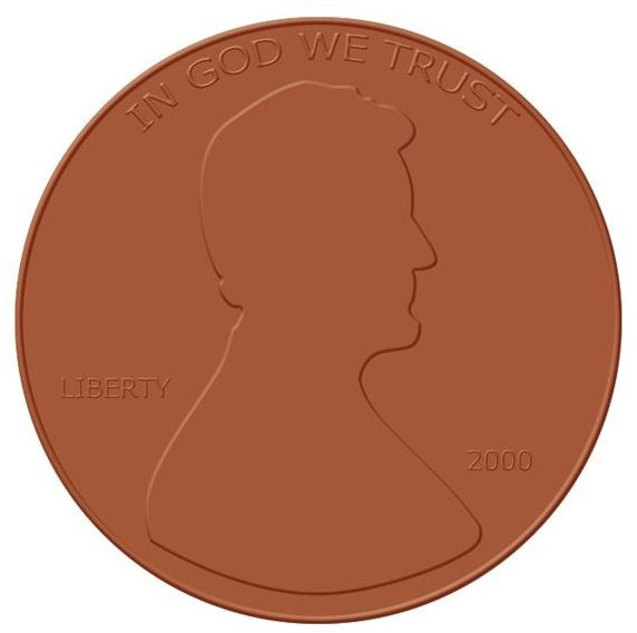
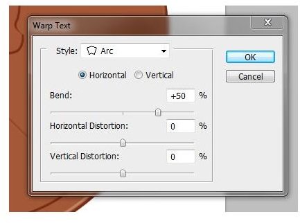
To bend the “In God We Trust” text, simply select that text layer and click “Warp” - now take your arc and bend it where it needs to go!
By the way, font I used was Verdana.
Now select all of your penny layers (excluding the document background) and press CTRL+E. This will merge your penny onto one convenient layer. Feel free to use your dodge tool to increase the shininess of your penny.
Color: F4C9A7
Size: 432px
Exposure: 60%
Mode: Highlight

Now you’ve got a shiny penny, and it’s even heads-up for good luck!
You can easily apply these concepts to other coins, such as quarters, dimes, and if you really want to be creative, wooden nickels.
Resources
All images and information provided by Amber Neely.


