There are times that budding graphic designers, techie gurus, and even the average computer users need to learn the difference between DPI and PPI. This can be confusing for even the most seasoned computer users, but here you’ll learn what they are, why they’re important, and how to use them!
Understanding the Differences
DPI - which stands for dots per inch - measures the spacial dot density, or individual dots that can be placed in a single, straight line in the span of a single inch. PPI - which stands for pixels per inch - measures the dot density of individual dots that can be placed in a single, straight line in the span of a single inch. So they both mean the same thing, which means that they must be synonymous, right? Actually that’s a common misconception that even some of the most seasoned graphic designers still make. No, DPI and PPI are not the same thing, and here’s why.
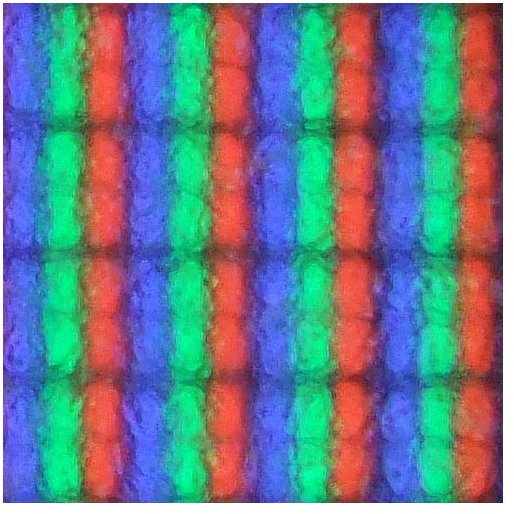
DPI refers to physical dots, such as those created by a printer. The more dense the DPI, the more vibrant the colors and more seamless an image. When printing something in high-quality, you generally aim to print somewhere around 150-300 DPI, largely depending on the end use of your printed media. However, it should be noted that because of the limited colors of printer ink, a 5x5 dot image will usually take more than 25 dots to reproduce. This is largely because your printer must take the time to mix the four colors included (magenta, cyan, yellow, and black) to create the colors that we see in things like photographs. A common misconception is that DPI is related directly to image resolution, but it is actually only related tangentially - it is more of an independent factor than most people think.
PPI, however, refers to the amount of pixels displayed within an inch on a computer screen . For years, the PPI standard had been 72 pixels per inch, or 72PPI. That meant for every inch, you could lay a row of pixels end-to-end and fit 72 of them inside. These days, there are monitors and mobile devices that are capable of displaying much greater PPIs. For example, my iPhone 4 has a 326PPI display, and my computer monitor has a 102PPI display. What does this mean for the average computer user? Here is where there is a direct correlation between resolution and PPI. The larger your screen resolution, the higher your PPI. A monitor that uses 800x600 mode will have a lower PPI than a monitor using 1024x768 mode. The lower your resolution, the less pixels fit on your screen, making windows appear larger and your workspace more cluttered. The higher your resolution, the more pixels per inch, and your workspace will feel much less cluttered, which is great for people who work in UI-heavy programs like Adobe Photoshop. Higher PPIs also have the added bonus of producing, sharper, clearer images.
Conversion of PPC and DPC
Because most of the world uses the metric system, it’s not uncommon to see many devices offer up Pixels Per Centimeter (PPC) or Dots Per Centimeter (DPC). If you need to know the DPI/PPI from the DPC/PPC, take your DPC/PPC and multiply it by 2.54. Likewise, if you need to know your DPC/PPC from your DPI/PPI, multiply it by 0.39 - this should get you close enough to make any informed decisions about printing or displays that you need to know
Calculating your PPI
It’s possible to calculate your computers PPI by doing a little bit of research, locating and using a standard imperial system (US) ruler, and requires you to be somewhat familiar with the Pythagorean Theorem. If you’re like me and you’re not into reliving your freshman year geometry classes, don’t worry about it! There are a ton of helpful online tools that can help you figure out your PPI without you having to break out your yardstick. My personal favorite is by Ping.de, which includes both a form where you can fill in your information, as well as a list of commonly used resolutions and display sizes.
Applying These Concepts to Desktop Publishing
Why is it so important for you to know these concepts in desktop publishing or graphic design? Let’s explore this with a couple different scenarios.
Say you’re designing some artwork or logo that you fully intend on printing onto some physical medium , such as paper, or t-shirts, or pretty much anything else. Learning the difference between DPI and PPI is crucial. Here is where you would need to know the DPI setting, which would be about 200DPI. For larger artwork, it’s safe to say you should be using up to 300DPI for the best printing effect.
Say you’re looking for a really good monitor to work on. Whether you’re a graphic designer, a hobby publisher, or someone who likes video games, a monitor with higher PPI will showcase graphics and photographs in a clearer, true-to-life fashion. While it is true that the average person can’t see much difference in detail above 300PPI, these displays are helping to move toward a paperless office era - after all, why print something out if you know it looks exactly the same on the screen?
So now that you know the difference between DPI and PPI, hopefully you can improve the quality of your printed work, or maybe just find that crisp, clear new monitor you’ve been searching for!
Resources:
References:
Author’s personal experience in graphic design and computing.
Tools:
Ping.De’s PPI calculator.
Image Credits:
The New Printer by Erin Sparling
New Monitor by Matt Steele
Pure White by Lee Heywood
DPI Magazine by Alberto Cerriteño


