Whether you’re looking to relive a bit of times gone past, or you’re looking to start your own retro-revival, you’ll certainly learn a lot about Art Deco here! Learn how it got started, what the trademarks of the era are, and of course see how Art Deco colors and styles still live on today!
As a Movement
If you were alive in Paris in the 1920s, you would have seen the birth of the Art Deco movement . This movement was considered bold, eclectic, and was known for its ornamental qualities. It focused on elegance and functionality, and spread like a wildfire across Europe, Asia, Russia, and the Americas in the 1930s and 1940s.
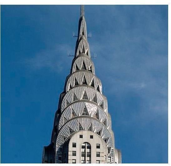
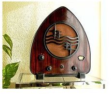
In this period, flashier designs were suddenly in. Materials used involved bold and bright chrome and stainless steel for everything from toasters to the sides of diners, and the use of man-made plastics like Bakelite began covering household radios, guitars, desks, clocks, and anything that needed a bit of faux-wood flair. Architectural giants such as the Empire State building, the Chrysler building, the Rockefeller Center, and the Golden Gate Bridge were all heavily influenced by the movement.

Popular fashion designers such as Coco Chanel grew to their height here, their products always having an air of sophistication and high-society, while often still being affordable to the average person. Exotic fabrics such as shark skin, zebra skin, leopard skin, and furs were often depicted as the finest a person could own. Designers also helped to inspire graphic designers to push themselves harder and influence bolder, more striking signage and advertisements. It was here that bold black and white designs became popular. In a time of excess, sometimes the most minimalistic advertising and signage worked the best.
As a Style
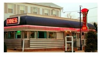
Art Deco styles and colors, above all, are bold. That’s the number one thing you have to remember above all. Nothing was designed with subtly in mind. Imagine walking down the street of a big city in the 1940s. You would probably see shining chrome diners, neon lights, signs in pinks and greens, and cars with wooden inlays on the sides. That’s right, the popular wooden panels on the side of cars got it’s start here, in the Art Deco era!
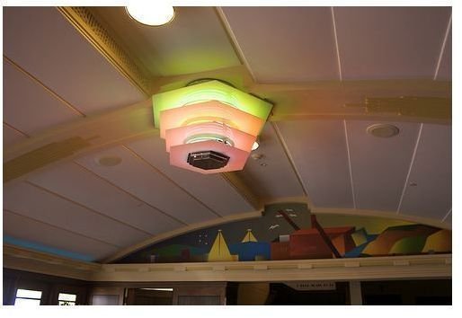
When choosing your colors, remember what was popular at the time. This was the birth of the baby-pink and mint-green movement. While they may seem to be a design faux-pas now, when applied to a retro setting, they still offer a lot of charm. Creams and neutrals were still around, but almost always accented with chrome to help them stand out better. Remember, try to accent your retro-chic with something bold! Black and white were also made incredibly popular here as well, and can still be used to great effect!
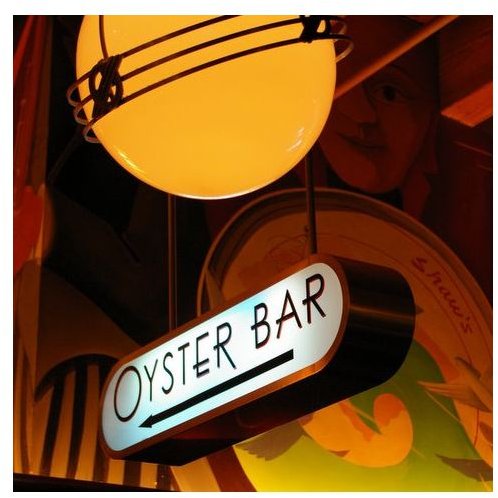
Fonts in the art deco era tended to fit into one or two categories, which seemed to be the entire opposite of each other! Fonts were either thick, wide, and bold, or were known for being written in a thin and narrow manner. The sign to the left showcases a popular type of font at the time, a sans-serif with thin lines. This particular font actually mixes the two popular styles, by using a thin font that spans a very wide amount of space. Here are a few more examples to show you the types of fonts that were popular at the time.
Tips & Tricks
Here are a few tips and tricks for you to remember when designing something heavily influenced by the Art Deco style:
- Go bold or go home. Playing it timid isn’t going to make your design stand out in any way, and can possibly confuse people - they might not know what kind of art movement you’re trying to mimic. Make sure your colors are striking, glamerous, and with purpose!
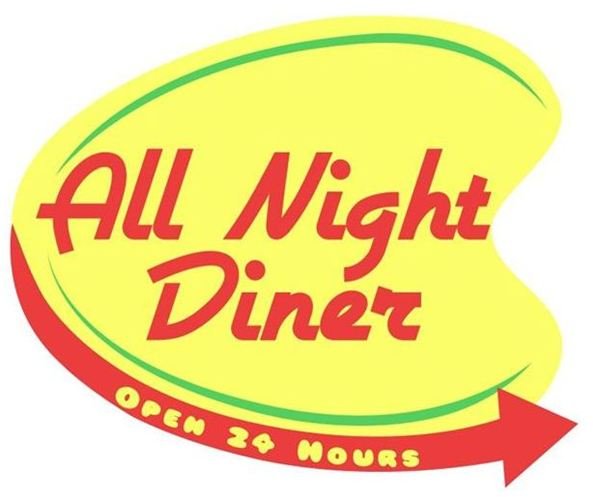
- **Think streamlined designs.**Rounded corners and sleek, fast cars were totally “in” in this era. Signage tended to be ovals or geometric blobs (see left.)
- Don’t forget the geometric designs. While it sounds a little contradictory to the last tip, often times architecture focused heavily geometric shapes such as triangles and squares.
- Tie it all together. Take a look at the images in this article, they should help you get a really good feel for what Art Deco is all about. Take a little time to study them and do some picture-research of your own. Then, you’ll be making your own retro a-go-go in no time flat!
Resources
References: Author’s experience in graphic design, the visual arts, and art history.
Hillier, Bevis Art Deco: of the 20s and 30s. Studio Vista (1968).
L106084 (Radio) by Nite_Owl
Chrysler Building from Wikipedia
Chanel No 5 bottle from Wikipedia
Diner from Wikimedia Commons
Art Deco Napier by Russel James Smith
Shaw’s Art Deco (Oyster Bar) from Wikipedia
Diner Sign by Amber Neely