Whether you’re looking to learn about color theory, or you just want a little extra help in designing your own color palette, it’s our goal to help you get started by teaching you about both complementary and split-complementary color schemes.
So you’ve never taken a course in graphic design, you don’t know any history behind color theory , and you’re not entirely sure where to start when it comes to picking out your colors your next big project. Don’t worry about it! This guide aims to help you understand two of the most basic color schemes and cornerstones of the visual arts: the complementary and split-complementary color schemes
What Are the Differences?
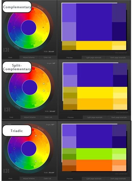
A complementary color scheme involves a main color, and then a color that is exactly 180 degrees away from it on the color wheel. Examples of this are blue and yellow, purple and orange, and red and green. A split-complementary color scheme is a main color, and then two colors that are on the opposite side of the color wheel. These are slightly less high-contrast, but still very high energy. These also should not be confused with a triadic color scheme, which involves three colors evenly spaced on a color wheel. Below are examples of complementary, split-complementary, and triadic color schemes and their relations on a color wheel.
Click to enlarge
When and Why They Are Effective

Complementary and split-complementary color schemes are the high-impact, high-energy, and very urgent choice when it comes to a color scheme. They’re used to target younger audiences and promote the most edgy must-have products and businesses. Because of this, they’re a very poor choice for more serious businesses, such as banks and insurances, and generally aren’t used to promote products that target a more adult crowd. This is the scheme you’d use to promote your energy drink, but if you’re a budding law firm, you’ll want to step back from it. Complementary colors tend to work well on signage and flyers, and can be used to great effect to draw the eye in from a distance.
A fair warning to all of you who are debating using a complementary color scheme – these sometimes can come off as too contrasting and can actually promote a feeling of distress or urgency that could lead people away from your design. It’s important to remember to not distribute the two colors evenly, but rather to use one color as your main focus, and the second as your accent color. Also, by using the addition of black or white, you can help prevent oversaturating your design while still keeping it high-energy.
Online Tools for Designing Color Schemes
Kuler, a free online program offered by design giant Adobe, is a fantastic tool for being able to create just about any kind of color scheme you would like. Not only does it offer the ability to design a complementary color scheme in a single click, it also helps by giving you colors that fit within the scheme but help to soften it slightly.
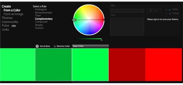
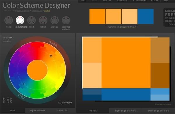
Color Scheme Designer is my personal favorite for helping to pick a split-complementary scheme, as they’ve given you the option of changing the degree of separation between colors on their triadic scheme designer.
Resources
References:
1. Kuler – Adobe’s color scheme creation tool.
Image Credits:
Color scheme examples by Amber Neely.
Complementary Colors, Orange & Blue by Sara Spaulding
Screenshots of Kuler and Color Scheme Designer taken by author.


