
Logos are a marketing method to brand your company or business. They must be easily recognizable and be remembered by others. Choosing the right color combinations for business logos is the key to making a logo stand out from the rest. These key tips will help make yours one of a kind.
What is a Logo?
To various people, a logo is a simple method to recognize a company, such as the renowned “swoosh” in Nike’s logo. To designers, a logo is the heart of building a strong brand to represent a company’s identity. Logo design is an art that can be challenging. Companies rely on their logo for branding and identification. Logos such as those for McDonalds or Apple are easily recognizable by the general population. These types of logos are generally what a designer strives for; one that will be easily recognizable and will symbolize the business.
Color choice is a large part of creating a recognizable logo. It is one of the key elements of branding and identification for companies. Having the right color combination in a business logo can make the difference between a great logo and one that is rather bland. However, one important key element to remember is that a good logo will not only rely on color for branding. Although various businesses rely on colors to make theirs recognizable, a great logo should work just as well in black and white. Therefore, when you are designing your own logo , always begin by working in black and white. Once you have determined the layout you can begin choosing colors.
The Significance of Color
Each color has a specific significance and meaning. Colors create physical and emotional connections and reactions. Understanding the meaning of each color is an effective method to begin choosing colors for your logo.
Red: As a good representation of love and passion, red is a common color in logos, due to the fact that it is the hottest of all colors. This color represents heat, excitement, competition and aggression. It is a bold and powerful color.
Orange: Warmth and luxury are signified with the use of orange. It is a good representation of summer or fall, as well as friendliness. This color has more of a mellow and retro feel when used in logos.
Yellow: This energetic and jubilant color is a great signification of cheerfulness and happiness. It is a fun color that can be seen as friendly and often associated with the sun.
Green: The earthy feel that green gives is great for logos trying to represent the environment. Green signifies growth, profit and an all-natural environment. However, the color green is also a signification of jealousy versus trust.
Blue: The most popular color used in logos is blue. This color conveys tranquility, trust and peace. It signifies loyalty, intelligence, and freedom.
Purple: This elegant color is often used to convey a royal or romantic feeling. It is mystical and sensual, as well as stylish. It is a great representation of justice and truth.
Brown: This color is known to have an earthy and rustic feel. It is warm and often conveys fall and warmth.
Continue to page 2 for more tips on choosing color combinations for business logos.
Color Wheel
The color wheel is commonly used in graphic design to help designers choose color combinations for their logos in business. It is important to understand the color wheel, as this can help you choose colors that are appropriate for your logo. Always refer to the color wheel when choosing colors to ensure they work well together.
Complementary: Complementary colors are two colors that are opposite from each other on the color wheel. These colors include
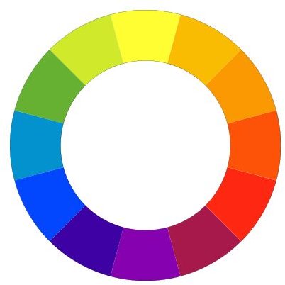
red and green, orange and blue, as well as purple and yellow.
Analog: Analog colors include three colors. These three colors are usually chosen with a primary color and two colors that lie on the right and left of the primary color. For example, if yellow is chosen as the primary colors, the secondary colors would be a yellow-green and yellow-orange.
Split Complementary: For a logo with high contrast, choose split complementary colors. These colors would be the colors that lie on the right and left of the complementary color. For instance, if yellow if your primary color, blue-purple and red-purple will complete the split-complementary color scheme.
Triad: A triad of colors include three colors of equal distance on the color wheel. Triad color schemes are generally the most colorful and balanced color combinations. For instance, the three colors red, yellow and blue form a triad on the color wheel.
What to Keep in Mind
-
Always make sure that your logo looks good in black and white before choosing colors for the logo. A good logo will work both in black and white, as well as in color.
-
Choose colors that will not compromise the readability of the logo. Light colors for text on a white background are usually not readable, while they may be on a darker background.
Advertisement -
Use contrast in your logo. Do not choose multiple colors that are similar in tone or hue. This can make your logo bland and unreadable. Colors that are contrasting will help with readability as well as make your logo stand out.
-
Do not be afraid to use a variety of colors. Various logos, such as Windows and Google, use multiple colors. However, just because you can use multiple colors, it is important not to combine too many colors. Limit yourself with colors.
Advertisement -
Pick colors opposite to your competitor. Your logo must stand out from your key competitor and allow you to separate yourself from the competition.
-
Research other logos to see what color combinations have been used prior to your design and which color combinations work well. View examples of famous logos to obtain an idea of color choice.
Advertisement
References
Image Credits:
References:
Source: Author’s own experience
Usability Post. “A Guide to Choosing Colors for Your Brand”, https://www.usabilitypost.com/2008/09/29/a-guide-to-choosing-colors-for-your-brand/
Connie. “Choosing the Right Colors for your Logo”, https://www.signatureworx.com/choosing-colors-for-your-logo/
Hubbell, Leighton. “Setting the tone. Color selection in logo design.”, https://leightonhubbell-logos.com/2010/05/18/setting-the-tone-color-selection-in-logo-design/


