If you’re looking for a new logo, there’s no need to pay a graphic artist or hire someone who knows how to create fancy computer desktop images. You can learn how to make a logo using Microsoft Publisher, right here and right now.
So You Need a Logo…
Maybe you’re operating a new business, and you need to design a logo for your company. If your business is already established and you are
looking to boost its image or point out a major adjustment in the business, you can design a new Microsoft Publisher logo that will showcase the change.
If you have never used Microsoft Publisher, open it up and get acquainted with it. How easy is it? Think about prehistoric man, who probably soaked plants to make colors for his cave paintings, and imagine his excitement when he discovered crayons. Well, even if that’s not how it happened for Mr. Neanderthal, that’s how you’re going to feel about the simplicity of creating logos using Microsoft Publisher!
With Publisher, each new page you open is a blank canvas. Every time you want to write or draw something new, you first must place it in a text box—automatically supplied by Publisher. Unlike Word, the textboxes are automatically formatted to have no lines and no fill—they’re just repositories for your work. Microsoft Publisher requires only a few clicks of the mouse to create an original logo.
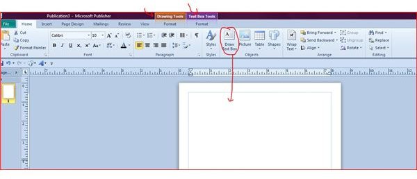
Brush Up on Logos
Here you will learn several ways to accomplish this. Since you’re bypassing the services of a graphic artist, you must remember the types of things a hired artist would tell you about logos:
1. Once you create your logo and put it on your business card or letterhead, that’s it! Repeatedly changing it will defeat the entire purpose of having a logo, which is having a specific image to make people think of your company.
2. As you go through the steps to design your logo, try it out in several sizes. Does it look just as good when it’s small as it does when it’s taking up a half sheet of paper?
3. How does it look when it’s photocopied, emailed or faxed?
4. If you have printed a motto or slogan on your logo, are the words readable in all situations?
Next, consider what type of logo you want to design. Will it be just a monogram or acronym for your company? Will you incorporate a graphic or even a photograph? Those are the two basic types of logos, and Publisher can design either type.
Entrepreneur.com recommends beginning with a slogan. You might or might not put it on the logo, but either way it will suggest an image for your company. Keep the colors limited to two or three at most. Pay careful attention to the font type if you are printing your company name or slogan on the logo.
More Than a Photo and a Slogan…
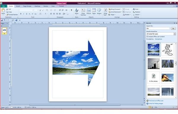
Here we have a logo for Airinger Corporation. Let’s say it’s a trucking company run by Bill Airinger, and the slogan is “We’re taking you places.” For this logo, I’ve chosen an arrow, because it makes the client feel like he’s going somewhere. The arrow itself is an image of blue sky, clouds, and a lake. The slogan travels upward across the arrow.
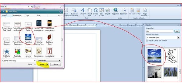
To make a logo like this, begin with a fresh new Publisher document. Choose an image of sky from Clipart and right-click on it to save it as a photo. You can also skip the Clipart and choose a photo that you’ve uploaded. Choose Insert.
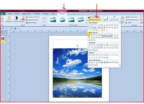
Next, if you’re familiar with the Microsoft ribbon , you’ll look for the Picture Tools tab. This is one of the tabs that only appear at certain times—when you’re doing something and the Ribbon taps you gently on the shoulder to ask, “Need this?” Those kinds of tabs are called contextual tabs. On that tab, in the Picture Styles group, look for Picture Shape. Click on your photo to activate it, and then choose the Picture Shape option. (If you don’t see it, click on the Picture Tools tab to bring it into view.) You’ll see all the shapes that Microsoft offers for your picture. The arrow has been chosen for this logo.
Choose a banner from the Shapes (see standard Shapes option), and as soon as you click on the banner you will immediately see the Drawing Tab contextual tab appear. You really don’t need it if all you’re going to do is re-size the banner and change its layout. Inside, I typed the Airinger slogan, and then chose the font, the font size, plus the type color.
Please go to Page 2 for two more types of Microsoft Publisher logos.
Use Your Monogram or Company Acronym
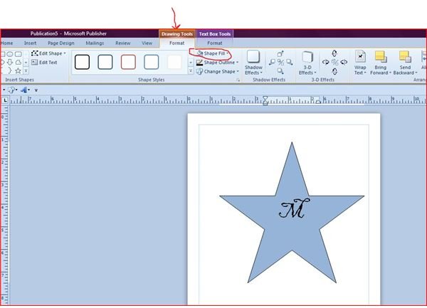
Let’s try another type of Microsoft Publisher logo. You can make one using a monogram. On your new Publisher document, choose a shape. The star here represents Morningstar Company. Use your mouse to make the shape larger. Inside the star, type an M and center it within the star. Highlight it, select the Black Adder font and resize it to 72.
On the Drawing Tools contextual tab that has appeared, look for Shape Fill (click on the Drawing Tools tab if you don’t see it) and then choose a color.
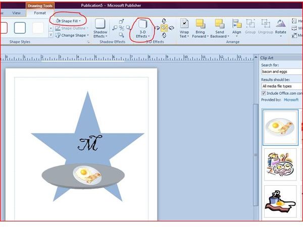
It’s easy from here to select various effects such as Shadow effects, 3D and lighting effects. You have to click on the drop-down arrow for Shadow effects in order to specify the dimension of the 3D look, and that’s also where you apply the light effects. In the last image, I’ve added an oval shape below the M, chosen 3D effects from the Drawing Tool bar and selected an option to make it look like a plate or skillet, and then, since this is for Morningstar Breakfast Foods Company, inserted a Clipart image of bacon and eggs. Voilà!
Create a Graphic for Your Logo
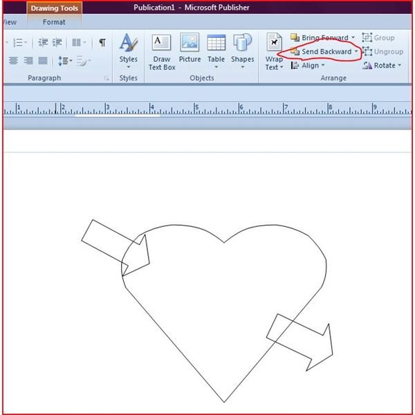
For the last image, let’s assemble one from bits of shapes. Open a new document and insert a heart on it. To make the heart look like it’s pierced by an arrow, arrows are inserted on either side of it. In this image, you can see that the ends of the arrow are superimposed on the heart where they really shouldn’t be visible.
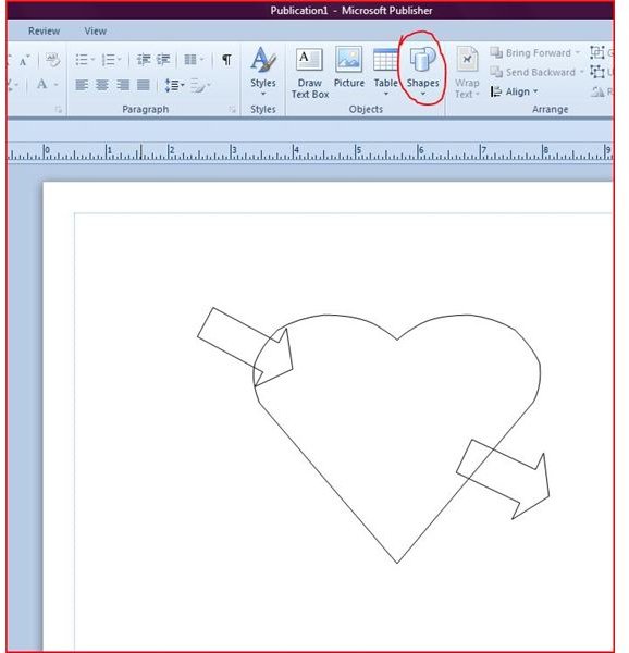
Next, click on one of the arrows, and then choose Send Backward and then Send Back. Do the same with the other arrow.
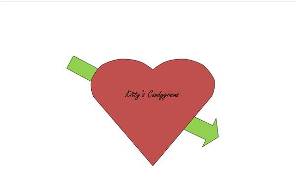
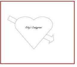
Click once again on the heart itself and then click on the Drawing Tools tab. Choose Shape Fill—where you have options for colors, textures, and patterns. You can color the heart red and the arrow halves green. On the heart you see the business name typed, Kitty’s Candygrams, with the font formatted . Once you’re satisfied, you can save it as a .png, .jpeg or .gif image and you’re in business. Just in case you want to use the logo as a black-and-white graphic, simply replace the green and red fill with white. You have two logos in one–it’s that easy! Working with Publisher, your imagination is the limit.
References
Entrepreneur.com. How to Create a Logo. https://www.entrepreneur.com/marketing/marketingbasics/marketingmaterials/article71902.html
Logo design based on the writer’s experience with MS Publisher.
Image Credits:
screenshots created by the writer


