The letterhead may just take up a small portion of your document or letter, but it surely says a lot! Hence you must be careful in choosing one for your own purpose. These 10 great designs that may just inspire you!
Visualizing Your Ideal Look
There are tons of letterhead examples to choose from, and it may sometimes be confusing to pick one that perfectly suits your purposes. Perhaps you can begin by asking the following questions:
1. What is the nature of my business?
2. What kind of image do I want to portray?
3. Who is my target market, and which design would best appeal to them?
Upon pondering on these questions, then you may just be able to visualize your ideal letterhead a bit. Afterward, you can browse through different letterhead examples while keeping your answers to the three questions above in mind. In this way, you will be able to easily narrow down your choices.
To help you further in creating that picture-perfect letterhead design in your head and finally be able to show a sample to your graphic designer (if you are not making it yourself) as well as describe it fully to him, here are 10 great examples for you to begin your search with.
Patterns and Symbols
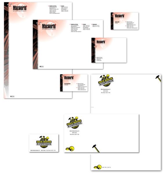
Placing patterns on one side of the paper as part of a letterhead design is a classic style, yet still a surefire method to catch the attention of the reader and to create a big bang impact on existing and potential clients. For instance, in the Macworld sample shown here, the pattern used not only gives a modern feel, but also appeals to the intellect. The zigzag side adds a twist, breaking the conventional straight line and suggesting something out of the ordinary. In addition, the colors used still maintain that official and serious look. On the other hand, the other design shown here immediately gives the impression that the service offered has to do with carpentry. Consequently, symbols or representations are powerful in making these kinds of impressions. For example, if your business is a coffee shop, then a cup and saucer or a mug with steam going into the air is appropriate.
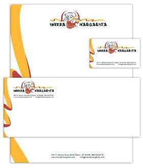
Pictures and Graphics
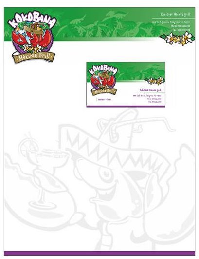
Using a letterhead is one form of advertising, a way of leaving that visual reminder in the minds of people who will see it. In this example, the picture used as a logo and representation of the restaurant instantly exhibits the kind of food the establishment serves. It is quite colorful and attractive as well. More than anything, the concentration of the design on the top together with the huge watermark for the background of the entire paper both generate a strong impact that will be hard to forget. You can go for this kind of design, if you want the “hard sell”, especially if you are just beginning to introduce your business to the market.
Minimalist Impact
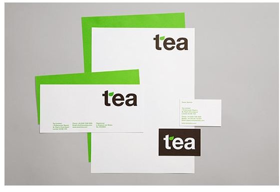
Straightforward, but stylish. Simple, yet elegant. This design banks on its color scheme and the font used for the title combined with the logo to speak out what the products and/or services are all about. You may opt to be minimalist but at the same time powerful in your approach when choosing that letterhead design for your company. Sometimes, there are those who prefer such because the design does not take one’s attention away from what the document or letter is trying to say. At the same time, it still has a good impact.
Fun Fare
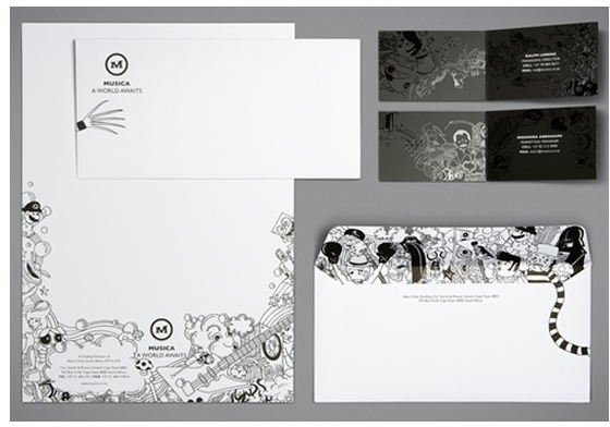
This design will surely grab one’s attention! The black and white colors are elegant and formal, but the graphics are certainly unconventional. If your business conveys a fun and adventurous image, something like this would be good for your letterhead.
Elegant Swirls
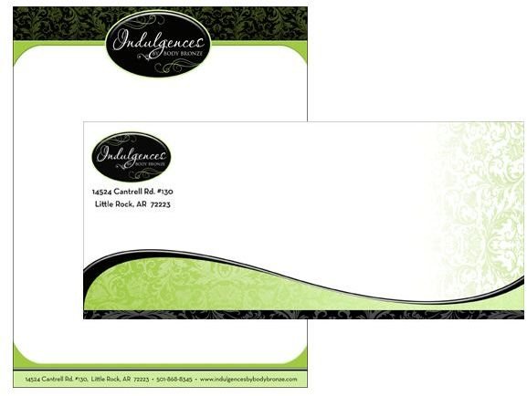
Elegant swirls and waves are very attractive. This design is really stylish and would fit businesses that go for the chic and charming, yet still posh and formal. For example, businesses that have something to do with fashion, beauty, and wellness may want to use letterhead designs such as this one in order to appeal to women and to give that “beautifying” impression. Also check out the other similar letterhead examples in the link below.
Watermark Power
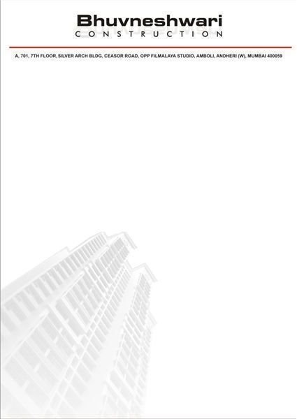
If you want to go for plain and simple, this is the design for you. It highlights the name of the company and the information given because there is very minimal design involved. However, if you notice, the watermark of the building seems to be its most powerful aspect. It symbolizes what the company is all about, and at the same time appeals to clients and creates an impact without distracting people.
Bottom Bang
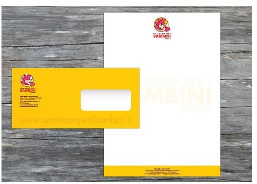
Save the best for last. This is what this letterhead example seems to communicate, as the bright color of yellow is at the bottom. Some offices would like to do the same, in order not to distract readers from the real message of the document. They put only the logo and the name of the company on top, and add more design at the bottom. There are even letterhead examples that have more intricate and loud designs which are placed at the bottom of a page.
All Around
This letterhead example appears to have a unique kind of border because of the wavy lines on the sides and the logo on top. The design is also simple, but the colors are the ones that seem to bring life to its entirety. You may choose to go for this kind of letterhead design. You only need to change the logo and pick your own color combination!
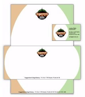
Matching Logo and Design
In this design, the side accent was made to match the logo of the company. This makes the entire design more appealing and effective. Instead of just having the colors match, the wavy lines were also copied. If, for example, your logo has a geometrical pattern, then it would be better to adopt this kind of pattern on the sides or at the bottom of the page instead of putting something like waves that may just clash with the logo.
Classic and Serious
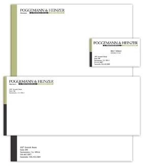
Do you wish to express the seriousness of your company? If you are involved in formal and not-so-creative products and services, then perhaps letterhead examples like this one would best fit your needs. It is both classic and serious, with just a thin line on the side divided into two plain colors. Usually, if you want to achieve this kind of look, then you can choose earth colors like the shades of brown, gray, and black.
Sources
Patterns and Symbols can be viewed at https://www.jovisa.biz/MVld5Dx5/ .
If your type is more of Pictures and Graphics, visit https://www.thelogofactory.com/stationery-design/case-studies/ .
For Minimalist Impact, you may go to https://www.youthedesigner.com/2009/12/22/83-crazy-beautiful-letterhead-logo-designs/ .
Catch Fun Fare at https://www.youthedesigner.com/2009/12/22/83-crazy-beautiful-letterhead-logo-designs/ .
If you adore Elegant Swirls, you can check it out at https://www.phrizbie-design.com/spa _stationery_design.html.
Watermark Power can be viewed at https://www.coroflot.com/public/image _file.asp?portfolio_id=1512957&individual_id=182235&s=2&v=2&a=1&t=0.
If you like Bottom Bang, you may visit https://www.coolcreativedesign.com/bambini-letterhead-design.php .
Is All Around your ideal letterhead? Then go to https://www.logowaves.com/letterhead-designs-22 .
For Matching Logo and Design, just go to https://www.logowaves.com/business-card-4 .
If your choice is Classic and Serious, you can catch it at https://www.logowaves.com/business-card-2 .
Have fun browsing through these wonderful letterhead designs!


