If you’re just getting started designing a magazine cover, or if you’re wanting to revamp an already existing magazine, then you will want to study the seven design principles of magazine covers and include them in your next design project. Learn about magazine cover design principles here.
Design Principles of Magazine Covers - What?
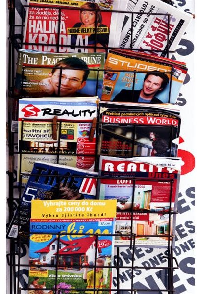
A good magazine cover does two things. First, it grabs the attention of the reader so that the potential reader will pick it up, purchase it, and take it home. Second, it informs the reader of two things - what type of magazine it is, and what the reader can expect to find inside its cover. That is a lot for one sheet of paper to do. It’s not enough to slap down the contents of the magazine on the front cover with an image of a model to accompany this barrage of information. Instead, the design principles of magazine covers must be carefully woven together in order to produce a product that is visually appealing. Before continuing reading, if you have a copy of your favorite magazine close at hand, grab it. You’ll want to look at it so that you can see the design elements at work .
Image Credit (MorgueFile )
1. Numbers Sell Issues
Have you ever noticed that your favorite magazines often have a lot of numbers on their covers? For instance, on the covers of magazines sitting on my desk, a total of 7 of the headings contain numbers in the title - “365 Markets for Your Work,” “Burn 300 Calories in 15 Minutes,” “5,203 Goodies Inside,” and “Free 16 Tracks from Our Top 40 Albums,” are four examples. Why are there numbers all over the covers of magazines? It’s easy, because readers look at the numbers and become interested in finding “62 Ways to Get Healthier.”
2. Simplicity Rules
A magazine cover is not the place where you want to pull out all the stops. Have you ever seen a popular magazine with a cover that is visually cluttered? In order to put together an effective cover, try to stick to between 5-11 cover headings. Too few headings won’t create enough interest for readers, but too many headings will overwhelm a reader. How many headings does your favorite magazine have on its cover?
Keep the colors simple. If the cover model’s clothing or cover image has a lot of different colors in it, you won’t want to have a background that has a lot of color in it. This would overwhelm the eyes of your potential reader. Instead, try to stick to 3 or so colors for your background and title.
3. Consistent Title Design
Be sure that your magazine title itself has been designed with an eye for the eye-catching. Again, look at the way the magazine title has been designed on your favorite newsstand. It is consistent, no matter what. While the color of Self magazine’s title may change month-to-month, it is always done in the same block letters. Spin always has a red background with white letters. What is your magazine’s title logo? Is it consistent?
4. What Was the Name of That Magazine?
Unless your magazine is well-known, make sure you do not cover or otherwise obfuscate the title of your magazine in any way. By avoiding placing images or words that overlap the title of your magazine, you can build brand recognition and brand loyalty for your magazine.
5. Model Poses Reflect the Magazine’s Aim

Think about the difference between Maxim and Rolling Stone. On Maxim’s cover, even if the cover model is a musician, often she is in a provocative pose. On the cover of Rolling Stone, however, the cover model is often posed with the instrument he or she plays, or alongside his or her band. Just as it would be inappropriate to have a scantily clad supermodel on the cover of a business magazine, it would be inappropriate to have a man in a button-down suit on an men’s adult magazine. Make sure that anything on your cover reflects what you want to convey in your magazine.
Image Credit (Wikimedia Commons )
6. Backgrounds
You should avoid any background that will draw attention away from your headers. While you might believe a fall scene to be beautiful, when you have a model and all of your headings/teasers on the cover, plus your magazine title, it can be too overwhelming for your readers. Also, never choose a background that competes with any of your other cover items. It’s best to choose a neutral color.
7. Don’t Shoot Yourself Before You Get Out of the Gate!
Finally, keep in mind that when sold on newsstands and mailed out to subscribers, part of your lower-left hand corner will have either the barcode or the address, or both. Do not place any key design elements in this area, otherwise your readers will not see them. If you have a header in that area, be prepared that it will not show up when on the newsstand.
By following these seven design principles of magazine covers, you can start to create magazine covers that don’t just look good, but that also sell copies!


