Logo design is a complicated thing that requires you to juggle a lot of different elements to get right. In order to demonstrate how to do this I have created 10 logo design examples that will hopefully help you design your own logos in the future.
Logo Design
Logo design is both an art and a science and are difficult to master when you have to consider all the variables that go into making a great logo design. Color, contrast, symmetry, shape, size, visibility, recognizable shapes, uniqueness, with or without text, fonts, etc. are all incredibly important elements of design that don’t always mesh together easily so you have to find the right balance in order to create a great logo.
If you’re having trouble visualizing a great logo or even understanding why a logo is good I have created and assembled 10 great logo design examples and some explanations as to why they work so you can better understand the intricacies of logo design.
(Click the images for a larger preview.)
Shiny Lens
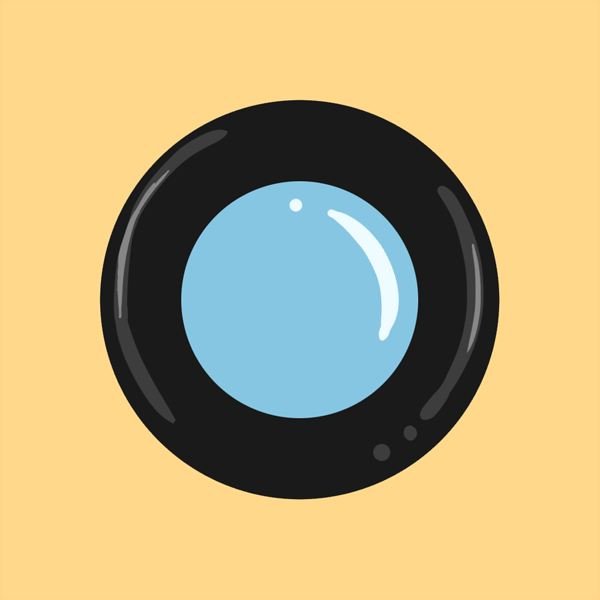
The future of design has been sort of laid out for us as trends gravitate more and more in certain directions. One trend in particular emphasizes darker colors, glow effects, and faux-shiny surfaces to create stark contrasts and eye-popping colors to really draw the eye towards the logo.
However, dark colors aren’t a great choice for traditional medias such as physical signage because it is difficult to see the darker colors at night and anything on the gray scale will generally blend into urban scenery. However, on the Internet or in magazines where you are able to create a contrasting background that is constant for your logo it works a lot better.
This logo in particular is just a set of simple circles which have been transformed into a frame holding glass that is placed on a contrasting background. Since the logo itself mimics shiny qualities of materials like metal, glass, and plastic it’s a depth contrast to the flat background which it lays on.
Sailboat Silhouette

Silhouettes have always been popular because they are the definition of contrast and recognizable figures. Though they are often not very colorful, no one can argue that a silhouettes are bland and boring.
This logo design example in particular is a silhouette of a sailboat (obviously) but from far away it could look like an odd shape which may cause people to investigate. Also since the logo is a distinct sailboat it will be easy for passerby and associates to identify the logo.
Messy Head
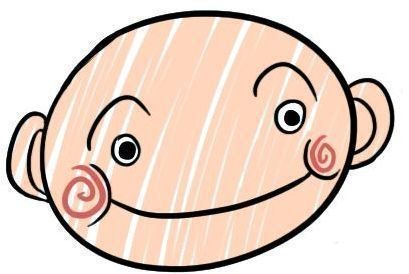
These messy styled logos are often associated with businesses and services that focus more on younger children because they are more familiar with that style of art. And while the style may seem a bit childish it works well for a lot of other logo designs as well.
Messy, sort of outside the lines, style of painting is good at catching the eye because logos tend to be thought of as clean and sleek. This logo in particular is eye popping because the entire image is mostly colored in but you can really see that there are some missing spots after a second glance. The fact that this attracts a second look is a good thing because people will spend more time looking at your logo and committing it to memory.
Eyes on You
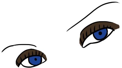
This logo represents a popular style of taking features of someone and making that the only thing you see with the logo. Eyes are fairly popular but I have also seen teeth for dentists and hand prints for lots of things.
But the unique thing about this logo is that it includes the little bits of color that really make it stand out from the pure black and white counter-parts that you most often see. Even without the colors though, this style of logo is really great looking because it’s got a lot of great elements to it. Simplicity, familiar shapes, identifiable features, and contrasting colors.
Symbolism Frame

On top of being a recognizable symbol by itself it creates a great frame for other elements to be placed inside as well as being able to interchange the designs. What I’ve done for this logo is taken the ancient Roman symbol for the planet Earth and placed within each “window” an image that would be associated with an environmental project.
Of course it doesn’t have to be photographs, I could have just as easily drawn 4 logos to put in each window that corresponds to an element of the environment or just let it be empty. That’s the beauty of something like this, it creates a versatile logo that can be edited to include lots of different things while still being incredibly simple.
Inverted Shading on Pineapple
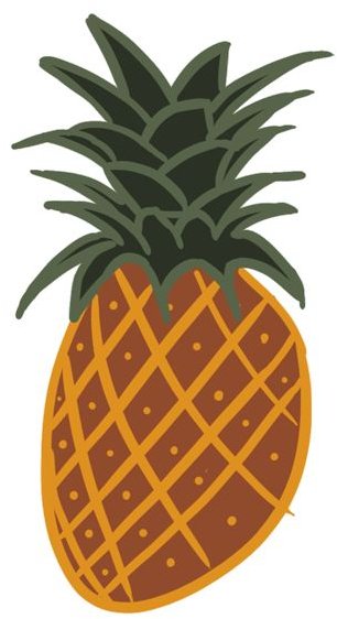
If you hadn’t realized it yet the key to making a winning logo is simplicity and contrast. This logo design is not exempt from that rule.
However, the thing that is different about it is that I’ve actually inverted the shading you normally see on real pineapples and pineapple designs. Since it’s familiar, simple, and contrasting we already have a lot of great design elements, but when you are able to take that familiarity and sort of add a neat twist to it like the inverted colors people sort of catch that it’s not “correct” and will be able to identify your logo as unique and cool.
Minimalistic Sun
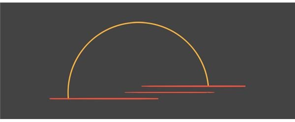
Minimalism is a difficult sort of technique to get right on the first try because you really have to rely color and a little bit of shape to create a bit picture that is effective.
In this case it really works well. Most people will immediately recognize this as a very artistic take on a sunset. The other great thing is that you could put this logo on just about any background color and it would look amazing. Even without the color it would likely be recognizable as a sunset given how the shapes work to create a familiar object.
Simple Pizza
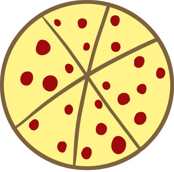
This pizza logo design example is probably the best logo design in the article though it appears to be the easiest to have made. That is because it is familiar, colorful, contrasting, and can be placed on just about any sort of media and still be identified easily as a pepperoni pizza.
The logo is also fairly versatile as a number of things could be done to this logo to make it look different. It we were to take away the cheese it would be minimalistic.
Amorphous Paint Blob
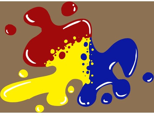
This is the design I am most proud of. It breaks a lot of the rules about shape and familiarity and sort of does its own thing. It is certainly a unique shape which helps it become recognizable, it’s got a faux 3D shape with the reflective bits, and is incredibly colorful and contrasting.
However, it’s a very specific logo and would lend itself well to only a certain number of people. But the idea is that while familiar and polygonal shapes are great, you can still create beautiful designs with blobs.
Painted Pink Cloud Logo
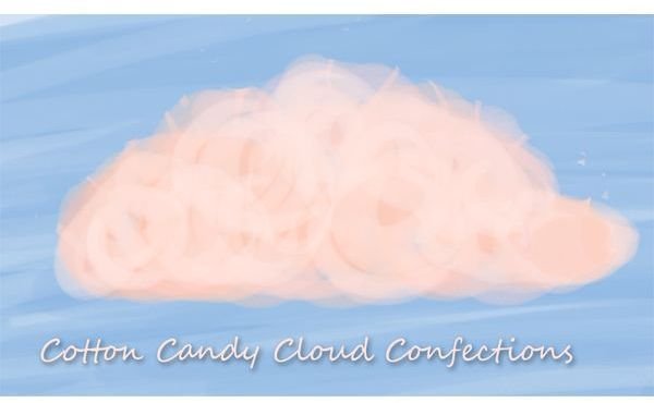
Sometimes, logos don’t have to be sleek and crisp and this logo really captures that I feel. It’s more painted style that is far more eye popping than some of the other logos I’ve done in this article. Painted logos are very difficult to do right, much like the minimalistic approach, but if you can create something that is identifiable as I’ve done here, you will definitely have a unique and interesting logo to work with.
Credits
All images were created by Michael Guerrero with the exception of logo 5 (Symbolism Frame) which was assembled using the following images.
https://commons.wikimedia.org/wiki/File:Earth _symbol.svg
https://commons.wikimedia.org/wiki/File:$5 _tree.JPG
https://commons.wikimedia.org/wiki/File:Ocean _waves.jpg


