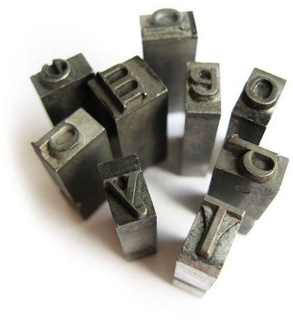
Are you new to typography and have no clue what the terms mean? Then this typography glossary can help you out. Learn the difference between serif and san serif fonts, what a baseline is, and more.
Typographical Terms A-K
**
Alignment: The positioning of text within page magins. Set your text to flush left, flush right, justified or centered. Another term for flush that you will see is the term, justified.
Anti-aliasing: A process that smooths the distortions and jaggedness from letters and letter spacing.
Ascender: The part of a lowercase letter that rises above the x-height, such as the tail of the letter b.
Baseline: The imaginary line on which the text line rests, and which the leading and x-height are measured. In most typefaces, the descenders on characters such as p or y extend below the baseline. Curved letters such as c or o may extend slightly below the baseline.
Curly quotes: A style of quote that are used in typeset materials, such as books.
Descender: The part of a letter that dips below the baseline, such as the tail of the letters p, q and y. The loops of letters Q and g may also dip below the baseline.
Em dash : A dash that is used to indicate a break in a sentence.
En dash: A dash that is used to indicate a range of numeric values.
DPI: An abbreviation for dots per inch. This is the resolution that a device, such as a printer or computer monitor, displays text or graphics. Laser printers use DPI’s as low as 100 and as high as 2400. Monitors usually display 100 dpi or less. 72 dpi is common for web page displays.
Greeking: Using placeholder text to map out the position of the text on a document, such as a flyer or magazine cover. Common placeholder text is called lorum epsom.
Kerning: The spaces between individual characters in a line of text. Kerning adjustments are important in large bodies of text, such as books, as well as headlines. You can adjust the kerning so that the letters of a headline either overlap or spread out widely.
Programs such as Quark and InDesign allow you to to manually set the kerning in order to make fine adjustments to your text. Some word processors also offer this feature, although they are not as sophisticated.
Typographical Terms L-Z
Leading: Pronounced ledding, it is the space between the lines of text. You can set your line spaces to single, double, triple, or a space and a half. Programs such as Quark and InDesign allow you to fine tune the adjustments to your text so that you can make your document look more professional, as well as legible.
Ligature: Two or more letters that get tied into a single letter, due to bad letter spacing or font design. Kerning may be able to fix the problem—if done unintentionally. Also, the font may be available in Adobe OpenType format.
OpenType fonts: An extension of Microsoft’s TrueType Open format, which contains either PostScript or TrueType fonts in a single file that is compatible with both Mac and Windows platforms.
Pica: A unit of measure in typography. A pica uses 12 points to an inch, or 1/6th of an inch.
Point: A unit of measure in typography
San serif: Fonts that do not have the small, decorative strokes that serif fonts have.
Serif: Fonts with small, decorative strokes that have been added to the main strokes.
TrueType fonts: Fonts that have scaling capability.
Type 1 fonts: The original type standard used for scalable type, most commonly used by professional graphic designers.
Typeface: A group of letters, numbers and symbols that make up a type design, such as Times Roman or Helvetica.
x-height : The height of the body of lowercase letters in a font, excluding the ascenders and descenders.
References
TypeNow: https://www.typenow.net/glossary.htm
Adobe: https://www.adobe.com/type/topics/glossary.html


