Want to have a real visual punch? Bring on the contrast! This article covers high contrast photography and how to go about pushing the extremes of contrast to create striking effects in your photography.
How To Make Your Photos High Contrast
A quick discussion of some technical details before we get into types of high contrast photography. There are many methods and schools of thought regarding the contrast in your photos in the digital age. Use of a format such as RAW , especially if you’ll be spending a lot of time working at an image, is probably a good place to start. The amount of editing is entirely a matter of personal preference and experimentation – time intensive techniques such as HDR may be employed, but just using a high contrast digital filter on-camera can also work just as well. Keep in mind while taking shots, however, that it is easier to raise contrast than to lower it once you’re in post processing, so it might be a good idea to take the photographs with a relatively low amount of contrast at the beginning and tweak it once you’re in front of the computer.
Also, your choice of scene may also influence whether the photograph will simply naturally end up being high contrast. A bright sunny day will cast a lot of shadows and bright spots, forcing you to take advantage of it. Similarly, many scenes are simply so busy with regards to color and texture that your only choice is to create a high contrast image from it.
Try not to get too fixed into one way of shooting. Intentionally creating high contrast images, for instance if you’re a photographer who tends to work with fine shades of gray, or someone without a set style quite yet, may prevent stylistic stagnation and excite those right brain neurons. Go forth and experiment!
Throughout this article I provide many examples of my own personal toying with high contrasts. By no means are they the only way to go about using high contrast in your photography. Check out sites like DeviantArt and some of the quality photography therein: what does high contrast do for an image? How do different photographers approach contrast? Keep a close eye—you might be surprised at what you see.
Black & White Examples
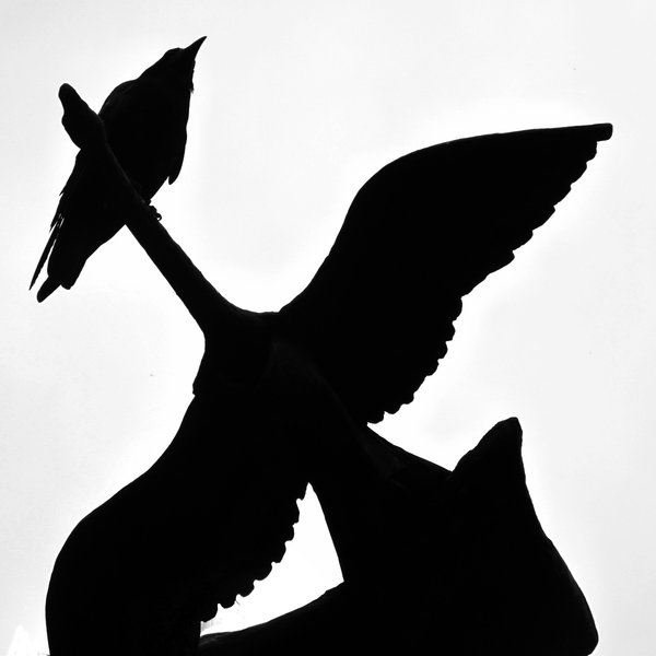
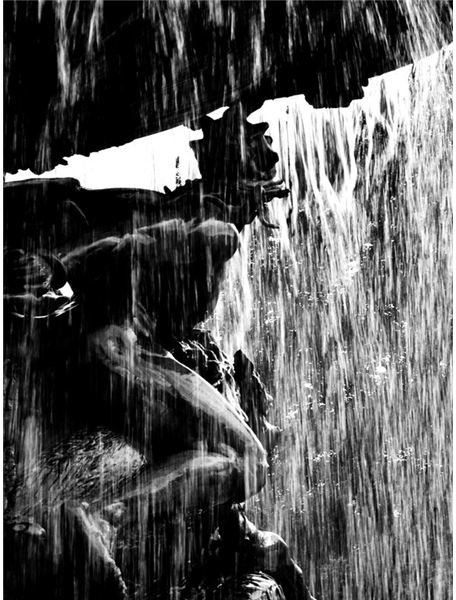
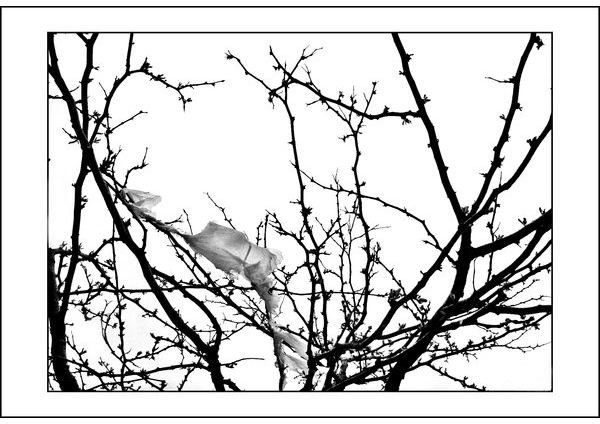
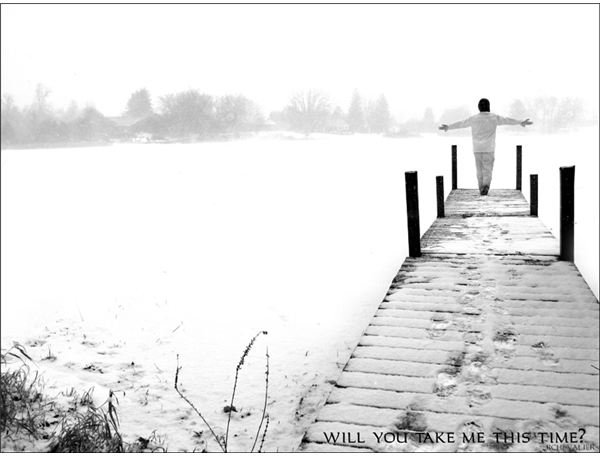
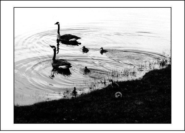
Black & White Contrast
Black and white, without any color whatsoever. Here, contrast is your only real tool to bring out the nuances of texture, without the often unnecessary noise that color brings along with it. It’s the most classic high
Now, this may involve over (or under) exposing your subject. While many find this flouting of the technical rules of photography uncomfortable, it certainly provides for a striking image, though the aesthetics are of course subjective and debatable.
Color Isolation Examples
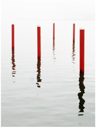
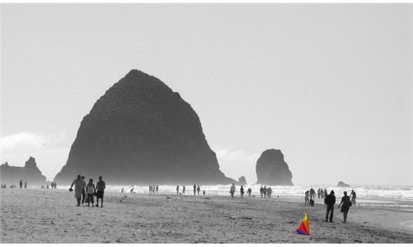
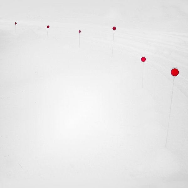
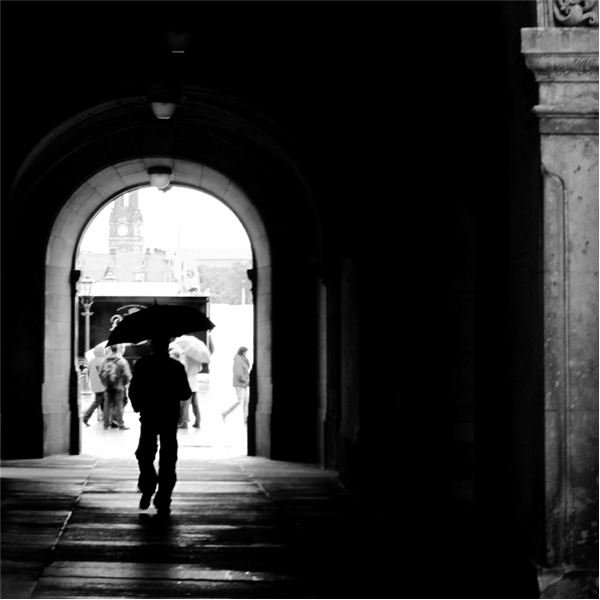
Color Isolation
Small, but striking use of color in an image is another powerful technique to bring out the contrast. Take a scene, and turn it all to black & white—except for some small point of color, a technique known as color isolation. A striking color such as red works best, though others also work. You can leave the rest of the scene to be low contrast, bringing even more emphasis to the point of color, or also make it high contrast—experiment with the different feels it gives your photograph.
Your point of color will generally be your subject. It could be a lone red umbrella walking down a rainy city grayscape, or a sailboat at sea. This is a powerful tool to bring attention to a subject that might have otherwise gone unnoticed in a photograph using conventional techniques.
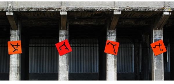
Color, Color, Everywhere!
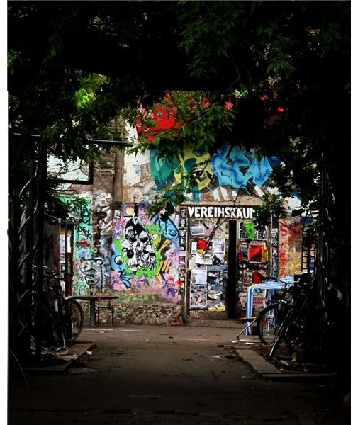
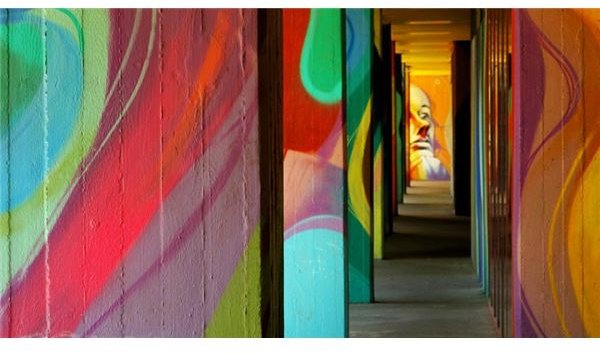
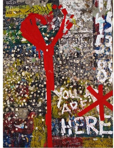
Some scenes you’ll end up photographing will just be defined by their sheer life, their color and constant change, and by bringing out the contrast of the image, you’ll be bringing out all the vivacity of the place. Graffiti on the Berlin wall, a souk marketplace, a field of wildflowers—using high contrast, the scene will just seem all the more alive.
Taking advantage of contrasting colors , be it in a general sense of warm versus cool, or more specific, such as purple versus yellow or blue versus orange, may also make an image pop all the more.
You may end up getting a slight postering effect. Some people avoid it at all costs, others revel in it. It’s a personal choice. Again, just don’t be afraid to experiment and keep an open mind about the art of photography. If such an effect displeases you, why is it? Merely because it is somehow technically inadequate, or because it doesn’t seem real anymore? Do things need to appear real to tell a real story (or for that matter, just to look nice?) Explore!
Color Examples