Follow this easy tutorial to create a realistic looking touch screen smartphone image.
In this tutorial, we will be learning how to use shape and text layers to create a full touch smart phone. The smart phone design is fashioned based on my own mobile. You may tweak it a bit to make it look like yours too if you want to.
Let’s first start with creating a workspace with the following properties:
- Name: Smart Phone
- Width: 332 pixels
- Height: 640 pixels
- Resolution: 72
- Color Mode: RGB – 8 Bit
- Background Contents: Transparent.
Most of these are already set by default except the size.
Let’s Get Started!
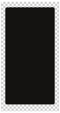
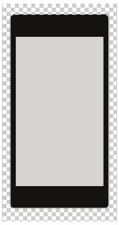
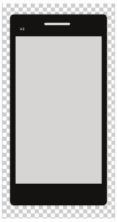
Pick the rounded rectangle tool and set the radius to 10px, fill color to black and draw. Now take the rectangle tool and set the fill to ash #d7d5d3. Draw a rectangle in your rounded rectangle, this one should be a smaller. Now before we get confused, rename your rounded rectangle layer – Rounded Outline and name the ash rectangle you just created – Ash Screen.
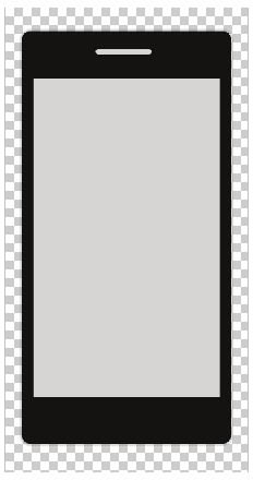
Ok, now let’s go back to the rounded rectangle tool. Using the rounded rectangle, draw a small rectangle above the Ash Screen. This rounded rectangle is supposed to represent the phone’s front speaker (ear piece). Take the text tool, set the size to 9pt, and in a simple font type – W8 - on the upper right corner of the screen, just above the Ash screen. By now you must have something like this:
Creating the Touch Buttons
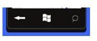
Now it’s time to focus on the three touch buttons on the lower part of the screen; the left pointing arrow, the windows button and the handle glass buttons.
First the arrow, this is rather easy to create. Pick the custom shape tool (under the rectangle tool). Under the shape drop down you will find an arrow (pointing right). We need our arrow to point left, so use the Free Transform tool under ‘Edit’ to change the direction, and make sure your fill is white.

NOTE: When you pick the rectangle / eclipse tool, you see these options in the upper left corner of your screen. The first option – highlighted – is for ‘shape layers’; the second option is for paths and the third and last is for fill pixels. In order to create a path layer, make sure the middle option is selected and deselect it when you want to create a shape or pixel layer.
After that we come to the windows button. Pick the pen tool and make a rectangle with paths only, no fill. Draw to two straight line paths, criss-crossing the rectangle path, dividing it equally. Now to go Edit-Transform-Warp. Under the Warp ‘drop down’, pick flag and set the BEND option to 15. Now, just as we did to the arrow, we need to turn the direction of the wave (with the free-transform tool) to go right (ref. image above). After this is done, FILL the path with black and STROKE it with white, you will right click on the path with the pen tool to see the options. Now you may delete the path you made by selecting it with the path selection tool and pressing ‘DELETE’.
On the third button all you need to do is draw a circle path and a connecting line path and stroke them white. We are done with the buttons now.
Final Touches
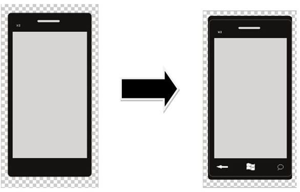
Select the Rounded Outline Layer we first created now and give it a stroke by going to Layer-Layer Style-Stroke. Select a lighter shade of black and reduce transparency to about 50% and stroke. Then create another rounded rectangle, just below the old one (just above the background layer), keep the width the same but increase length by a few millimeters. Remember the new layer must stay under the old one.
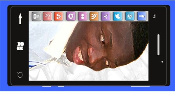
If you followed the proceedure carefully you must have something like this by now.
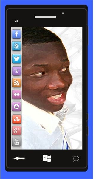
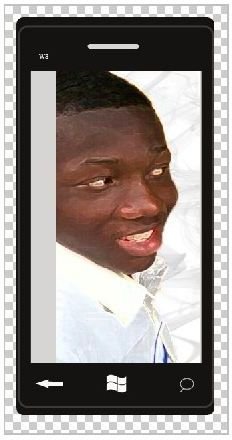
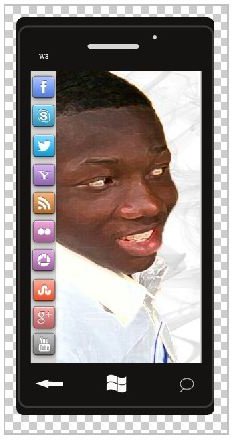
At this point, you may pick your background picture, paste as a layer and use free-transform tool to reduce/increase size to cover the ash screen, leaving a small margin on the left where you are going to paste your tabs. You can get the social-media or browser icons for free on many sites. Find one which suits your style and download. Then you can paste it on your screen to give it a more realistic look.

But before we prepare finish the project we have to add this tiny detail (do you remember the front camera?); pick your brush tool and set the size to 3/4px and the color to white (maybe a slightly darker shade) and strike on the upper part of our old rounded rectangle (see below).
You’re Finished!
Optional: You may create a couple small rectangles just above the background layer to represent buttons that maybe be on the side of the phone. And also you may change the background layer color (in my case to blue). And rotate it or slant it as you wish.
Editor’s Note: Oliver Mcstill is a Ghanaian based freelance graphic and logo designer who loves music, learning, sharing, making new friends and blogging. Connect with him on Twitter or Facebook. We share knowledge to gain knowledge…


