Moving Average Convergence Divergence, or MACD, is still widely used after more than 40 years. After explaining MACD construction and calculation, and introducing simple buy and sell signals, we now explore more powerful divergences.
MACD Defined, Briefly
Remember that MACD defined is the difference obtained by subtracting the 26-day EMA of the closing stock, index, or other security closing price from the 12-day EMA of the same value. The second piece of the MACD oscillator indicator is a 9-day EMA of the MACD indicator itself.
In MACD parlance, the 9-day EMA is called the “slow line”, while the MACD indicator is the “fast line”. It is the relative action of these two lines, along with price movements and trends in the underlying security, that produces trading signals with the potential to foretell the upcoming direction of the underlying security.
We showed previously that “fast line” and “slow line” crossovers are the most common but least accurate signals. The “fast line’s” crossing above the “slow line” should be considered a pre-buy trading signal, and could be also be used as a pre-sell signal for existing long positions. The “fast line’s” crossing below the “slow line” should be considered a pre-sell signal, and could also be used as a pre-buy/cover signal for short positions.
But we’ve saved the best for last. The less common and significantly more powerful signals are MACD divergences.
MACD Applied: The Bullish Divergence
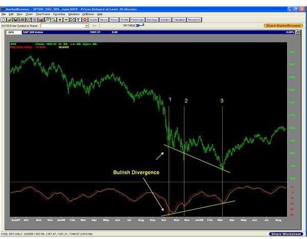
As in our previous article, we’ll use the S&P 500 (SPX) index to illustrate. The figure below shows a traditional daily high-low-close price chart (top pane) and MACD (lower pane) for the most recent two years:
NOTE: The charts in this article were produced from MarketBrowser .
Notice the three vertical lines on the chart labeled “1”, “2”, and “3”. “1” on October 10, 2008, marks the first low in the SPX in the decline that started in October, 2007; note that the MACD is also at its first low, -76.994, in the 2 year period shown on the chart. “2”, on November 21, 2008, marks a new low in the SPX at 741.02, but MACD, which started to rise shortly after the low marked by “1”, is now at -53.057. By the time that SPX made the new low at 666.79 on March 3, 2008, MACD continued to rise so that it was at -40.512.
We have three successive lows in the SPX but successively higher lows in MACD. This is a “bullish divergence” where the index is in a declining trend while MACD is in a rising trend. This portends an eventual end to the SPX downtrend and a subsequent rise in SPX. In fact, this marks the bear market low (so far!) from which SPX has risen ~50%!
MACD Applied: The Bearish Divergence
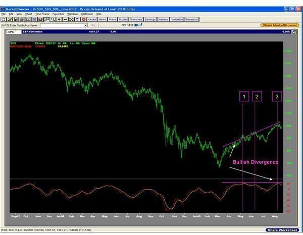
Again, notice the three vertical lines on the chart labeled “1”, “2”, and “3”. “1” on May 8, 2009, marks the first high in the SPX during the rise from the final low on March 3, with MACD at 25.813. “2”, on June 11, marks a new SPX high at 956.23 with MACD at only 17.384. SPX made a new high of 1018.00 on August 7, but MACD only rose to 23.22, below its value at the first SPX high on May 8. This is a “bearish divergence” where the index is in a rising trend while MACD is flat. This portends an upcoming end to the rally from the March 3 low and a subsequent decline in SPX. If you note the events since August 7, you’ll see that MACD has since crossed below its slow line, triggering a pre-sell signal. If this bearish divergence holds true, we should expect to see a noticeable decline in SPX in the coming weeks.
Conclusion
We have completed our explanation of the basics of MACD with explaining how MACD is calculated. We have examined the simple buy and sell signals that MACD generates by crossovers between the fast and slow MACD lines and by zero crossovers. We have now seen the divergences, which are the most powerful signals that MACD generates. We even have a prediction for upcoming market action by expecting SPX to pull back, terminating the present rally from the March low. Time will tell…indeed!