The best methods for testing your web design with different browsers to maximize compatibility for the end user.
Testing Your Website
When designing a website, you have to be careful that your layouts work on every major web browser. It used to be that you only had to worry about Internet Explorer and Mozilla Firefox, which used to be Netscape Navigator. Now you have Google Chrome and Apple Safari in the mix, plus all the mobile devices like BlackBerry SmartPhones and Apple iPhones. Although you can’t guarantee that your site will look exactly the same on every browser, there are things you can do to make it as close as possible. In this article, we’ll discuss the best browser compatibility testing strategy for you to employ in web development.
Different Browsers = Different Results
Last year I was tasked with designing a website for my work, and the boss wanted a drop-down menu to go across the top of the site. No big deal, right? I used Adobe Dreamweaver and had everything looking perfect with the menus and colors, then I tested it in Firefox and the menu didn’t work at all. I also found that in IE6, the fonts and colors were all messed up. It looked great in Internet Explorer 7, but didn’t work right on anything else. I wound up having to make all kinds of tweaks to the HTML and CSS in order to make everything backwards compatible with other web browsers. Such is the life of a web developer.
Browser compatibility testing is incredibly important for the main reason that you don’t want to embarrass yourself or your company by making a website that doesn’t work. Had I rolled out my initial design, I would have eventually fielded a bunch of complaints from people saying they couldn’t get to certain areas of the site because my menu was broken. Dreamweaver CS3 has some built-in options for browser compatibility testing, but you can’t totally trust them. Your best method is to actually use an older version Internet Explorer or different browser like Chrome or Safari and see what the site really looks like.
Download Older Browser Versions
You can still download older versions of some web browsers. For example, Microsoft still offers a download of Internet Explorer 6. I highly recommend you get it to put on a second computer for browser testing, as a great many users out there on the web are still running IE6. There are big differences between IE6 and IE7 or 8, and this should be taken into considering when doing browser compatibility tests. Here’s where you can download older versions of web browsers:
- Internet Explorer 6 – Microsoft still hosts the downloadable installer for IE 6 at Microsoft.com .
- Mozilla Firefox – You can get any previous version of Firefox from their FTP server .
- Google Chrome – All the previous versions of Chrome are available at Filehippo.com .
- Apple Safari – You can find all the previous version of Safari at OldApps.com .
Image credit: Microsoft.com
Get Another Computer
I strongly recommend that you keep a second computer on hand as the key part of your browser compatibility testing strategy. I prefer to use an older laptop with a 15” screen and some older version web browsers installed. One mistake a lot of people make in web development is that they build sites on their giant widescreen monitors and everything looks fine to them, but the home user with a smaller screen laptop or monitor is not going to see things the same way. If you aren’t careful in how you design the layout of the site, some parts of the content will be cut off while other people view it. That’s no good.
By keeping another computer on hand with older versions of web browsers like Internet Explorer 6, you can test compatibility in the code differences between what is supported in the old version of IE versus the current ones. You can also see how well your site fits within smaller sized screens and can tailor your layout accordingly, such as not using graphics that are so wide that they cause the user to have to scroll left or right just to see the whole site.
Browser Compatibility Testing Strategy for Mobile Devices
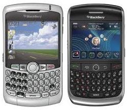
Designing web pages for mobile devices is another ballgame entirely. The Apple iPhone/iPad and its included Safari browser is actually quite good at rendering pages the same way they appear on a regular computer, though size constraints may cause some poorly designed sites to skew. Designing for the BlackBerry browser is really kind of hit and miss since it is such a limited browser in the way it displays information, plus the screen is very small. BlackBerry users with Opera Mini installed will have much better results, but you never know what people are using when they hit your site.
Your options for designing for handheld devices are fairly limited. You can create separate style sheets designed specifically for mobile devices so that certain incompatible elements are ignored, but this method doesn’t always work properly depending on the mobile devices and the software being used. You could also design a second site (such as a .mobi domain ) made specifically for mobiles, but this means you’d have to update everything twice whenever you made any changes or updates because you’d be running two different sites.
As a BlackBerry user, I am pretty used to sites looking kind of lame in my BlackBerry browser, so I am tolerant of having to do a lot of scrolling to get the content part of certain sites. Such is the way things work these days, though hopefully either the handheld device technology will catch up so that it’s not an issue or web developers will have to learn a whole new way to design their sites.
(Image credit: Crackberry.com)