Is a right focused Web layout more intuitive for the masses? I guess I’m just a right-leaning lefty in search of the truth. On route to the annual “Learning and The Brain” conference, I ponder this weighty cerebral question.
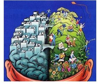
Left-Brain, Right-Brain
Without hesitation, I always begin the basic structure of Web page design with the primary navigation on the
right sidebar. It’s always been that way, since anything else just didn’t feel right. I’ve given that fact very little thought over the past 10 years. However, the need for self-examination seemed more relevant today as I started off to Cambridge Mass on what was a very cold November afternoon. It’s usually a 3 hour trip, so I had plenty of time for introspection, especially since I was traveling to the annual “Learning and The Brain” conference. I jotted down the reasons why I think a right sided navigation is more intuitive on the backside of a Google Maps printout. And, with that scrap of paper I traveled into the psyche of left or right navigation.
The speakers that were scheduled for the three-day event included scholars, authors, professors and educators in the “heady” field of psychology and psychoanalysis. Where better to analyze the dynamic that lie deep within my subconscious than experts in the field? This year’s “Meeting of the Minds” was extra special since it had the most attendees ever, with over 2000 reservations and several dozen highly respected speakers. All of whom would pontificate and cajole the very essence of the “left brain, right brain” question.
The insight I came away with at the end of my fiirst day of lectures, is that the professional programmer (left brain) has a sequential way of looking at the parts to obtain a result. Programmers have to to be able to comprehend the highly complicated coding necessary to create today’s interactive Web applications. While the designer (right brain) is a more fluid thinker, whose decisions are based on visual cues. What better way to explain why websites created by programmers look vastly different from those created by designers.
Note that this is my own personal discovery and not a scientifically proven fact. By no means do I claim to be a reseracher or brain surgeon.
The Answer: Print Design?
I’m not a brain surgeon, though I have been a professional graphic designer for over 20 years, so the following observation is worth including. Should Web design navigation emulate print design? Why do I choose to structure my Web pages with a right-sided navigation menu instead of the long established left-side? In fact there was a study performed by Kingsbury and Andre in 2004 which concluded, Navigation: Left is Best. In their
analysis they use L.L. Bean as the “TLL” (Top - Left - Left Navigation Pattern) which their shoppers prefer. I checked out their Web interface today and I don’t see a left OR right navigation model. Maybe L.L. Bean’s Web marketing department has abandoned this study, since theiy’ve since replaced their Web interface for a newer, more inuitive interface design. Could it be that their customers respond favorably to the new design by spending more coin?
So, why should the Web be any different?
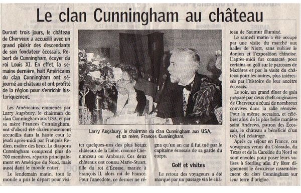
Coming from the realm of advertising design, I’ve always worked from left to right. Let’s examine one of our society’s most popular past time: scanning local newspapers’ “Society Pages” for a glimse of the civilized class. I admit it, I do sometimes envy their huge fortunes and fabulous good looks. The “Le clan Cunningham au chateau” article is a very effective way to garner favor from them, appealing to their egos. Newspapers, have used positioning, placement and coverage for many years to appeal to their readers and advertisers. So, why should the Web be any different?
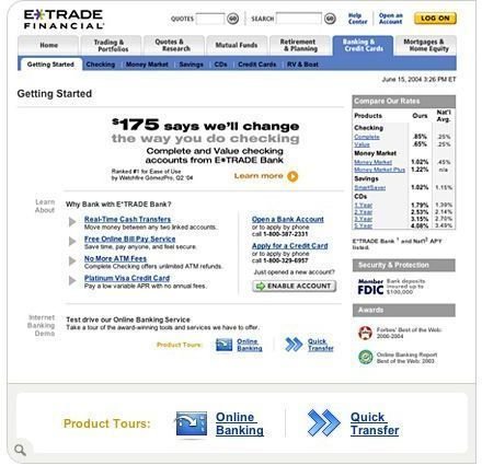
As the modern day “investor class”, whose fortunes have lessened recently, could have benefited from better Web usability. As the remaining doom days of 2008 come to an end, I can’t help wondering is a right-sided navigation could have kept millions of investors from losing their life savings? Could a more inutive Web interface have kept our economy from collapsing? The day trader may have been able to react more quickly to the falling market if only E-Trade’s navigation was more intuitive.
Evolving Web Design

A not-so-subtle Ug used a heavy method of coaxing his favor. The methods of persausion used by today’s Web are far more sophisticated and far more nuanced. Like many national newspapers, we are all reluctant to change. Maybe that’s the reason why the Web has managed to grab a significant share of traditional print’s market. Immediately after the Web became commercially viable, research and statistical organizations begain measuring user response. WebTrends was one of those pioneering companys that wanted to sell this valuable data to advertisers. Now there is Google Analytics which offers the regular Web developer access to a powerful suite of tools which can measure the user’s reaction to changes you make to your interface design and assessibility.
Don’t be an Ug.
There are many differences that exist between the Web user, not to mention sex, age, origin, politics and affluence. The way we shop (and search) for goodies on the Internet need to be a serious consideration when preparing your Web user interface. The world is becoming more sophisticated, so changing your Web design with acssesibility and usability in mind is a must!
This post is part of the series: Web Usability
Designing a user friendly Website user interface design. A heady, though slightly humorous analysis of different concepts that raise the question: what makes a intuitive Website design?