How do i make columns on a web page? is a question you might find yourself asking when websites or services like Yahoo Mail or Gmail come up with a new layout that dazzles you. The good news is that you too can learn the same techniques. Here is how.
As you browse through various websites on the Internet it does not surprise one to wonder how some layouts and effects are achieved. So if you are wondering how to make columns on a web page, I would tell you there are two basic ways. You could use the built in HTML tables through the
Column One, Row One Column One, Row Two Column One, Row Three Column Two, Row One Column Two, Row Two Column Two, Row Three
The code above will give your a two row, three column layout. This may work and seem simple and straight forward but should be considered as deprecated, even though officially it is not. As mentioned before it goes against best practices in web design.
Presenting Your Columns in Style with CSS
CSS layouts are achieved by using Cascading Style Sheets to dictate the position and magnitude of
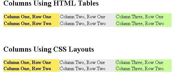
Columns Using CSS Layouts
Column Two, Row One Column One, Row One Column Three, Row One
Column Two, Row Two
Column One, Row Two
Column Three, Row Two
This may look complicated but it is quite a basic way of achieving columns on your web page. I will now walk you through the code.
The Style Sheet
This appears in the
section of your web page. Container is the container element that defines the bounds of the columns. In this case we want them in a 540 pixel region. Secondly we define the columns bearing float:left. This means it should try and occupy the left most position it can take just after the element before it. This will allow the elements to be placed side-by-side. Each column must also have a width.The right-most column should have a left margin that is minus its own width. The first column must have a left margin that is minus the entire container. This is because everything added after the container is laid beside it. So using a negative left margin forces it to move left back to the right place.
The remaining space which so happens to be the second column in this case is bound to a left margin equal to the sum of the widths of the elements on its left. In this case column one, while the right margin is set to be equal to the sum of the elements that appear after it. In this case column three. All this is contained in a wrapper that spans 100% of the container. So the margins for column two or remaining space pads the container on both side so it fits in the right place.
The rest of the elements such as the background are purely cosmetic.
The HTML has nothing special only that the wrapper
Which Option Should I Choose From?
Probably the only advantage tables has over CSS columns is tables are able to maintain the same height within all the columns in the layout while CSS would need some back breaking tweaks which are too complex to be covered in this guide. If one column has a lot of data, a CSS based layout will not scale the other columns to fit. Using attributes such as min-height or JavaScript code to dynamically resize the columns can achieve this.
Whichever method you use is a matter or preference. As for best practices and highly recommended, it is preferred that CSS layouts be used for general web page layouts. HTML Tables can be used for tabular data in grid based data formats even though well crafted CSS can still handle grid based data.
References
Source: author’s own experience.
World Wide Web Consortium (W3C), www.w3.org .
Images provided by writer.

Using LastPass to Keep Passwords Safe
Still writing your password on sticky notes? Do you use the same password for multiple sites? Why not use a password …

Installing and Using Ablock Plus
Do you have a limited data cap for your internet connection or are tired of seeing endless ads on your computer? …

Ad-blocker Versus Facebook – the Fight for User’s Rights
Adblock Plus is obviously having an impact on Facebook’s revenues as Facebook recently changed the way they code ads on …