Do you enjoy discovering cool websites and sharing them with others? I’m sure most of you have heard of StumbleUpon, but Google has also jumped on the bandwagon and has been stirring in their labs their latest experiment, Google Reader Play.
Editor’s Note: Google Reader service is ending July 1, 2013. They are working on updating Google Play to be usable without Google Reader. See their website for details.
What is Google Reader Play?
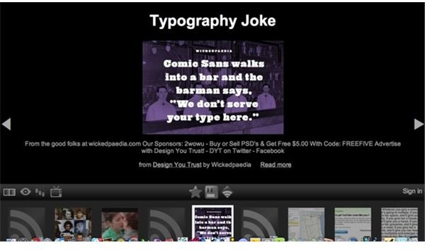
Google Reader Play is a simple and accessible way to play around with discovering new web sites. When you launch Google Reader Play, you’re presented with a large picture, video, or text on the center of the screen. Below that main section are the right and left arrows, a few icons for interaction, and a thumbnail view of websites for you to explore. There’s not a whole much you can do in Reader Play except to browse through the pictures, videos, and articles Google recommends to you. If you like them, then you can share them with others.
The Main Features
As they did with Buzz, Google is making an effort to join in on the sharing game, and Reader Play is another experiment that falls under that category. In order for you to get the full experience, you’re going to have to interact with it, by telling Google Reader Play about articles that you like, that you favorited, and that you shared. The favorite, like, and sharing buttons are right in the middle between the main section and the thumbnail view. The more you click on those buttons, the better Google Reader Play will recommend other web sites to you that will cater to your interests.
A convenient part about Google Reader Play would be its large text and images, so anyone who likes to browse the web this way will appreciate that gesture. While text and images can increase in size to fill the main section of the screen, many videos are unable to do so; that makes it awkward to watch a small YouTube video when you have all this empty black space surrounding it.
Two notable buttons on the left hand screen are the TV and slider icons. The TV icon will let you start a slideshow that will automatically browse through websites for you. It’s convenient for anyone who doesn’t want to flip through websites by having to click on the left and right arrows every time. The slider icon will give you the option to tell Google how to give you recommendations: based on what you have shared or based on what general categories interest you – like sports, entertainment, technology, arts, news, health, business, and science. If you want to select all of them, you can do that too.
The Problems with Google Reader Play
Google will have to make further improvements if they want this to be as enjoyable as StumbleUpon, which seems to be one of the inspirations behind Reader Play. Not every item in the thumbnail view will show a picture or video so what you get instead is a large RSS icon, which isn’t all that exciting to click on, and worst of all, you have no clue as to what that website is. A picture in the thumbnail view at least gives you some idea of what to expect, but unfortunately I saw many RSS icons in my thumbnail view and it didn’t really motivate me to want to click on them.
There are no settings so far to visually alter the look of Google Reader Play, which would have been an attractive option. The default theme, while simple and easy on the eyes, is not visually stunning or inviting and doesn’t motivate me to want to keep on discovering new websites.
Worth Checking Out?
At least Google Reader Play has one thing right – which is to make this StumbleUpon-like feature simple to navigate and easy on the eyes. I would like to see changes made to the visual style of Reader Play, a solution to the problem of RSS icons appearing too much in the thumbnail view, and also in the settings option, for the categories that interest me to be expanded. Google’s latest experiment has a long way to go, and it’s nothing compared to the original Google Reader.
This article has been placed in our archives.