Earning money with Google Adsense seems pretty easy, but it can be tricky as well. Like in many cases, the first impression counts. Your ads can make your visitors love you or hate you, return to your site or go and never come back. Learn the secrets of integrating ads wisely within the page.
Google Adsense has made its way to the top in a very short time. Without any doubt, it is now one of the biggest players. Bloggers and web developers alike clutter their pages with Google ads, secretly hoping they would become rich over night. However, things don’t work like that in reality. Optimizing is a complex process that seems to function by its own rules. Why do people click certain ads? Why do some earn lots of money, while others don’t? Is there a secret formula? If there is, it is probably called ‘common sense’.
The first keywords that come to mind are balance and discretion. It is true that people are eager to make easy money but it is just as true that nobody likes a webpage or a blog that has more Google Ads than actual content. The viewers can sense if the web developer/blogger has put a real effort into designing the page and providing relevant content or he has just dropped a few ads here and there, hoping he’ll get lucky enough to get a few clicks. A webpage cluttered with ads of any kind strikes us as opportunistic and unprofessional. It is usually recommended to have no more than two or three blocks of ads on one page.
Color Coordination
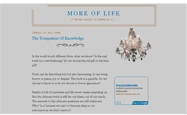
Another essential thing with Google Ads is getting the colors right. The color scheme is one of the elements that make an ad look right or wrong. For instance, if the background of the ad is the same color as the general background, it will appear as a part of the whole, supporting the unity of the page rather than breaking it. It is important to use color coordination. The following images show how different the impact of the ads can be, depending on the color scheme we choose.
Click each image for full size


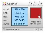
So what happens if you want to use a certain color from the page but you don’t know its color code? The solution is very simple and it’s called ColorPix. ColorPix is a small but smart and incredibly useful tool that renders the hexadecimal code of any color the mouse pointer touches on its way. You can download ColorPix for free at https://www.colorschemer.com/ColorPix.exe .
To get help and advice with color palettes and color coordination, you can also check the following links:
What colour palettes are the most successful?
Border or no border
If you use the same color for the border and for the background of the ad, you create the illusion that it has no border. This is usually recommended for integrating it better in the page. On the other hand, a well-chosen border can increase the visibility of the ad and give it a little style. The border in its turn can have rounded, slightly rounded or square corners. Choosing between them is a question of personal taste. However, the rounded or slightly rounded borders can give the ad a softer, more ‘professional’ look.
Click each image for full-size

In conclusion, getting your Google Ads right is as much a question of balance and discretion as of imagination and style. It can also speak volumes of the sort of person you are.