Many people find a bar or pie graph helpful in interpreting data. With Google Spreadsheets, you can add bar or pie graphs, and even scatter and line graphs with just a few clicks.
Creating Graphs in Google Spreadsheets
Graphs can help you understand all kinds of information. Whether you’re using Google Spreadsheets to track sales performance, business expenses, or stock market trends, Google Docs lets you add the type of graph you need to best illustrate your data.
1. Log into your Google Docs account
2. Select the Spreadsheet you want to work with, or start a new one.
3. Click on Insert in the toolbar.
4. Select Chart… from the drop down menu.
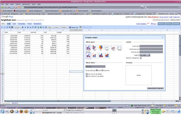
5. Select the type of chart you want by clicking on the picture of the appropriate chart.
6. Enter the cells the chart should incorporate into the text box. Cell information is entered by typing the coordinates of starting cell followed by a colon (:), and the coordinates of the ending cell. Example: A2:E21
7. Select Rows or Columns to specify how the data should be grouped. This tells the chart what the relationship between the data is.
8. Specify where chart labels come from. You can use either Row 2 or column A, or both to label your chart by clicking on the correct box.
9. Type your Chart title in the text box
10. Specify a label for the horizontal axis by typing the name for it in the text box.
11. Label the Vertical axis by entering its name in the text box.
12. Using the Legend drop down menu, set the location of the chart’s legend. You can also choose to omit the legend.
13. Double check the chart preview and hit Save chart to save your settings, and embed your chart into the spreadsheet.
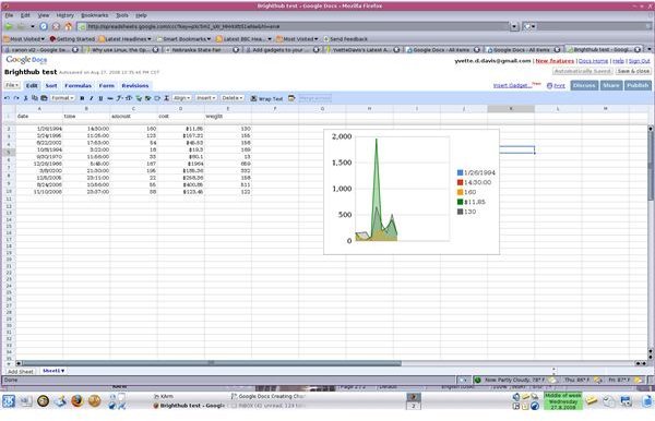
Once your chart is saved in the spreadsheet, you can move it around by clicking on the chart, so the gray border appears. Then, move your mouse over the gray border so the finger appears. Click and drag the chart to your desired location within the spreadsheet.
That’s all there is to it.
Images