Microsoft Expression Web makes it easy to add customizable interactive buttons to your web page designs. We’ll show you how in this step-by-step guide.
In other Microsoft Expression Web tutorials, we’ve described how to create basic links and how to create a custom button from an image to link to another web page. Another way to manage your hyperlinks and navigational structure in Expression Web is to use special interactive buttons that can be customized to blend in with the design of your web site.
How to Add an Interactive Button
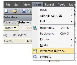
Begin by placing the cursor at the point on the web page where you want to insert the button. Next, from the Insert menu on Expression Web’s main toolbar, select Interactive Button.
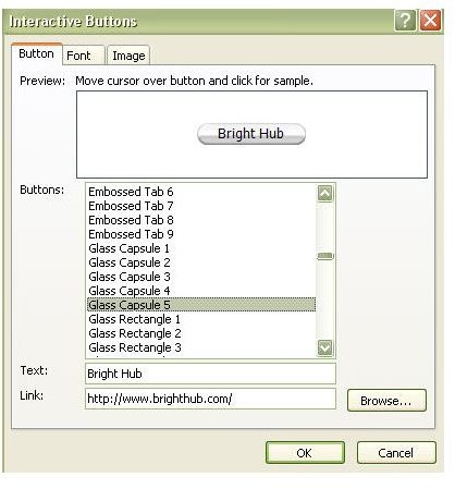
This action will open the Interactive Buttons window. First, make sure you are on the Button tab of this menu as shown in the screenshot to the left. Scroll through the choices for Buttons and pick out a design you like. Clicking on any of these choices will bring up a preview in the upper part of the window.
In the box next to Text, input the text that you want to appear on the button. Finally, enter the information for the Link field. This information will link the button to whatever URL or email address is entered here. When you’re finished, select the Font tab to move on to the next step.
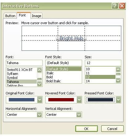
On the Font tab, there are several other options available to customize your interactive button. First, of course, there is Font, Font Type, and Font Size. You can play around with these choices to try to find something that looks best for the button you are designing. Any selections made here can be immediately seen in the preview window.
In addition, you can select different colors for the font depending on the state of the button. Changes made to the Original Font Color will be seen in the preview window without any additional action. If you want to know how the button will look with a different Hovered Font Color or Pressed Font Color, just perform these actions to the button in the preview window.
You can also make choices for the alignment of the text on the button on the Font tab. Keep in mind that these choices will have no bearing on the placement of the button itself. They will only affect the appearance of the text displayed on the interactive button. After you’ve decided on what options to use here, select the Image tab.
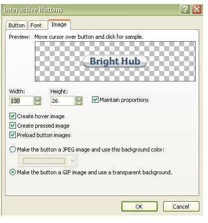
The options on the Image tab will allow you to further customize how the interactive button will appear on your web page. You can use the Width and Height fields to make the button larger or smaller. If you want to keep the same basic shape of the button while enlarging or shrinking it, make sure to check the box next to Maintain proportions.
By default, the boxes next to Create hover image, Create pressed image, and Preload button images will be checked. It’s generally a good idea to leave them this way unless, for some reason, you choose not to use these additional images.
One of the most important options available on this tab is the ability to change the background color for the button image. By default, the background color will be white. This option is fine if the background of your web page is also white, but since most of us like a little color in our designs, this is rarely the case.
To make the background of the button blend in with your web page, there are two options. The first one is to Make the button a JPEG image and manually select the color that matches the background of your web page. However, this can present a problem if you ever decide to change the colors used on your web page. I prefer to use the Make the button a GIF image and use a transparent background option. This way, I never have to worry about modifying the buttons later on if I change my mind about background colors.
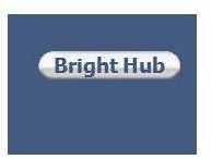
Click OK after you’ve finished making all of your modifications, and the interactive button will now appear on your web page. If you want to test the button out, use the Preview in Browser option located in the File menu on Expression Web’s main toolbar.
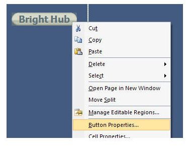
If the button is not working as expected or if you decide you just don’t like the look and feel of it, you can always make changes by right-clicking on the button and selecting Button Properties. This will open the Interactive Buttons window again, allowing you to make any needed changes.
For more tips and tricks, be sure to browse through the other items in Bright Hub’s collection of Expression Web tutorials and user guides .
This post is part of the series: Hyperlinks in Microsoft Expression Web
Microsoft Expression Web provides web designers with several options for hyperlink creation, using both text and images. In this series, we’ll explore these methods and offer a few tips on how to get the most out of each one.