You’ve had Internet Explorer since Microsoft started dropping it on your computer for free. You’ve been through upgrades and now, it’s on your Windows Mobile device. Here is the skinny.
IE and Windows Mobile
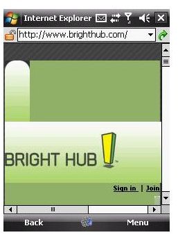
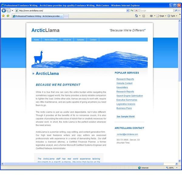
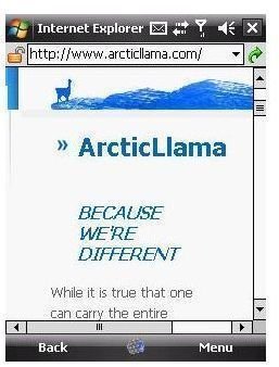
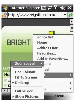
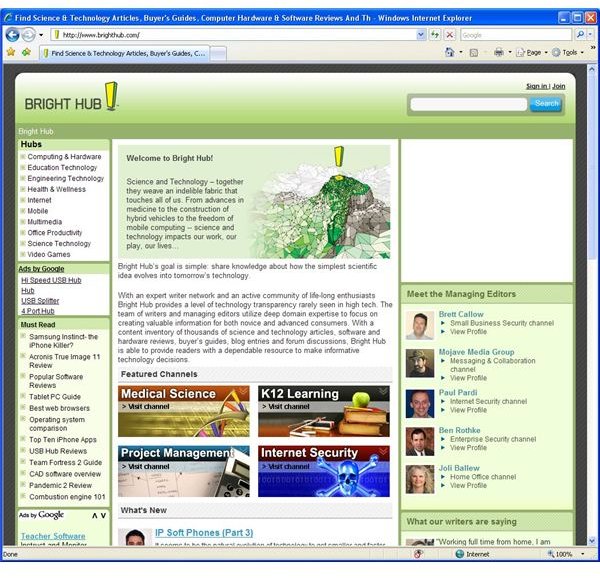
Internet Explorer Mobile comes standard on every Windows Mobile device, just like its bigger cousin does on all Windows desktop systems. Of course, that means that thousands of Windows Mobile device owners are using it right now just because it came with their new gadget. But, that doesn’t mean it isn’t worth taking seriously either. Internet Explorer Mobile provides solid mobile Internet browsing to a wide variety of devices. In a perfect world, every site a user tried to visit would have a full site of pages designed and optimized for mobile devices that were every bit as good as the ones for regular computer based browsers. But, this is not an ideal world, and many sites have no mobile ready site at all. For those that do, the content available is often just a subset of the content available to full browsers. So, the challenge is to allow for a pleasant user experience on not just for-mobile sites, but on regular non-mobile sites as well. Doing this is easier than it sounds. Microsoft provides such an experience by allowing users to select from different ways of viewing a website. As an example, we’ll use our beloved BrightHub.com website. Figure 1 is www.brighthub.com in Internet Explorer 7 on a regular desktop computer. Figure 2 is www.brighthub.com in Internet Explorer Mobile on an HTC Touch cell phone. At first glance, this doesn’t seem very useful, but the full Bright Hub website is right there waiting for me. All I have to do is scroll around. Since my HTC Touch has a touchscreen I can do that by moving my thumb around. Still, this isn’t very user friendly, even if I have the Bright Hub page memorized enough to know that is a menu if I scroll down from here. Fortunately, we have options. Three of them to be exact. There is Desktop, One Column, and Fit to Screen. As you can imagine, Desktop mode displays just like you were sitting at your regular computer and had the window re-sized to be really tiny. This view is all about scrolling. One column breaks the website up and then lines it all up in just one column. That means you only have to scroll up and down. But, things can get tricky there as well. Figure 3 shows my freelance writing website www.arcticllama.com . Figure 4 shows the same site in One Column view. What is there still a scroll bar for left to right? Because my banner is a single graphic that to size the site. (Yes, I know it needs to be re-built). So, mileage may vary. However, Figure 5 shows the same thing working like a champ on the Denver Art Museum website (www.denverartmuseum.org ). Notice how the Press menu item has been dropped down underneath the FAQ menu item. That isn’t programmed by the museum- that is IE making one column work. The last option is Fit to Screen, which as you can imagine, works a lot like Fit to Page when you print. Just like Fit to Print on one page is a failure waiting to happen when you have a four page legal sized landscape document, a big webpage is going to be barely recognizable in Fit to Screen. But, for a website you have a decent feel for, Fit to Screen will let you get a peak at where your navigation is so you can scroll on over. Internet Explorer Mobile also works with non-touchscreen devices. Just use your buttons or scroll wheel to accomplish the same things. I end up doing that even on my touchscreen because it is more precise. As an added bonus, Internet Explorer mobile is setup to move from link to link on a page. So, once you get past the clump of menu links, selecting the second link on a page is a snap. Just press the down key twice. Other basic functions are all here as well. Homepages and favorites are basically the same, although instead of a button, you need to go through the menu. (Figure 6) It makes sense to save whatever space you can for viewing the page. So most everything from your favorites button to your home button are under menu. The exceptions are Stop and Back. Knowing that you will use those the most, they pop up as you surf, either on your touchscreen or as your “soft key” on non-touchscreens, so you can click stop when you accidentally click the wrong thing, which happens much more often on these tiny screens. There are some things you just flat out won’t get on certain webpages. IE Mobile does not support Flash, so those fancy animations are never going to show on your device. Likewise, Javascript is pretty sketchy. Although, Windows Mobile 6.1 is supposed to support some of those fancier elements. All in all, when it comes to being able to surf the Internet from anywhere, Internet Explorer seems pretty much up to the task for your average basic user. Fire it up and start surfing around. You’ll find that one of the three views takes care of your reading. For images and multimedia, you’ll be better off handling that at home, or downloading and viewing it locally. If you are wondering about alternatives- stay tuned. We’ll use the old standby IE as our comparison point for other Windows Mobile browsers.
Images