No matter what type of chart you’re creating in Excel 2007, data labels are important. In this tutorial, we’ll take a look at how to change the labels of axis values on a chart or graph so that they more accurately depict the information you are trying to represent.
Excel Chart Axis Labels
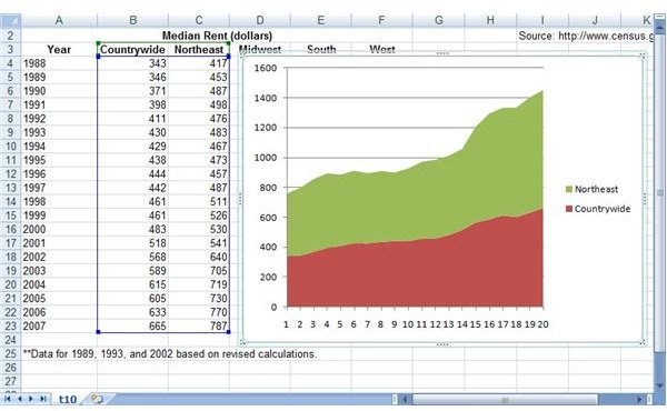
It can be frustrating when the axis labels of an Excel chart aren’t showing the information you want. For instance, in the chart shown below (click any image in this article for a larger view), we would like to compare the median rent of the entire United States to the northeast region of the country by year.
To make this chart easier to understand, we’d like the labels of the horizontal axis to depict which years are being measured. However, the default chart created by Excel is simply using a basic counter that doesn’t help much at all. In the steps that follow, we’ll show how to change these labels using this particular chart as an example.
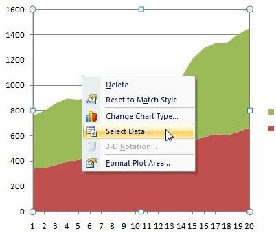
Step 1: To begin, click anywhere on the chart and choose the Select Data option.
This will bring up the Select Data Source window as shown in the screen shot below.
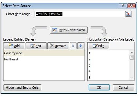
Step 2: Click on the Edit button under Horizontal (Category) Axis Labels.

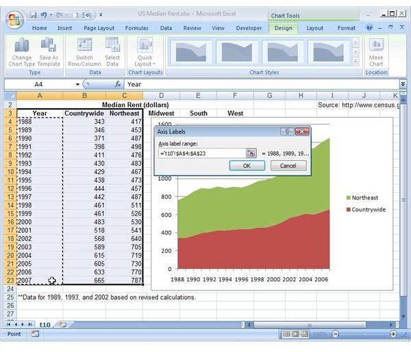
Step 3: Now, a smaller Axis Labels window will appear on the screen. Use your mouse to select the cells that contain the values you wish to use for the horizontal axis labels of the chart. As you select them, note that this cell range will appear in the box next to Axis label range. In this screen shot, you can see the selected cells in Column A surrounded by a box with a dashed-line border.
Step 4: Click OK in the Axis Labels dialog box to return to the Select Data Source window. Note that the new labels will appear in the Horizontal (Category) Axis Labels field.

Step 5: Click OK again to return to the main Excel spreadsheet and your chart. Note that the new horizontal axis labels will now be shown.

If you want to modify these values further, take a look at the tutorial on customizing chart axis values in Excel 2007 for more information.
For other tips and tricks, be sure to browse through Bright Hub’s collection of Excel chart tutorials and user guides found here on the Windows Channel. New and updated items are added on a regular basis, so bookmark us and check back often.


