You may have seen the bubble chart tool in Excel 2007, but when is the best time to use this chart option? In this Excel tutorial on charts and graphs, we’ll explain what a bubble chart is and give step by step directions on how to create such a graph in Excel 2007.
What is a Bubble Chart?
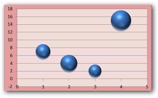
A bubble chart is a special type of graph that allows you to represent three or more characteristics of each piece of data in a two dimensional display. That is, a standard chart of plotted points, such as a scatter diagram , usually is only able to give information about two fields with one being plotted on the horizontal axis and the other on the vertical axis of the graph. However, a bubble chart can also show information about a third quantity – the differences in this quantity are represented by the size of the bubble (or point) in the graph.
While you can always modify other types of graphs to give them a bubble chart appearance, Microsoft Excel 2007 does include preformatted templates for creating these charts. In the next section, we’ll take a look at how to create a bubble chart using one of these layouts.
How to Create a Bubble Chart
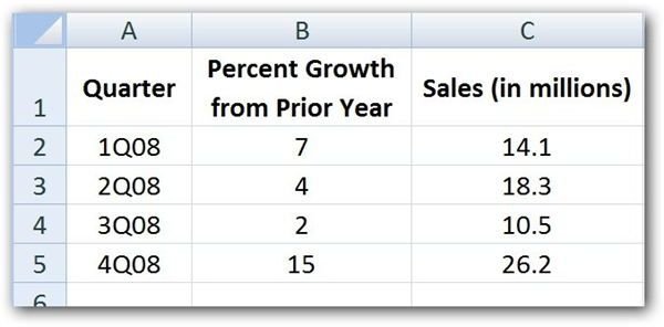
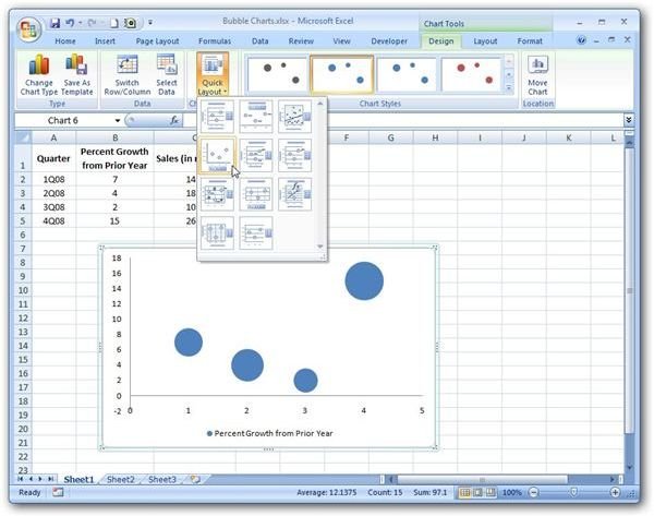
Step 1: The first thing we need to do is input the data that we want to use for the chart in an Excel spreadsheet. For this example, we’ll use some sample data that gives sales dollars and percent growth for each quarter in 2008. The screen shot below shows our sample data. (Click any image for a larger view.)
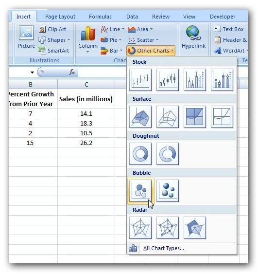
Step 2: Next, select the entire collection of data and open the Insert tab on the Excel ribbon. In the Charts section of this tab, click on Other Charts and choose one of the options in the Bubble category.
After making this selection, a default bubble chart will appear in your spreadsheet. Note that in this chart, the size of the bubble represents the Sales (in millions) category.
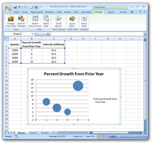
If you don’t like the location chosen for the initial placement of the chart in the spreadsheet, you can click on it and drag it to a new position. Also, you can choose to move the chart to its own dedicated worksheet within the same workbook.
Step 3 (optional): With the bubble chart still selected, go to the Design tab under Chart Tools on the Excel ribbon. Here, you can select a new layout or style (or both) for the chart.
You can also make other modifications to the chart by going to the Layout and Format tabs under Chart Tools on the Excel ribbon. In addition, if you don’t like the default values chosen for the horizontal and vertical axes, you can change these as well. For more information on how to do this, see Customizing Chart Axis Values in Excel 2007.
For more information on how to customize Excel charts or how to construct other types of graphs, be sure to browse through Bright Hub’s collection of Excel chart tutorials . New and updated articles are being added all the time, so bookmark us and check back often.


