Are the default axis values in your Excel chart or graph not quite what you had in mind when creating the object? This Excel tutorial will show how you can modify those values so that you can display the exact information needed in any Excel chart.
Default Axis Values in Excel Charts
One great feature about Excel 2007 is that the spreadsheet application easily lets you create a chart or graph from a table of data with just a couple of clicks of a button, and sometimes this simple creation will be exactly what you want. However, most times there will be something about the chart that you want to change, even if it’s just for aesthetic reasons. In this tutorial, we’ll take a look at how to make modifications to one aspect of an Excel chart – the default axis values.
When you first create a chart in Excel (any type of chart), the application will look at your data and make a “best guess” as to what the proper values and increments should be for both the horizontal and vertical axes. While these values might work okay in some instances, you’ll often need to tweak them to get the exact representation of your data that you want to achieve.
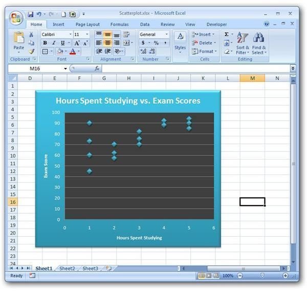
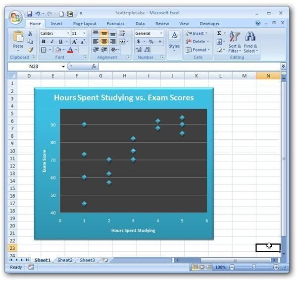
As an example, we’ll take a look at this scatter plot created in Excel 2007 . (Click any image in this article for a larger view.)
While this chart doesn’t look bad now, it is apparent that all of the plotted data points are in the upper portion of the graph. If you’re running short on space or if you just want to emphasize certain details, you may want to see what the graph would look like without all that dead space. So, instead of having values on the vertical axis ranging from 0 to 100, we could try changing the range from 40 to 99. We’ll explain how in the following steps.
Step 1: Right-click anywhere on the vertical axis of the chart and select Format Axis.
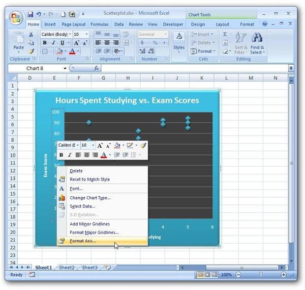
This will bring up the Format Axis dialog box as shown in the screen shot below.
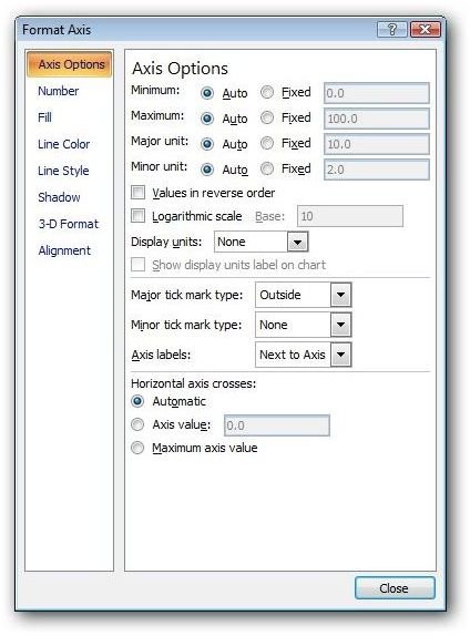
Make sure that you’re in the Axis Options view and continue on to the next step.
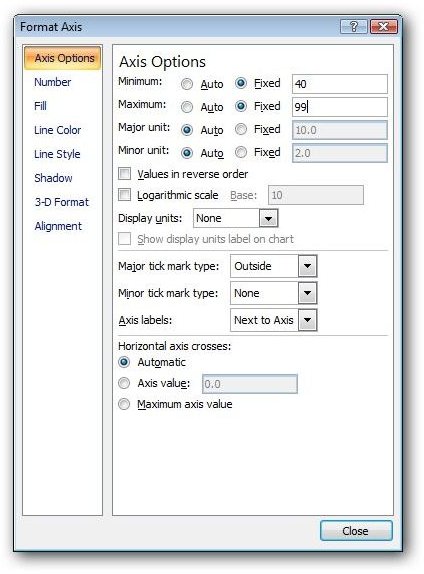
Step 2: In the Axis Options area, click on the radio buttons next to Fixed for both the Minimum and Maximum categories. Then, enter the values that you want to use for the range on the vertical axis. In this case, we’ll enter 40 for Minimum and 99 for Maximum.
Note that you can also enter a different scaling unit here if you like. The Major Unit and Minor Unit control how many values are displayed on the axis and which values will be used as major divisions. We’ll leave these settings on Auto for now, but you may want to play around with them on your own to see how changing them will affect the appearance of your chart.
Step 3: When finished making all of your changes, click the Close button to return to your main Excel spreadsheet. All of the changes made will be applied to the chart in the sheet.
The horizontal axis can be modified in the same manner - just begin by right-clicking on that axis instead and follow the same steps.
Be sure to take a look at the other Excel chart tutorials found here at Bright Hub. New and updated articles are added on a regular basis, so bookmark us and check back often!


