This Microsoft Excel 2007 tutorial will walk you step-by-step through the process of how to make a bar or column chart.
How to Make a Bar or Column Chart
As discussed in Part 1 of this series, the process for creating both bar and column charts in Microsoft Excel 2007 is almost identical. The only difference is that bar charts will display the information “bars” as horizontal objects, and column charts will show them as vertical objects. So, instead of covering identical steps for each chart type, we’ll focus on walking through the steps for making a column chart in this tutorial.
If you’re interested in other chart types, take a look at this collection of Excel chart and graph tutorials .
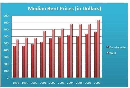
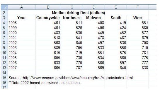
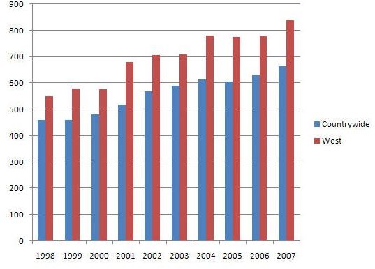
As an example for creating a column chart, we will take data that has been provided by the U.S. Census Bureau on median rent prices in the United States over the last ten years. We’ve already entered this data, shown in the screenshot below, into an Excel worksheet. (Click the image for a larger view.)
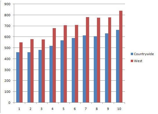
In this example, we will construct an Excel column chart that shows the median rent for both the entire United States and the western region of the country from 1998 through 2007.
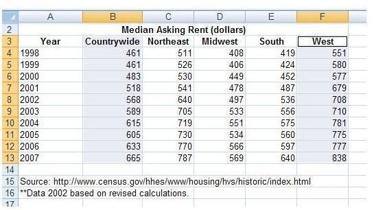
Step 1: Hold down the CTRL key and select the cells that contain the data you would like displayed on the chart. In our example we will select the columns containing information on Countrywide and West median rent.
Step 2: Open the Insert tab on the Excel ribbon and click on Column in the Charts section. (Note: If you want to create a bar chart, select Bar instead of Column.) This will expand the list of choices you have for the column chart creation. Here, we will pick the first chart listed in the 2-D column section – Clustered Column.
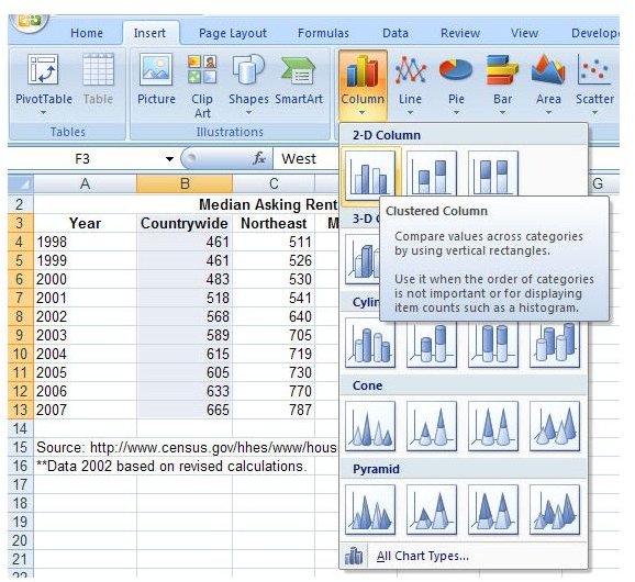
If you would prefer to pick another type of column chart type, go ahead. The instructions will remain the same no matter which one you choose.
Step 3: After selecting the chart type, the column chart will appear in the Excel worksheet. You can resize the chart and drag it to a new location on the worksheet if you wish. If you would like to move the chart to a different worksheet, take a look at the directions provided in Moving Charts in Microsoft Excel 2007 .
Final Steps
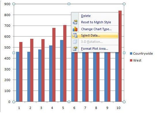
Step 4: Next, we want to modify the horizontal axis of the chart so that the proper column labels are shown rather than just the numbering sequence 1, 2, 3, …, 10. To do this, first right-click anywhere on the chart area and choose Select Data.
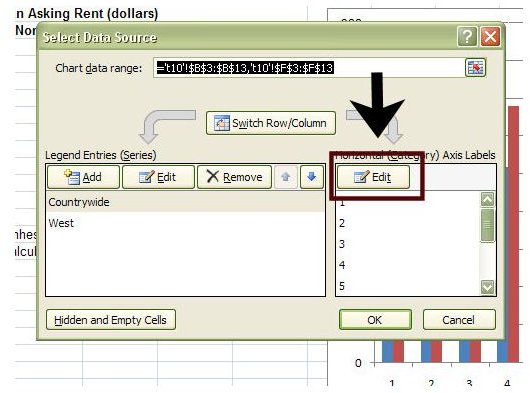
In the Select Data Source window that appears, click on the Edit button under Horizontal (Category) Axis Labels.
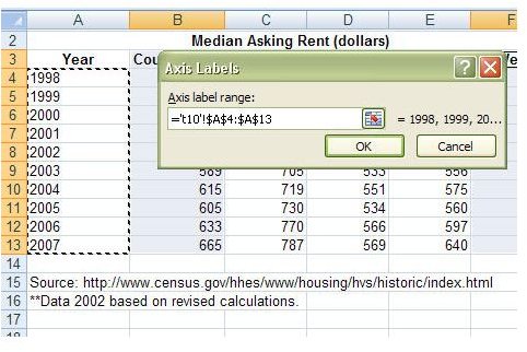
Another window, entitled Axis Labels, will appear on your screen. With this window open, select the labels you want to use for your data on the horizontal axis. Only select the actual label values here – don’t include the column header. In our example, we will select the years 1998-2007.
Click OK and you’ll be returned to the Select Data Source window. You should see the years listed under Horizontal (Category) Axis Labels now. Click OK again to return to the column chart.
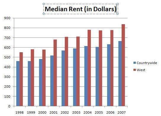
Step 5 (Optional): Although this is an optional step, we’ll want to have a title shown on our chart most of the time. To add a title, make sure that the chart is selected and then open the Layout tab under Chart Tools on the Excel ribbon. Click on Chart Title in the Labels section, and select whichever option you prefer for placement of the title. For the column chart in our example, we’ll pick Above Chart.
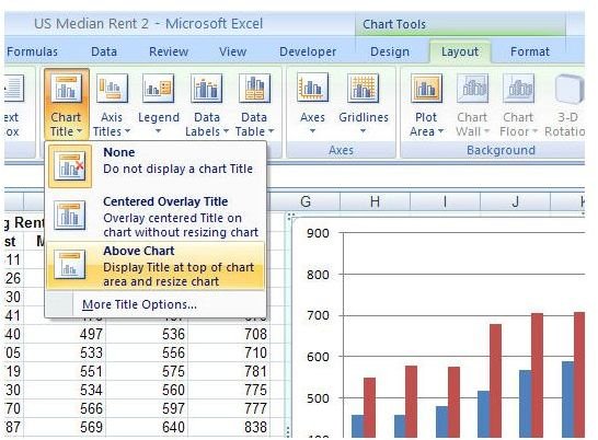
A new text box will appear on the column chart. You can click on the text box and enter any title you wish.
Step 6 (Optional): At this point, you have a perfectly functional column chart. However, you may want to take a few extra moments and make some design changes to the chart to make it more visually appealing, or match better with other colors and styles in your worksheet. There are many chart styles to choose from within the Design, Layout, and Format tabs under Chart Tools in the Excel ribbon. Experiment a little and find one you like!

This post is part of the series: Bar and Column Charts in Microsoft Excel 2007
This series includes tips and tricks for working with bar and column charts in Microsoft Excel 2007. We’ll explain what they are, when to use them, and how to create them.


