
In this guide, we’ll show how you can use the chart features of Microsoft Excel 2007 to create a scatter plot. Once you have your data entered, the rest is easy!
What is a Scatter Plot?
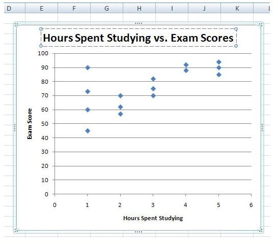
A scatter plot is a type of graph commonly used to represent the correlation between two different variables. For instance, it’s generally believed that the amount of time spent studying for an exam has a direct influence on how well a student will perform on that exam. To support this theory, you may gather information from several students consisting of the number of hours they spent studying and their final test scores. This information could then be transformed into a scatter plot.
There are several different types of scatter plots that can be created in Microsoft Excel 2007, but we’ll focus on the most common variety – a scatter plot with only markers – in these instructions. However, these steps can easily be adapted and used to create any of the other varieties of scatter plots in Excel.
How to Make a Scatter Plot
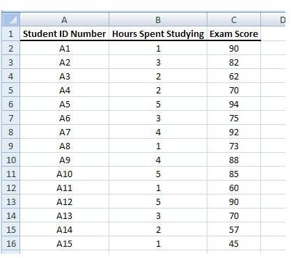
Step 1: Enter or copy/paste your data into an Excel worksheet. As an example in this tutorial, we’ll be using data consisting of hours spent studying and final exam scores for a select group of students. (Click any image for a larger view.)
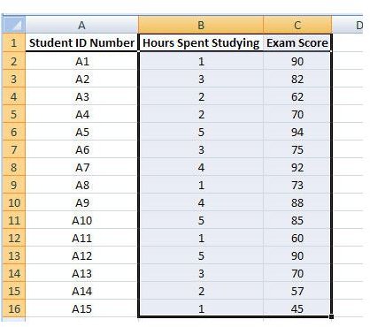
Step 2: Highlight the columns that contain the data you want to represent in the scatter plot. In this example, those columns are Hours Spent Studying and Exam Score.
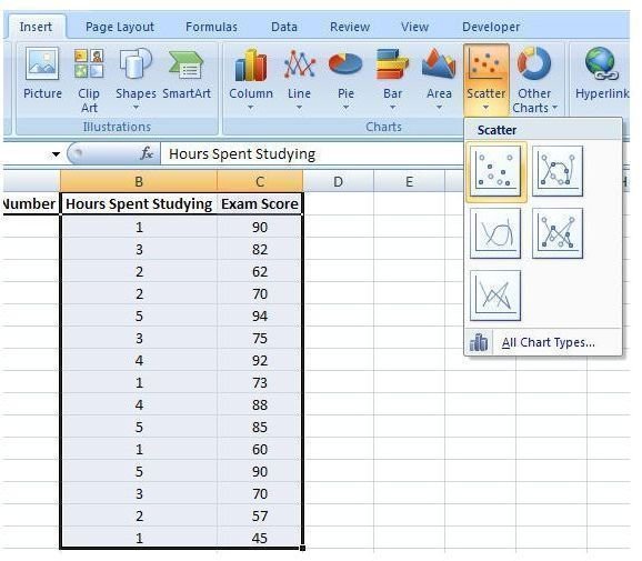
Step 3: Open the Insert tab on the Excel ribbon. Click on Scatter in the Charts section to expand the chart options box. Select the first item, Scatter with only Markers, from this box.
After making this selection, the initial scatter plot will be created in the same worksheet. You can resize this chart window and drag it to any other part of the worksheet. If you want to move the chart to a new worksheet, click here for instructions .
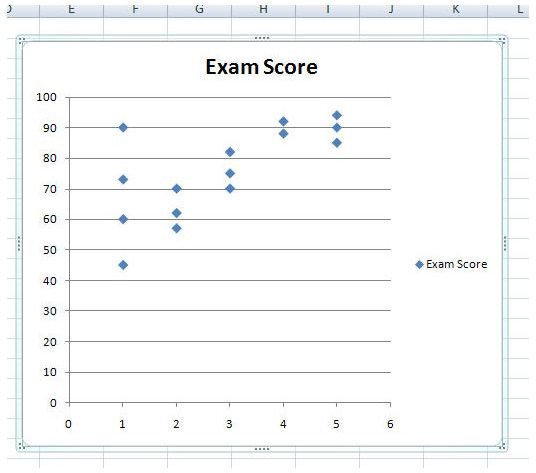
Step 4: Make any formatting or design changes you wish in the Design, Layout, and Format tabs located under Chart Tools on the Excel ribbon. Most of these changes will be based on your own personal preferences, but there are a couple that we’ll discuss here.
Label the Axes
First, let’s label the horizontal axis. To do this, select the Layout tab under Chart Tools. Next, click on Axis Titles in the Labels section. Choose Primary Horizontal Axis and then pick Title Below Axis.
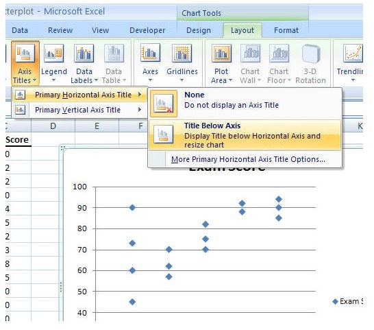
A text box with the default wording Axis Title will appear on the chart. Click anywhere in that text box and edit the information to reflect the true title of the horizontal axis.
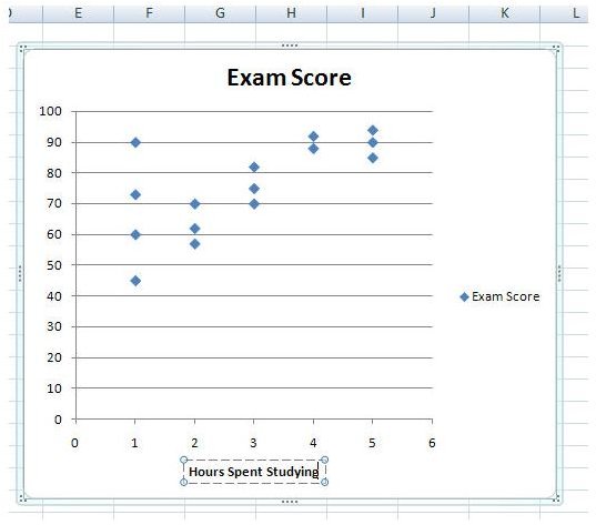
Similarly, you can create a label for the vertical axis, but you will have more choices for title placement here. We’ll use the Rotated Title option.

Chart Legend
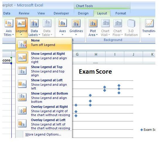
The default legend that was created with the scatter plot serves no real purpose here, so let’s get rid of it. If you’ve been “tabbing” around, go back to the Layout tab and click on Legend. From the list of expanded options, pick None to turn off the legend.
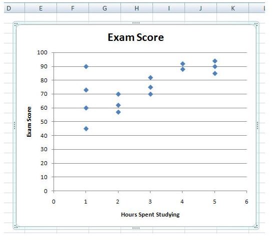
With that annoying, useless little box gone, your chart should now look like the one in the screenshot below.
Change Chart Title
Another thing that most everyone will want to change is the chart title for the scatter plot. To do this, just click on the title to open the text box that contains it and edit it with your new description.
Visual Appearance of the Chart
If you want to add a bit more color and style to your scatter plot, check out the options available in the Design tab under Chart Tools. There are tons of choices that you can make here to liven up your chart’s appearance. Try a few of them out and see how well you like them. The screenshot below shows just one example of how the scatter plot can be redesigned with just a couple of clicks.

Be sure to browse through the other articles on charts and graphs in Bright Hub’s library of Excel tutorials. More are being added on a regular basis so check back often!