There are many times when you may want to represent one variable as a line and another as a bar or column in a Microsoft Excel 2007 chart. This step-by-step guide will show how to accomplish this task.
Different Types of Charts
Often times, there will be cases where you want to create a chart in Microsoft Excel 2007 so that one item in the chart is represented by a column or bar and the other is represented by a line. In older versions of Excel, creating a chart of this type was a lot more intuitive than it is in the 2007 version. However, the process still isn’t too bad with this latest version of the spreadsheet software once you know the trick.
Although we will be concentrating on how to create a mixed column and line chart in this tutorial, the same technique can be used to combine any two (or more) chart types within a single object in Microsoft Excel 2007.
Note: These directions are for creating what is known as a Column Chart in Excel, also known as the traditional vertically oriented “bar chart”.
Creating a Mixed Chart
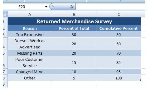
Step 1: Enter or copy/paste your data into an Excel worksheet. For this example, we will look at the results of a returned merchandise survey. (Click the image for a larger view.)
Step 2: Select the data that you want included in the chart. Open the Insert tab on the Excel ribbon, and click on the arrow under Column in the Charts section to expand the selection panel. Choose the column chart type that you want to use. We’ll go ahead and pick the basic Clustered Column chart to use in our example, but the following steps will still apply for any choice you make here.
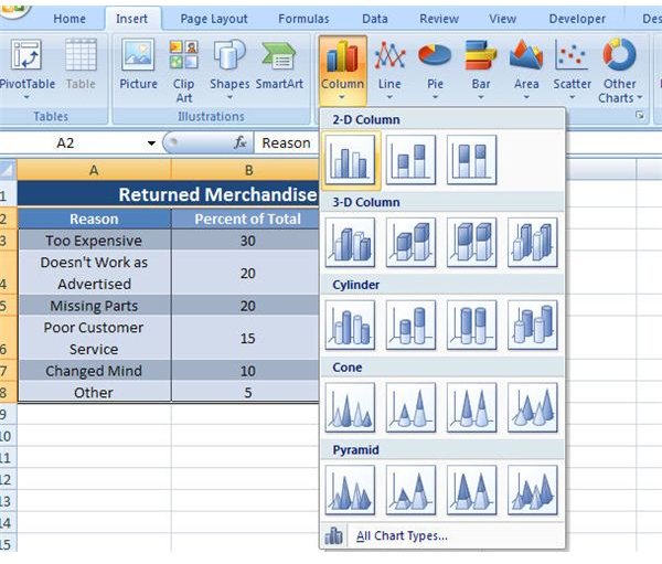
After making this selection, the column chart will appear in the same Excel worksheet as shown in the screenshot below.

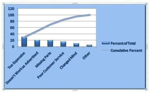
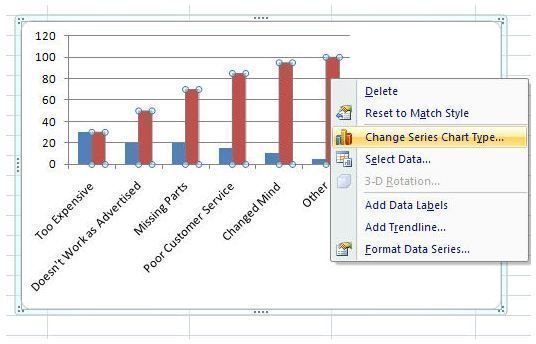
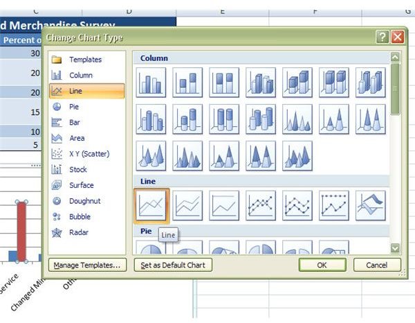
Step 3: Next, right-click on the column representing the data that you want to convert to a line. (In our example, we want Percent of Total to remain a column and Cumulative Percent to be represented as a line.) Select Change Series Chart Type.
Step 4: In the Change Chart Type window that appears, select what type of chart you want to use for this variable. Since we wanted this column displayed as a line, we’ll pick that.
Click OK to continue. The final chart should look like the screenshot below. You can now apply any formatting or design changes that you like in the same manner you would follow for any Excel chart.

For more tips and tricks, be sure to browse through the other Microsoft Excel tutorials found here on Bright Hub’s Windows Channel. New and updated articles are added on a regular basis, so bookmark us and check back often.
This post is part of the series: Tips and Tricks for Working with Charts in Microsoft Excel 2007
This collection of articles is dedicated to exploring the many tips and tricks that can greatly enhance the power of charts in Microsoft Excel 2007.


