If you have the need to display a reporting structure within your organization you can easily create an Organizational chart using PowerPoint 2013. This article will show you how!
Preparation
Before you dive into PowerPoint and start creating your org chart, you’ll want to have a plan for how you will create your chart. How many levels deep will your chart go? Will you only use departments or will you show positions or even employee names? Or, for larger organizations maybe you will only be working with a specific department or division? Try to have a plan before you get started to make the process more efficient.
Creating the Chart
Open PowerPoint 2013 and create a new blank presentation using whichever theme you wish to use. Give your first slide a title if desired and create a new slide for the org chart itself. On the new slide you’ll want to remove the ‘content’ box to give yourself room for the chart.
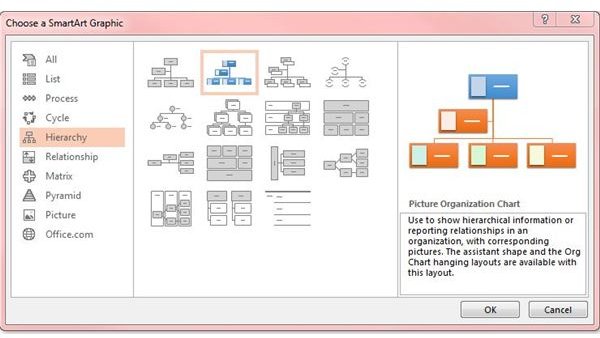
Click on the Insert menu tab and select SmartArt. The SmartArt button lets you choose from a number of designs that let you create great looking diagrams and pictures. For our org chart, we’ll select the Hierarchy heading on the left. On the right side of the window (Figure 1) you can see the various types of charts you can create.
Choosing the right design will depend on how you answer a few questions:
- Do you want your org chart to lay horizontally or vertically?
- Do you want to include pictures of employees?
- Do you want to have labels for each level of hierarchy?
Once you find a design you like, click on it and click OK. In my example, I chose the ‘Labeled Hierarchy’ design.
Filling Out the Chart
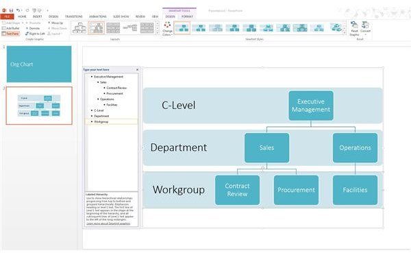
When your chart opens, you will be able to see an outline on the left side of the window while your chart itself will be in the right side of the window. In Figure 2 I’ve added in my various levels and headings.
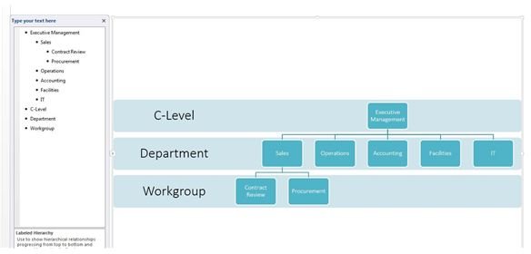
However, as you can see the default chat only had two boxes for my departments. To add additional SmartArt objects I will click on one of the existing departments (Operations in this case) and then in the SmartArt Tools menu tab I click on ‘Add Shape’. A new box appears next to the box you selected. As you can see in Figure 3 I’ve added a few more departments to my chart.
Next, I need to repeat the step above and add new workgroups. If you accidentally create a box at the wrong level, you can easily rearrange the boxes by using the Promote, Demote, Move Up and Move Down buttons. Repeat the process until your chart is built out the way you want it.
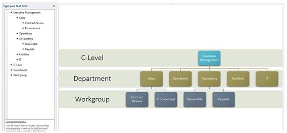
The last step is to spice up your chart. You can easily change the color scheme by clicking on the SmartArt Tab and then the Change Colors button. You can also use the SmartArt Styles picker to choose a different look (Figure 4).
With that, your org chart should be complete. If you don’t like the final layout you can always use the Layouts section of the SmartArt tab to try out a different layout. Just be sure to save what you have before you do this! Good luck and don’t be afraid to try out different options.


