Boxplots are handy charts for visualizing sets of data along with statistical facts related to that data such as median and percentile ranges. Although there is no boxplot chart available in Excel 2013, this article will show you the relatively easy way to create this powerful visual tool.
A Box of Whiskers?
Boxplots can be drawn horizontally or vertically, but they will typically contain the same few elements including:
- A box which shows the 1st and 3rd quartiles represented by the bottom and top of the box respectively.
- Lines may be drawn above and below the box to indicate outliers in the data. These lines are sometimes lovingly referred to as whiskers.
- A line running through each set of data represents the median for each set.
Although Excel doesn’t officially have boxplots available, you can easily create one using the Excel ‘Stock’ charts.
Prepping Your Data
Your data will need to be ordered in a specific manner in order for the chart to work properly. Follow along and you should end up with a great looking box and whisker chart.
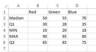
Your data will need to have five series to indicate the Median, 1st quartile, Min and Max values and 3rd quartile. Under Column A, add the following in each row: “Median”, “Q1”, “Min”, “Max” and “Q3”.
Next, obtain your data set. If all you have are raw numbers you can easily calculate the values for median, min\max and quartile values.
Median – To calculate the median, use the MEDIAN function and select the data you with to use. Hit enter to obtain the median value. Do this for each remaining set of data.
The Min and Max values can be easily found using the MIN and MAX functions.
The quartile can be found by using the QUARTILE.EXC or QUARTILE.INC functions. The ‘.exc’ and ‘.inc’ indicate whether or not to exclude or include the median value in the calculations. To use this formula, enter ‘=quartile.exc(DATARANGE, 1)’ for the 1st quartile and ‘=quartile.exc(DATARANGE, 3)’ for the 3rd quartile.
Creating the Chart
Next, we’ll build the chart using Excel’s Stock charts.
Note - click on each of the examples below to enlarge.
1. Open Excel 2013 and create a new blank workbook.
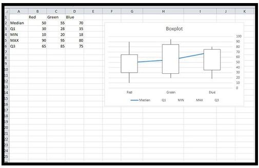
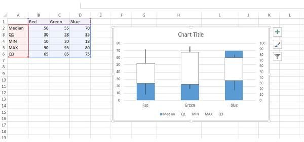
2. Enter your data in the columns starting with column B. As you can see in Figure 1 I have three columns labeled ‘Red’, ‘Green’ and ‘Blue’.
3. Select all of your data. In my example I selected A1:D6.
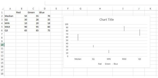
4. Click on Insert -> Recommended Charts-> All Charts. Select Stock and then the ‘High-Low-Close’ chart. Click OK. You will now see a chart that looks nothing like a boxplot, but that’s okay (Figure 2). We’ll fix it up over the next few steps.
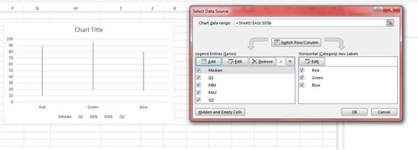
5. Right click in the chart (in between the gridlines) and click ‘Select Data’.
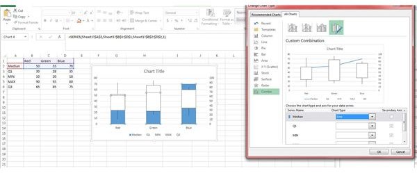
6. In the Select data source window, click the Switch Row\Column button and click OK. Your chart should now have the correct series in place (Figure 3).
7. Right click on the chart again in between the grids and select Change Chart Type. This time we should be able to select the Stock -> Volume-Open-High-Low-Close chart. Click OK (Figure 4).
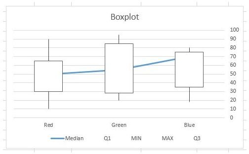
8. Next, we need to tell Excel that the Median data series should just be a single point – not a whole bar. Left click on the blue bar that represents your Median value. Right click on it and select Change Series chart type.
9. In the Change Chart type window, you should see your Median series highlighted blue with a chart type of “Clustered Column”. Use the dropdown box to select the ‘Line’ chart type and click OK (Figure 5).
10. Next, left click on the left-hand series axis. Delete this set of labels.
11. Give your chart a proper title and pat yourself on the back. You’ve got a boxplot (Figure 6)!
Although boxplots aren’t terribly quick to create, they do offer a great statistical view of your data letting you know what the median value of your data sets are as well as percentile ranges and whether or not your data has any outliers.
You can download the spreadsheet used in the illustrations above, here ..


