Arguably one of the hardest tasks for any web or photo designer is to create attractive color combinations. Many a site have been ruined by unattractive, ugly colors. ColorSchemer Studio 2 aims to alleviate much of this work by suggesting different color combinations and letting you demo them.
It’s a Colorful World
With the onslaught of rich, Web 2.0 web sites, designers truly have their work cut out for them. Not only must they design graphics which have a vibrant look and feel, but they also have to create color schemes that blend harmoniously together. You can often tell when a designer has very little color experience - the ambiance of the site will feel harsh, the text might not have enough contrast on the background color, and so on. Sites that have these novice problems will feel, for lack of a better word, “tacky”. Beginners to the design world often have difficulty deciding on which colors to pick. If you have an amazing background color, which one complements it nicely for the buttons? Which color should you use for the sidebar? These are challenges that every designer, new or veter
ColorSchemer Studio 2 seeks to eliminate many of these problems. At $49.99 for a single license (ouch!) it faces some stiff competition, considering the awesomely free Kuler service from Adobe (you can visit this for free at kuler.adobe.com ). In the following paragraphs, we’ll see if it’s worth the steep expenditure.
Functionality (3 out of 5)
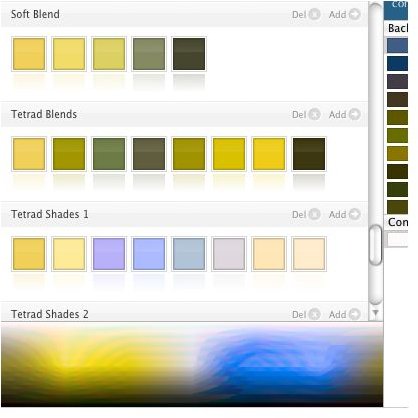
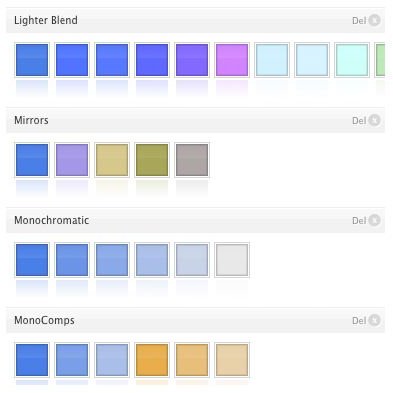
To be perfectly blunt, ColorSchemer Studio 2 does what it says. You can select different colors and also view various complimentary color palletes. For example, if you’re looking for the color steps in a fade-to-black theme or complimentary colors to use for a logo, you can get them from this simple application. Saving your color selections is quite simple - just click on the add arrow for the color scheme to add it to the right-hand side.
ColorSchemer Studio 2 lets you preview your colors in one of 13 very basic web site themes. You can then set each part of the theme, such as the links and top bar, to one of the colors you’ve saved. Don’t get me wrong, this is a fantastic idea in theory. The problem is that in actuality, sites are often far more complex than the templates provided. If you’re searching for color schemes for a blog or basic site, then putting these colors on the themes might be beneficial. The majority of users, however, will still find that they need to experiment directly with the sites graphics.
Arguably the coolest, although perhaps the most non-useful feature of this software is that it can show you how a color-blind person will see the colors you’ve selected. That’s right - if you’ve ever wanted to know how someone who has a form of color impairment such as protanopia (red-blind) sees the world, here’s your chance! Useful? Not really, but it might be important for some.
Value (2 out of 5)
Where ColorSchemer really falls apart is in the value area. Granted, $49.99 for the software isn’t a particularly horrendous sum of money, but for the average person there are many free online services that can perform the same functionality. Kuler, for example, can pick six different types of color combinations and you can even create your own custom one, much like you can do in ColorSchemer.
In addition, although it might be a little more time consuming, you can perform many of the tasks listed above in Photoshop. Theoretically, you could create a little toy theme to test out the color combinations. Another feature of ColorSchemer is that you can analyze the contrast by plugging in various colors for a background and some text. Once again, while useful, it’s not exactly cumbersome to do in Photoshop.
Conclusion (3 out of 5)
After having used ColorSchemer Studio 2, I can’t say that I’m particularly enthusiastic about the software. Don’t get me wrong - it is useful, but its usefulness doesn’t feel worth the $50 unless you both work day in and day out with colors, and really find some particular aspect of this software helpful (like the ability to see how the scheme would look to a color-blind person).
However, for the average person who just needs the odd color selection or maybe just that extra bit of help to find something that looks visually attractive, ColorSchemer Studio 2 feels like overkill. Adobe’s awesome Kuler site is probably good enough for most people.
Courtesy of ColorSchemer