The latest iteration of the Mac operating system has been released - or perhaps that’s no longer correct, as Apple has dropped “Mac” from the official name. Let’s have a look at what this new rendition brings to the table.
Back to the Mac? Really?
Apple’s Mac line of computers was once the company’s mainstay, but over the last five years devices such as the iPhone and iPad have stolen the spotlight. Yet the Mac remains an important part of the company and important to Apple’s fans.
Steve Jobs made it clear during the press conference announcing the new version of OS X that the company was looking to prove that it had not forgotten about the computers that were once its bread-and-butter, but not everyone was buying it, myself included. I thought the announcements were uninspiring, and often based off lessons learned from iOS - arguably the best mobile OS available today, but also one built for devices much different from a modern computer.
Now I have OS X Lion on my MacBook, and it’s time to see if it brings new life to Apple computers.
The New Look - Aqua Refined (4 out of 5)
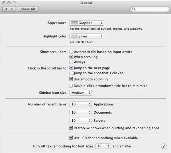
Apple’s OS X operating system has been defined since its inception by the “Aqua” user interface, which used light, colorful designs to convey a more user-friendly approach to software. Over the years, however, it hasn’t aged well. While great on the older MacBooks and iMacs, it was beginning to look cartoonish on Apple’s new sleek-and-silver machines.
Aqua is not gone, but it has been brushed up for Lion, resulting in a number of notable changes. Menu buttons have had their corners squared, and the overall look has been given a more mature, grayish appearance instead of the pastel-blue appearance of old.
Scroll bars have been redesigned as well. The bright and cheerful blue bars of old have been replaced by subtle gray bars that are far more reserved and, in addition to that, they disappear completely in certain situations when the user is not scrolling. This frees up a little extra display space when the bars aren’t needed and improves the elegance of the interface.
Not all of the changes were great, however. Apple has traditionally shown a love for animation, and this has continued. There is a new, simple animation that occurs when a window opens. The window starts small in the center of the space it will grow to occupy and then expanded. This all occurs in less than a second, but it does add an unnecessary pause to what should occur instantly. Adding an animation to this seems odd considering Apple’s focus on solid state drives in the interest of making its computers feel more responsive.
These updates were badly needed. The old appearance was becoming dated even when compared to Windows 7 with its latest implementation of Aero and new taskbar. With this refresh, Macs will have an OS that is appears as modern and refined as the hardware its running on.
Mission Control and Launchpad (3 out of 5)
Launchpad gained much attention, both positive and negative, from the press. Clearly inspired by iOS, this new feature provides a grid of application icons that makes selection of programs quick and easy. Or at least, that’s the theory.
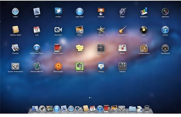
In practice, Launchpad seems like an odd and perhaps lazy addition to the OS. It’s no secret that a computer with a mouse or touchpad has the advantage of far more precise user inputs than a touchscreen device, yet Apple’s Launchpad does little to take advantage of it. My MacBook, which has only a handful of software on it, requires three Launchpad pages to show all of the available apps. Why? The icons could have been rendered smaller quite easily, but instead they’re large and in-charge, as if Apple expects me to give up on the wonderful touchpad they’ve provided and start sending my fingers on a stroll across my display.
Another problem with Launchpad is the fact that it doesn’t put priority on the user’s most important apps. Windows 7’s taskbar is a wonderful example of why priority is important. Launchpad simply offers to many options - and with the Dock already available, you may not even find occasion to use it.
Lion’s other big new interface feature is Mission Control, and it is excellent. It’s long been possible to access a thumbnail view of all running applications on OS X machines, but Mission Control refines the concept and adds to new, static thumbnails of the Dashboard and Desktop at the top of the display. There’s also an attractive new linen border that surrounds Mission Control, a small touch that classes up the operating system’s appearance.
Unfortunately, despite the improvements, Lion doesn’t properly respond to the Windows 7 task bar which remains the best stock app launching solution available on any computer operating system. The Dock remains the same and the Launchpad only serves to add another layer of UI to your computer. Borrowing from iOS isn’t going to cut it - unless Apple’s way forward is to simply turn OS X into iOS.
Multi-Touch - More Like Mobile (4 out of 5)
Multi-touch support is one of OS X’s best features, and there’s been some changes to it in Lion. The most immediately obvious change is the scrolling, which is reversed from its previous implementation. To scroll down users will need to actually move upwards with two fingers, while scrolling up will require users to move downwards.
This change brings OS X in line with modern mobile touchscreen devices. It requires an adjustment period and it doesn’t make as much sense as it does on a touchscreen device, but begins to feel second nature after an hour or so of using the new OS.
Some of the other gestures are not as intuitive. Launchpad, for example, requires a strange three-finger and thumb pinch that isn’t difficult to learn but always feels a bit awkward. Even so, multi-touch support remains strong and one of the defining features of OS X.
Processes - Another Step Towards Mobile (3 out of 5)
One major difference between mobile operating systems like iOS/Android and PC operating systems such as Windows and OS X is the process model. Applications on PC operating systems tend to take up resources and continue doing so until they are exited by the user. Mobile operating systems, on the other hand, aggressively terminate applications that are not currently in use, freeing up the device’s limited resources for use by active processes.
OS X is taking another step in this direction by including an API feature called Automatic Termination. This feature gives the operating system permission to automatically shut down an active process if the OS does not believe the app currently needs resources. Such actions appear to be made conservatively - the app needs to have no visible or minimized windows and can’t be actively used by the user. Automatic Termination works in conjunction with autosave where appropriate to make sure that no user data is lost.
While interesting, this change is so far only a small step. That’s because this is an API feature, and it’s not required for apps to run on Lion. It’s obvious why that is necessary, as dramatic software-breaking changes in an established OS rarely go over well, but for now you shouldn’t expect to see this feature come into play often. The situation may change by the time the next version of OS X rolls around.
Applications - Moderate Changes (4 out of 5)
File navigation is an important part of every operating system, but Windows and OS X have always taken much different approaches to it. Apple’s belief is that users can’t be expected to learn the details of a file system, and Finder is supposed to be obscured by the Dock, Spotlight and now the Launchpad. Unfortunately, this lead to some neglect of Finder itself. Compared to Explorer in Windows 7, Finder was bulky and confusing.
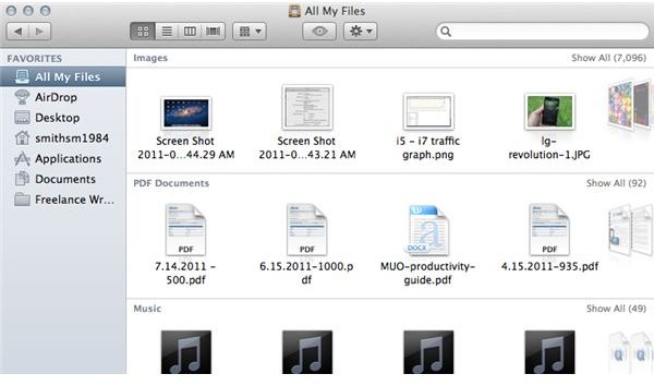
The user interface revamp has found its way to Finder as well, which means that the app provides access to more information while taking up less space. The left sidebar now consists only of “Favorites” by default, which means six categories in addition to whatever folders the user adds to them. On my system, that’s only one, so the file system on the left side is quite small and orderly indeed.
A smaller sidebar combined with the disappearing scroll bars described previously makes for a sleek interface indeed, but it’s not all good news. Finder has always felt like a bit of a mish-mash. On the one hand, it’s a traditional file system finder, but if you change to certain views it becomes something different indeed, full of animated thumbnail views and other such gee-whiz goodness. I don’t find this compromise a good solution because it gives both expert and laymen users the opportunity to stumble into an interface they won’t enjoy in the least.
Otherwise, the changes have been minor. Safari is updated with a few new gadgets like the ability to save a webpage for later reading and an improved download manager, while Mail has new rich text editing features. In addition, these built-in apps have a full screen mode and will reopen with the same windows available that were active when the program was last closed.
Verdict (4 out of 5)
If our system allowed it, I would give Lion 3.5 out of 5 starts. Indeed, I was somewhat inclined to give this update an “average” score, but the value proposition is hard to argue with. $30 isn’t a lot of money, and although there’s no new features that I would call revolutionary or must-have, there’s a lot of nice extras. I love the new mission control and greatly appreciate the interface refresh.
Still, OS X doesn’t live in a vacuum. Despite all the changes there’s still room for improvement, and Apple doesn’t seem to be aware of or willing to change certain disadvantages, such as the Dock’s weakness compared to the Windows 7 taskbar or Finder’s confusing half-and-half approach to user interface. I’m particularly confused about how Apple intends to remain competitive with Windows on larger machines. All of the mutli-touch, disappearing scrollbar goodness is wonderful on my MacBook’s small display, but it’s irrelevant on a 27" iMac. Launchpad looks corny on such machines.
We’ll have to see where Cupertino goes from here. For now, OS X Lion is a competent improvement that’s worth its pricetag.
References
Author Experience
Images provided by author


