Get a Free Pirate Font: 18 Different Choices for Parties, Treasure Hunts & More
Pirate fonts are for more than just Talk Like a Pirate Day. (Yarrr!) They’re usually slightly distressed serif faces that either look vaguely like 18th-century handwriting or like formal writing on parchment, so a pirate font has much wider use than you might first imagine.
Consider using these fonts in projects like:
- treasure maps (obvious, yes, but so very much fun)
- “olde tyme”-looking documents
- pirate theme parties
- sailing/boat themed events or excursions
- waterfront festivals and events
Also, you may want to check out this collection of free pirate clipart resources for even more ways to spruce up your project.
Pirate Dingbats Fonts
These fonts are all dingbats sets, which are fonts comprised of pictures instead of letters. The images are either created by the font designer or, more commonly, are public domain images.
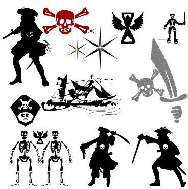
Pirates 3, created in 2004 by Manfred Klein, is a dingbat font with many silhouettes of pirates in sword combat, along with skeletons, skulls and crossbones, and ships.
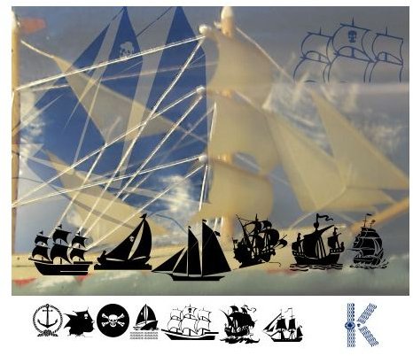
Armada Pirata, by Manfred Klein, is a pirate ship dingbat font, with over 60 different images of sailing ships.
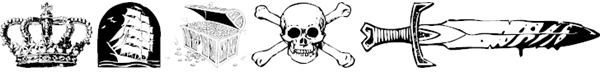
Fantasy clipart 2, by GemFonts, contains several pirate-themed images, from a saber to a bloody dagger to scrolls and of course a skull and crossbones.
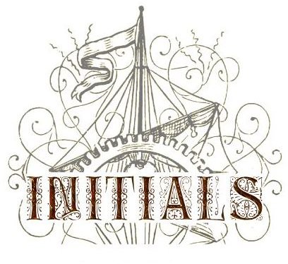
Pirate Initial Caps Fonts
These fonts are all decorated initial capital letters with a pirate flair.
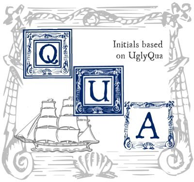
QuaNauticale, by Paul Lloyd, is an initials font based on UglyQua’s letterforms. It comes in three flavors: a light-bordered box, a dark-bordered box, and a box without borders. It only contains the capital letters A–Z, but that’s all it’s there for. Use QuaNauticale for initial caps to help any pirate-themed design stand out.
Delitsch Initialen, created in 2004 by Manfred Klein, is a caps-only initials font.
Pirate Text Fonts
Use these pirate fonts for headlines and in some cases, even body copy. Be careful: many of these fonts look best when used sparingly! I’ve tried to note the faces that would work in larger blocks of text to make things easier for you.
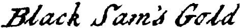
Black Sam’s Gold, created in 2001 by Redruth’s Basement Software, is an italic, bold weight pirate font that comes in three flavors: regular (seen above), Mapbats (map-based dingbats), and Whydah Heck Poker.
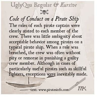
UglyQua, by Manfred Klein, comes in both a roman and italic face, with a complete set of accented characters. Great for setting out blocks of pirate text.

Pieces of Eight, another great treasure map font, was used in the title workups for Disney’s Pirates of the Caribbean movies.
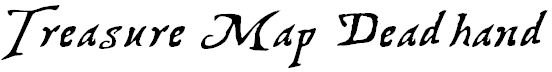
Treasure Map Deadhand, by GemFonts, is less distressed than many of our other “treasure map” style pirate fonts, lacking all the jagged strokes. Instead, Treasure Map Deadhand maintains the shapes of the distressed letterforms, making them more readable in longer phrases and blocks of text.
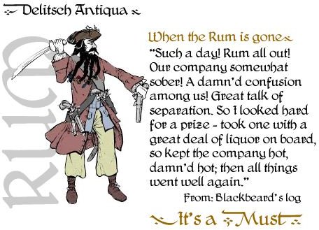
Dlitsch Antiqua, by Manfred Klein, is a squared-off, legible pirate font. It’s got quite a few accented characters, and includes several dingbat-like swash characters.
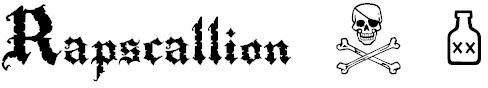
Rapscallion, by Ryan Splint, is a classic blackletter font perfect for treasure maps, matey.
Aquiline Two, by Manfred Klein, is a flowing, slightly italic face. Aquiline Two could work in short blocks of text to get across a full pirate feel. It looks like 16th–18th century handwriting, and comes with a complete set of accented characters. Oddly, it’s missing a dollar and Euro symbol, though.

Primitive, by Rick Mueller, stands out especially for its distinctive double-stroked capital letters. It contains a full set of accented characters as well.
Clerica, created in 2004 by Paul Lloyd, is another “almost-text” pirate font. So close to being readable in blocks of text, but falls short once laid out longer than a sentence. It’s still a tremendously era-evoking display font to use as headlines or in other places of emphasis.

Sketch Bones, created in 2005 by Character, has letterforms made up of—what else?—weathered bones.
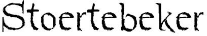
Stoertebeker, by CybaPee Creations, is another parchment-like font with ragged edges. It stands out for having some intriguing touches on the capital letters, such as broad serif strokes.
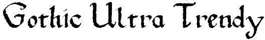
Such an unfortunate name for a font: Gothic Ultra Trendy, by Blue Vinyl. While the name inspires mental pictures of depressed upper class teenagers in Siouxsie and the Banshees t-shirts and combat boots, the font itself is pretty well-constructed. Heavier than most pirate fonts, Gothic Ultra Trendy is best for headlines and emphasis.
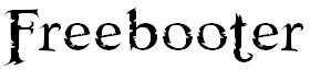
Freebooter, created in 2000 by GemFonts, stands out from other parchment fonts by its swooshy ascenders and descenders. Freebooter comes with three faces: roman, italic, and shadow.
Font Resources
Every pirate font in this article can be downloaded from the sites below, and are free for personal use. Contact the font’s designer for information on commercial licensing.
This post is part of the series: Free Display Fonts
Need an unusual or artistic font? The Free Display Fonts series covers dozens of fonts that look like monograms, handwriting, bubble fonts, and more. When you need a font that looks like a pirate wrote it or like a tattoo, this is the place to look.