Bubble Letter Fonts: 17 Free Fonts for Business or Personal Use
Did you know that bubble letter fonts are made by outlining plain letters? You can even try this yourself with a pencil: write a word, spaced out, then outline the letters, then erase the insides. Voilà! You have bubble letters.
Luckily for us, font designers love to create bubble fonts, probably because they’re easier to make than regular font families. As a result, there are tons of free bubble fonts available online. Given their originality, it’s hard to separate bubble fonts into groups. Here, I’ve given them two categories: outlined and filled. Filled bubble fonts are a solid color. Outlined bubble fonts are stroked on the outside and clear or white on the inside.
All of these free fonts are available at Dafont.
Outlined Bubble Fonts
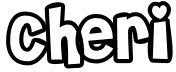
Cheri looks like the fanciful doodling of a teenage girl. This font would be appropriate in advertising targeted at the teenage girl demographic, or in scrapbook pages of your teenage children. I like Cheri a lot because it comes with some adorable heart dingbats as well as cute question marks and exclamation points.
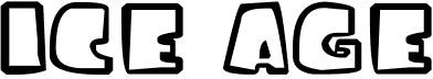
Evoking the film of the same name, the Ice Age font bursts with chunky personality. It’s top-heavy with varying line widths, making it a strong contender for possibly being useful in a more serious context than bubble letters normally are. On the other hand, Ice Age has some versatility, since the reader’s subconscious will link the font to “cold” or other feelings from the movie Ice Age if they happen to have been exposed to it in popular culture. For scrapbooking, try Ice Age on wintry seasonal pages.
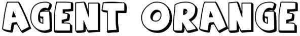
Agent Orange is all caps with a drawn drop shadow. Might just be the word “orange” in the name but it seems to evoke malt shops and fruity sodas.
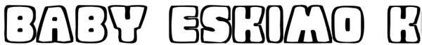
This one is actually called Baby Eskimo Kisses, but it was just too awesome to fit in one screenshot. Baby Eskimo Kisses comes in plain (shown), bold, and black. The letterforms evoke the building practices of Central and Southern American native peoples like the Maya and Inca — I can see Chichen Itza in the “M.”
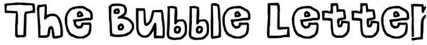
Another one just a tad too awesome to fit in one screenshot, The Bubble Letters stands out for actually having both upper and lower case letters.
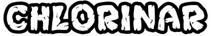
Chlorinar has a bit of a stone or wood feel to it with its markings inside the letters. With very tightly kerned letter pairs and super-thick strokes, reading Chlorinar feels like someone dropped a pile of bricks on the floor. It’s that heavy.
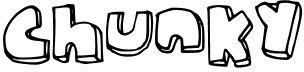
Pretty light for being chunky, Chunky, by Tim Sutcliffe, has puffy letterforms and crookedly-drawn open drop shadows.
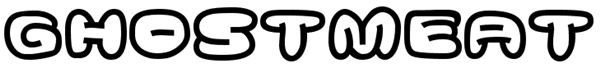
Full of curves, Ghostmeat looks like it’s about to burst or float away. Its shapes make me think of space and science fiction, what with how the “A” looks like a spaceship and the “G” looks like a spiral galaxy. Yes, they could look like other things. But now that you see what I see, wouldn’t this be a great font for short headlines in a planetarium brochure targeted at kids, or a poster for a science fiction film festival?
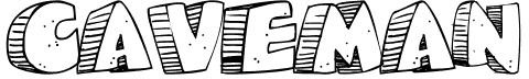
Harking back to the days of foot-powered cars made out of carved rock, Caveman, by Fonalicious, looks like letters chiseled from stone.
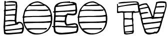
Puffy Loco TV is a basic bubble font whose only real detail is horizontal lines. Perhaps they’re meant to look like TV scan lines.
Filled Bubble Fonts
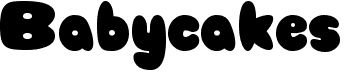
Babycakes, babycakes. So rounded, so nice for a baby page in a scrapbook.
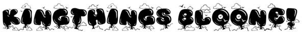
Kingthings Bloone! by Kingthings has letterforms that look like balloons floating high in the sky, with clouds and occasionally birds above them. Not just a bubble font, Kingthings Bloone! is also a decorative display font, meaning it might be most useful when using just one letter at a time from the font to emphasize whatever point you are making.
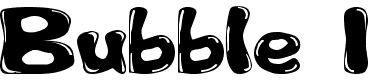
Bubble 1, by Gary Staunton.
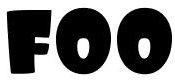
Foo, by Ray Larabie, is top-heavy, almost cartoonish. Could be used to letter short comics, or for Halloween-themed promotions and scrapbook pages.
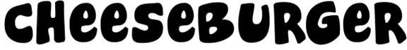
Yes, you can haz Cheeseburger. Cheeseburger mixes upper- and lowercase letterforms, giving it a very casual feel.
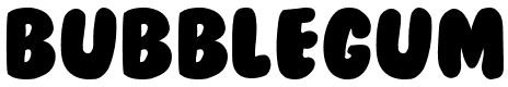
Bubblegum is a nicely-drawn bubble font, with short horizontal stems reminiscent of 1960s hand lettering.
Try one of these bubble fonts in your next casual project. They’re free, so you have nothing to lose!
Image credits: All screenshots ©Amy Carson
This post is part of the series: Free Display Fonts
Need an unusual or artistic font? The Free Display Fonts series covers dozens of fonts that look like monograms, handwriting, bubble fonts, and more. When you need a font that looks like a pirate wrote it or like a tattoo, this is the place to look.