Typographic Ligature Explained
What is a Ligature?
A ligature in typography is simply two characters that are joined together in order to create a glyph. Now a glyph can be a single character like the letter A or the number 9; these characters on their own are categorized as glyphs.
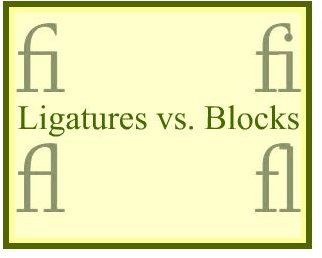
Back when printing was done by character blocks, there were certain letters that when printed together would come out not looking quite right. An excellent example of this is when looking at the lower case f and the lower case i. When printed, the character blocks for these two letters would show the dot of the i right underneath the top of the f which would make the f look like it had an extra appendage. In the image to your left is an example of what those letter characters looked like when printed by straight block as individual letters and what those letter characters looked like when combined to make a typographic ligature.
The most common ligatures that were used can still be seen today in some printed texts and they are fi, ff, ffi, ffl, ij, and fl.
Ligatures in Typography
In the world of typography there are many terms that can seem confusing when it comes to working with characters. One of those terms is that of “typographic ligature”.
Ligatures are not used as much in modern typography as they once were. What was once considered a great way to wrap up a line of text is now seen as an added step that not many people will understand or even notice when the type is being read. The hey day of typographic ligature usage came about through standard printing presses when character blocks were used to imprint the type onto the paper. Now, with the advent of ready made publishing and word processing programs the usage of old fashioned character blocks are rarely used. To learn more about typography standards beyond ligature use, see Standard Rules and Procedures for Typography.
Modern Ligature Use
Even though the mainstream use of ligatures are no longer popular, there are many typographers who still hold a love for them. Some modern typographers have even created entire font sets that are comprised with the intent of using typographic ligatures as much as possible.
Typograhic artist and font creator Zuzana Licko has developed a full font set based on the full use of ligatures. Titled the Mrs. Eaves font, which has various typeface styles such as Roman and Just Ligs that features nothing but the entire font in ligature form can be ordered online through MyFonts at the retail price of $39.00 for each set. Click through here to view all font sets, Mrs. Eaves Fonts.
To learn more about typography and the various terminology that is used, see What is Typography? for more information.