
If you’re a new designer, there’s a chance that you might find color a little intimidating to use at first. Don’t worry, though - check out this article for ten of the most common mistakes when it comes to design projects and learn how to avoid them. You’ll be designing like a pro in no time.
Color is a tricky thing when it comes to designing. On one hand, color lends visual interest, emotion, and depth to just about any design whether it’s a website design, a flyer or brochure, a poster or a cereal box. Colors even have a way of drawing in specific age groups and genders. However, no one is impervious to color mistakes, especially when you are first starting out. Here we’ll take a look at the top ten mistakes designers make when using color, as well as how they can be avoided.
Using Colors That Are Too Saturated
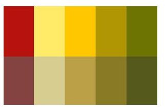
One of the biggest mistakes that you’re likely to run into with a new designer is that they tend to use a lot of very bold colors, which often tend to clash with each other. There’s no problem with being bold and bright, but keep in mind that too many colors with a too high saturation tend to be gaudy, and even sometimes physically painful to look at. How do you fix this problem? Easy! Just lower the saturation of your colors a bit. The example to the left showcases two palettes that are of the same colors, but just different levels of saturation.
Of course, it’s always good to remember that you should avoid using colors like magenta, yellow and cyan on white backgrounds, especially for things like text and logos. Using color matching tools can really help you dial in a perfect scheme.
Targeting the Wrong Audience
Have you ever found a design for a children’s toy with a bland color scheme? I guarantee you that item is less likely to be both played with by children, as well as picked up by adults. The same goes for color design: you have to know how to target your audience. For example, if you’re trying to sell furniture to the over 65 crowd, avoid designing brochures and websites in bold, primary colors. These colors come off as fun and friendly, but also tend to come off as childish - even infantile. Take a little time to think about your target audience and figure out how to pick colors to suit them, and you’re sure to have a fantastic design with colors to match.
Designs That Showcase Too Many Colors
Have you ever looked at a brochure, website, or flyer that felt incredibly “busy” and disjointed? Often times, one of the biggest problems is that a designer goes entirely overboard with color. It almost feels like a designer wanted to figure out how they could fit all of their favorite colors on a single canvas, which can cause a sensory overload!
There’s really no reason for a designer to use more than three or four colors in a design, so pick your base color (generally black, white, or gray) and build your design in two or three accent colors on top of it. This prevents it from feeling like you didn’t know where you were going in terms of color, and can help create a more cohesive design.
Color Palette That Doesn’t Fit Overall Theme of Design
Much like targeting the wrong audience, you can create confusion by not matching your color scheme to the content of your design. Say you’re designing a poster for an edgy energy drink. Are you going to use neutral colors? Pastel colors? Probably not, as neither of those give off a particularly “edgy” feeling. Generally energy drinks are marketed with bold, bright colors - brands like Monster and Amp use neon green on black, Rockstar uses bold color designs with black accents, and of course everyone knows Redbull’s silver, red, and blue design. Think about the product, service, or event you’re promoting before you begin designing, and pick your colors based on the feel of what it is you’re promoting. This works much better than trying to market a product around a color scheme.
Clash of the Colors
It’s surprisingly easy to create a design where colors clash when you have the intention of adding visual interest to your project. You may already know that there are designs called complementary color schemes, as well as split complementary color schemes ; these involve using two colors directly across from each other on the color wheel. This approach provides high contrast and a lot of visual interest, but it also brings its own set of problems to the table.
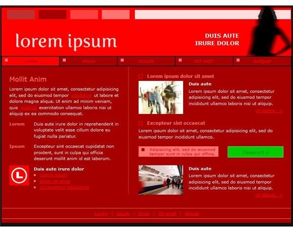
By using one color for a background - say red, and using another color for the accents and text, say green for example, you create something that feels clashy and can even cause physical discomfort to look at.
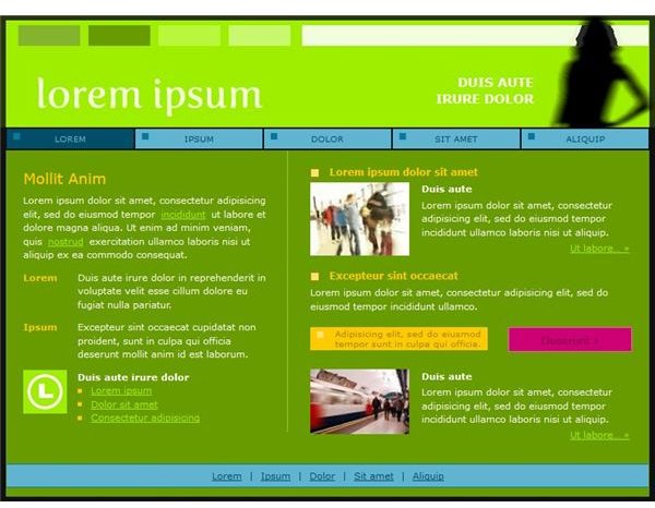
Does that mean that complementary color schemes should be avoided? Of course not! To get the most out of your complimentary or split complementary color scheme, choose a background color like white, black, or gray. Then, pick your main accent color, which you can use for headers on flyers, text in brochures, or buttons on websites. Finally, pick the complement to that color, and use it as your secondary accent color, using it to highlight your overall design. By doing this, you create a cohesive design that is sure to grab the attention of your viewers.
Front and Center
Bold colors should be used as an accent, not as a main component of your design. Think of how jarring a website design with a bright green or yellow background would be. However, a lot of beginners make this mistake. Instead of trying to make your color front and center, take the time to accent important elements, such as buttons on websites, titles on brochures, and decorative elements on flyers.
Copycat Designs
While colors aren’t expressly copyrighted (usually) - using colors too similar to other designs can have the opposite effect of what you want. For example: If you are posting flyers for your local real estate company, you’re going to want to make sure your flyers look different from any other real estate companies in your area - lest you be overlooked. Keeping a unique and well-designed color scheme is vital to the success of your design, so get in touch with your creative side.
Designs That Are Too Timid

Just like there are too many colors, there’s also such thing as too little color as well. When you use color in a design, you have the power to draw people into your design, invoke specific feelings, and more. By going out of your way to avoid using colors, your design can come off as bland, boring, and impersonal. To avoid this, make sure you use at least one color that stands apart from your standard black, white, and gray layout. This ensures that your color really “pops” and stands out from the rest of the design, imparting visual interest and making the design more fun to explore.
Not Taking the Function Design into Account
What is the purpose of your design? Is the design mostly focused on text or is it centered around images? Designs that have a lot of words and little images often need colors to help break up walls of text. However, image-heavy designs should avoid too much color which can detract from the photographs or artwork within the design. You see this kind of tactic employed in art galleries - where walls often tend to be a solid color so whatever is placed against them “pops.”
Shifting Designs
You actually see this design error quite a bit: a design that shifts from one color to the other - or worse, a design that switches between multiple color themes - seemingly without warning. While this seems to pertain mostly to web design, there have been instances of brochures that have multiple, clashing color schemes throughout. Try to stick to one color palette and theme, as this will create a feeling of harmony within your design.
References
- Color palettes designed by Amber Neely
- Website Screenshots taken by Amber Neely, example websites generated by Color Scheme Designer 3


