Simple mistakes or last minute fonts changes can end up making type that is unreadable and makes no sense to your print audience. Find out what bad typography is and how you can avoid it in your next desktop publishing.
What is Bad Typography?
Typography in itself is an art form. The placements of lettering and the design of a font collection can express ideas and communicate with the reading audience in an effective way. Using the right placement and font can be the key to successful communication, while using the wrong placement and font can produce a jumble of information that comes across unreadable and uninformative.
Here we are going to take a closer look at bad typography examples and show you how to avoid these common mistakes for better publishing. For more information on typography, see Advantages of Typography and Standard Rules and Procedures for Typography.
Too Many Fonts
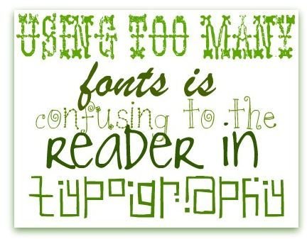
The most common mistake that people create when working with typography is using to many different fonts in one area. Too much style can detract from the message and can overload the reader. The best bet when creating is to stick with no more than two complementary fonts choices, so that each style font won’t be competing for the readers eye.
The image at the left is an excellent shot to use for bad typography examples. Here we see what happens when too many fonts are used in one publication. The message is lost in the type because the reader’s eye doesn’t know what area to look at. Image was author created through Picnik, click on image to get a better view.
Letter Placement
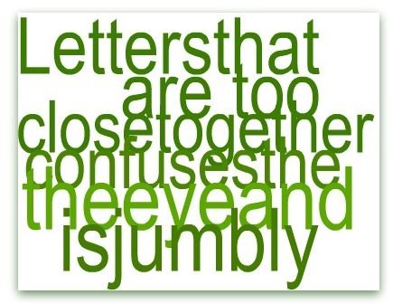
Another area where people seem to make typography mistakes is in letter placement. The idea is to space your letters accordingly and in a readable manner. Having letters that are too close together can make for jumbled printing and unreadable text where as using letters space too far apart can leave the reader’s eye searching for where to go next.
The two images seen here are bad typography examples that both show the importance of proper letter placement. In the upper left hand image, you can see how placing letters to close together can give the reader
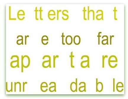
a cramped feeling and an inability to read the message that you are trying to get across. In the image here at the right is an example of lettering that is spaced to far apart which give the reader’s eye an inability to follow the message all the way through without jumping around to figure out where the next letter should be. Click on each image to get a better view. Each one was made using the Picnik application online.
These are the most common and widely seen examples of bad typography that are still used today. There is an unfortunate number of new designers and desktop publishers that will repeatedly make these mistakes over and over, sometimes on the insistence of the client. Use good judgment when working in typography and above all read through the finished publication to ensure that these mistakes have not been made.
*images used were created by Laura Jean Karr for the purpose of illustration in Picnik and are property of Bright Hub


