There are four basic types of stock charts in Excel, and each one requires the source data to be entered in Excel in a special manner. We’ll give examples of each of these types of charts and describe what each one represents.
Using Stock Charts
The group of stock charts found in Excel 2007 is fairly narrow in scope, in terms of the types of information that you can represent, but they’re great tools to use when you want to graphically compare the performance of several different stocks or when you want to look at how a single stock has performed over time.
Various combinations of the following values can be graphed and analyzed in Excel stock charts:
- High – The highest price of a specified stock over a given time period.
- Low – The lowest price of the stock over the same time period.
- Open – The price of the stock at the beginning of the time period.
- Close – The price of the stock at the end of the time period.
- Volume – The volume traded over the time period.
In the next section, we’ll take a closer look at the four types of stock charts found in Excel 2007 and give examples of each.
Types of Stock Charts in Excel 2007
Depending on the type of stock chart that you want to create, you’ll need to make sure that your data is arranged in a particular order in your spreadsheet before you create the chart. We’ll list that order along with an example of each Excel stock chart type.
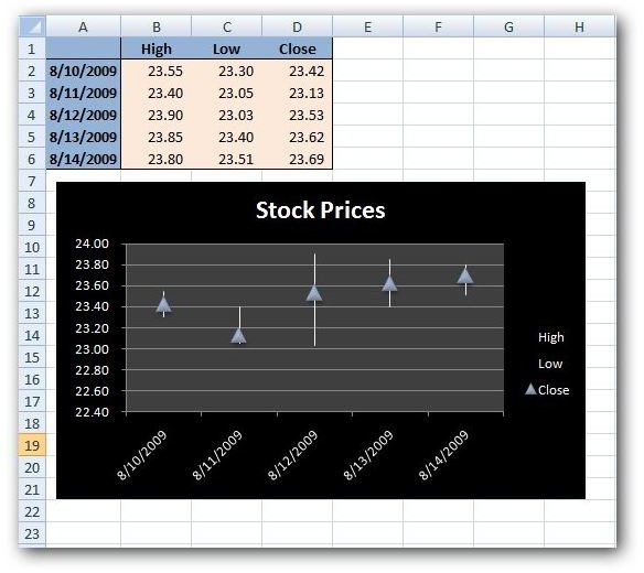
High-Low-Close – In this type of stock chart (click the image for a larger view), make sure that your data is arranged in the same order as appears in the name of the chart: High Price, Low Price, and then Closing Price.
When you construct the stock chart, the high and low prices will be represented by the endpoints of a line segment connecting the two values. The closing price will be represented as some type of marker. If you don’t like the default appearance of this marker, you can change it by right-clicking any of the markers and selecting Format Data Series. From here, just click on Marker Options, select the radio button next to Built-in, and choose a new marker from the Type drop-down list.
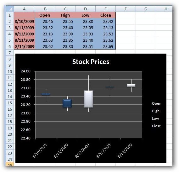
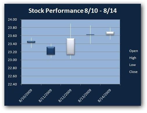
Open-High-Low-Close – For this chart, make sure that your data is arranged in the following order: Opening Price, High Price, Low Price, and then Closing Price.
Just as with the High-Low-Close stock chart, the high and low prices will be designated on the graph by the endpoints of a line segment connecting the two values. In addition, the opening and closing prices will be depicted by a column connecting the opening and closing values.
Note that if the closing price is higher than the opening price, this column will be white or a lighter shade of coloring by default. In contrast, if the closing price is lower than the opening price, this column will be a darker coloring by default. This lets you tell with a single glance if the stock rose or fell over the course of the time period being charted.
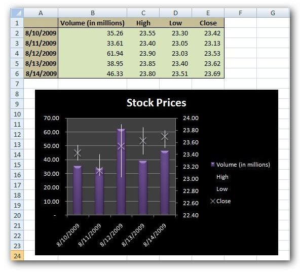
Volume-High-Low-Close – This type of stock chart requires that the data in your table be arranged in the order: Volume Traded, High Price, Low Price, and then Closing Price.
Note that the portion of the chart representing the high, low, and closing prices is the same as that in the more basic High-Low-Close chart. However, the added component of volume is shown as a column in the background of this information. In order to be able to graph the volume traded on the same chart, a second axis has been added on the left side of the chart – this axis is only used to identify the values of the volume column. The axis on the right of the chart is used to identify the values of the other three variables.
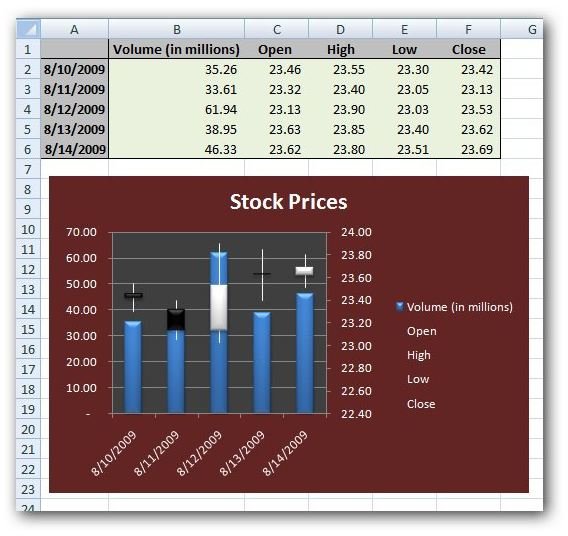
Volume-Open-High-Low-Close – This last type of chart includes all of the various stock values all crammed into one graph. When creating this stock chart, make sure that your data is arranged in the order: Volume Traded, Opening Price, High Price, Low Price, and then Closing Price.
This chart is basically the same as the Open-High-Low-Close chart described above with a column in the background representing the volume traded. The latter column is placed in the graph in the same manner as in the Volume-High-Low-Close chart with its axis values shown on the left.
For more tips and tricks, be sure to take a look at the other Excel chart and graph tutorials found here at Bright Hub. New and updated articles are added on a regular basis, so bookmark us and check back often.


